How to create a seaborn correlation heatmap in Python?
Last Updated :
21 Mar, 2024
Seaborn is a Python library that is based on matplotlib and is used for data visualization. It provides a medium to present data in a statistical graph format as an informative and attractive medium to impart some information. A heatmap is one of the components supported by seaborn where variation in related data is portrayed using a color palette. This article centrally focuses on a correlation heatmap and how seaborn in combination with pandas and matplotlib can be used to generate one for a dataframe.
Installation
Like any another Python library, seaborn can be easily installed using pip:
pip install seaborn
This library is a part of Anaconda distribution and usually works just by import if your IDE is supported by Anaconda, but it can be installed too by the following command:
conda install seaborn
Correlation heatmap
A correlation heatmap is a heatmap that shows a 2D correlation matrix between two discrete dimensions, using colored cells to represent data from usually a monochromatic scale. The values of the first dimension appear as the rows of the table while of the second dimension as a column. The color of the cell is proportional to the number of measurements that match the dimensional value. This makes correlation heatmaps ideal for data analysis since it makes patterns easily readable and highlights the differences and variation in the same data. A correlation heatmap, like a regular heatmap, is assisted by a colorbar making data easily readable and comprehensible.
The following steps show how a correlation heatmap can be produced:
- Import all required modules first
- Import the file where your data is stored
- Plot a heatmap
- Display it using matplotlib
For plotting heatmap method of the seaborn module will be used.
Syntax: heatmap(data, vmin, vmax, center, cmap,……………………………………………………)
Except for data all other attributes are optional and data obviously will be the data to be plotted. The data here has to be passed with corr() method to generate a correlation heatmap. Also, corr() itself eliminates columns which will be of no use while generating a correlation heatmap and selects those which can be used.
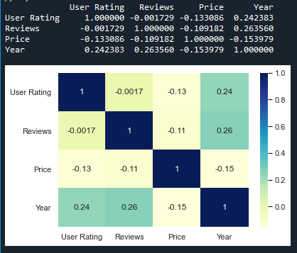
Example 1:
For the example given below, here a dataset downloaded from kaggle.com is being used. The plot shows data related to bestseller novels on amazon.
Python3
import matplotlib.pyplot as mp
import pandas as pd
import seaborn as sb
data = pd.read_csv("C:\\Users\\Vanshi\\Desktop\\bestsellers.csv")
print(data.corr())
dataplot = sb.heatmap(data.corr(), cmap="YlGnBu", annot=True)
mp.show()
|
Output:
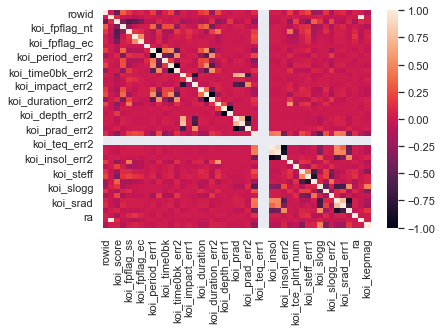
The above example deals with small data. The following example depicts how the output will look like for a large dataset,
Example 2:
The dataset used in this example is an exoplanet space research dataset compiled by NASA.
Python3
import matplotlib.pyplot as mp
import pandas as pd
import seaborn as sb
data=pd.read_csv("C:\\Users\\Vanshi\\Desktop\\cumulative.csv")
dataplot=sb.heatmap(data.corr())
mp.show()
|
Output:
Share your thoughts in the comments
Please Login to comment...