Data visualization with Pairplot Seaborn and Pandas
Last Updated :
22 Jun, 2021
Data Visualization is the presentation of data in pictorial format. It is extremely important for Data Analysis, primarily because of the fantastic ecosystem of data-centric Python packages. And it helps to understand the data, however, complex it is, the significance of data by summarizing and presenting a huge amount of data in a simple and easy-to-understand format and helps communicate information clearly and effectively.

Pandas and Seaborn is one of those packages and makes importing and analyzing data much easier. In this article, we will use Pandas and Pairplot Seaborn to analyze data.
Pandas
Pandas Offer tools for cleaning and process your data. It is the most popular Python library that is used for data analysis. In pandas, a data table is called a dataframe.
So, let’s start with creating a Pandas data frame:
Example 1:
Python3
import pandas as pd
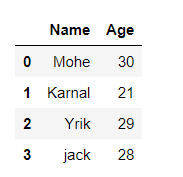
data = {'Name':[ 'Mohe' , 'Karnal' , 'Yrik' , 'jack' ],
'Age':[ 30 , 21 , 29 , 28 ]}
df = pd.DataFrame( data )
display(df)
|
Output:
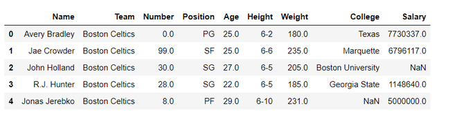
Example 2: load the CSV data from the system and display it through pandas.
Python3
import pandas
data = pandas.read_csv("nba.csv")
data.head()
|
Output:
seaborn.pairplot()
To plot multiple pairwise bivariate distributions in a dataset, you can use the pairplot() function. This shows the relationship for (n, 2) combination of variable in a DataFrame as a matrix of plots and the diagonal plots are the univariate plots.
Syntax: seaborn.pairplot( data, \*\*kwargs )
Parameter:
data: Tidy (long-form) dataframe where each column is a variable and each row is an observation.
hue: Variable in “data“ to map plot aspects to different colors.
palette: dict or seaborn color palette
{x, y}_vars: lists of variable names, optional
dropna: boolean, optional
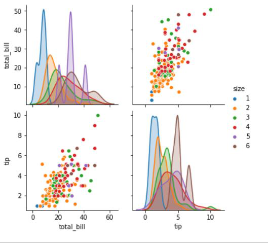
Example 1:
Python3
import seaborn
import matplotlib.pyplot as plt
df = seaborn.load_dataset('tips')
seaborn.pairplot(df, hue ='size')
plt.show()
|
Output:
Data visualization with Pairplot Seaborn and pandas
We see how to create pandas dataframe and Pairplot. We will visualize data with pairplot using pandas
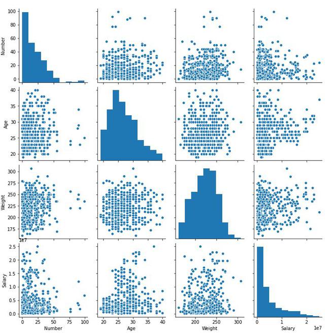
Example 1:
In this example, we will simply plot a pairplot with pandas data frame. Here we are simply loading nba.csv data and creating a dataframe and although passing as arguments in a pairplot.
Python3
import seaborn
import pandas
data = pandas.read_csv("nba.csv")
seaborn.pairplot(data)
|
Output:
Example 2:
In this example, we will be going to use hue attributes for the visualization of a specific column.
Python3
import seaborn
import pandas
data = pandas.read_csv("nba.csv")
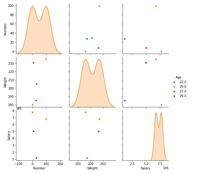
seaborn.pairplot(data.head(), hue = 'Age')
|
Output:
Example 3:
In this example, we will pass the dictionaries of keyword arguments for bivariate plotting function(plot_kws and diag_kws)
Python3
import seaborn
import pandas
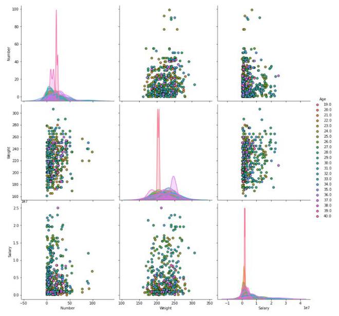
data = pandas.read_csv("nba.csv")
seaborn.pairplot(data, hue = 'Age', diag_kind = 'kde',
plot_kws = {'edgecolor': 'k'}, size = 4)
|
Output:
Share your thoughts in the comments
Please Login to comment...