Seaborn Kdeplot – A Comprehensive Guide
Last Updated :
20 Dec, 2023
Kernel Density Estimate (KDE) Plot is a powerful tool for estimating the probability density function of continuous or non-parametric data. KDE plot is implemented through the kdeplot function in Seaborn. This article explores the syntax and usage of kdeplot in Python, focusing on one-dimensional and bivariate scenarios for efficient data visualization.
What is KDE plot?
Kernel Density Estimate (KDE) Plot allows to estimate the probability density function of the continuous or non-parametric from our data set curve in one or more dimensions it means we can create plot a single graph for multiple samples which helps in more efficient data visualization.
In order to use the Seaborn module, we need to install the module using the below command:
!pip install seaborn
Syntax: seaborn.kdeplot(x=None, *, y=None, vertical=False, palette=None, **kwargs)
Parameters:
x, y : vectors or keys in data
vertical : boolean (True or False)
data : pandas.DataFrame, numpy.ndarray, mapping, or sequence
How to visualize KDE Plot using Seaborn?
We learn the usage of some parameters through some specific examples:
Importing Libraries
First import the corresponding library
Python3
import pandas as pd
import seaborn as sb
import numpy as np
from matplotlib import pyplot as plt
%matplotlib inline
|
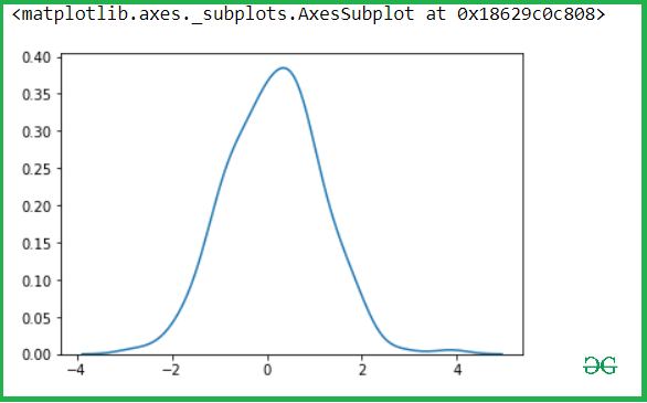
Draw a simple one-dimensional kde image:
Let’s see the Kde of our variable x-axis and y-axis, so let pass the x variable into the kdeplot() methods.
Python3
x= np.random.randn(200)
y = np.random.randn(200)
sns.kdeplot(x)
|
Output:
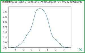
Then after check for y-axis.
Output:
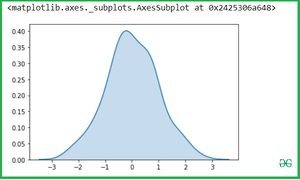
Use Shade to fill the area covered by curve:
We can highlight the plot using shade to the area covered by the curve. If True, shadow processing is performed in the area below the kde curve, and color controls the color of the curve and shadow.
Python3
sns.kdeplot(x, shade = True)
|
Output:
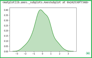
You can change the Shade color with color attributes:
Python3
sns.kdeplot(x, shade = True , color = "Green")
|
Output:
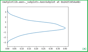
Use Vertical to draw indicates whether to draw on the X axis or on the Y axis
Python3
sns.kdeplot(x, vertical = True)
|
Output:
Bivariate Kdeplot for two variables:
Simple pass the two variables into the seaborn.kdeplot() methods.
Output:
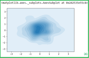
Shade the area covered by a curve with shade attributes:
Python3
sns.kdeplot(x,y, shade = True)
|
Output:
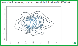
Now you can change the color with cmap attributes:
Python3
sns.kdeplot(x,y, cmap = "winter_r")
|
Output:
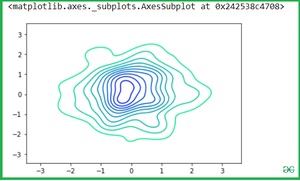
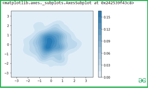
Use of Cbar: If True, add a colorbar to annotate the color mapping in a bivariate plot. Note: Does not currently support plots with a hue variable well.
Python3
sns.kdeplot(x, y, shade=True, cbar=True)
|
Output:
KDE Plot of Iris Dataset
Let see the example with Iris Dataset which is plot distributions for each column of a wide-form dataset:
Iris data set consists of 3 different types of irises’ (Setosa, Versicolour, and Virginica) petal and sepal length, stored in a 150×4 numpy.ndarray
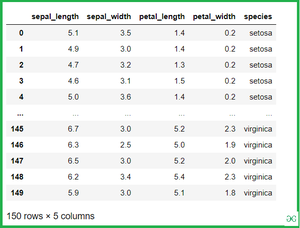
Loading the iris dataset for Kdeplot:
Python3
iris = sns.load_dataset('iris')
iris
|
Output:
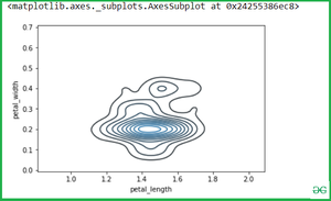
Bivariate Kdeplot for two variables of iris:
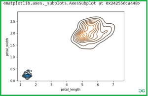
Once we have species set then if we want to simply calculate the petal_length and petal_width then Simple pass the two variables(Setosa and virginica ) into the seaborn.kdeplot() methods.
Python3
setosa = iris.loc[iris.species=="setosa"]
virginica = iris.loc[iris.species == "virginica"]
sns.kdeplot(setosa.petal_length, setosa.petal_width)
|
Output:
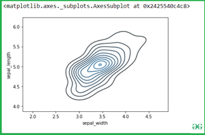
See another example if we want to calculate another variable attribute which is sepal_width and sepal_length.
Python3
sns.kdeplot(setosa.sepal_width, setosa.sepal_length)
|
Output:
If we pass the two separate Kdeplot with different variable:
Python3
sns.kdeplot(setosa.petal_length, setosa.petal_width)
sns.kdeplot(virginica.petal_length, virginica.petal_width)
|
Output:
Conclusion
In summary, kdeplot in Seaborn offers a versatile approach to visualize probability density functions, aiding in the exploration of one or more dimensions in datasets. Whether shading areas, adjusting colors, or applying it to real-world datasets like Iris, kdeplot stands as a valuable tool for data scientists and analysts.
Frequently Asked Questions (FAQs)
1.What is KDE plot used for?
KDE plot is used to estimate the probability density function of a continuous variable, providing insights into data distribution, shape, and central tendency.
2.What is a 2-dimensional KDE plot?
A 2-dimensional KDE plot visualizes the joint probability density of two continuous variables, offering insights into their bivariate distribution and correlation.
Like Article
Suggest improvement
Share your thoughts in the comments
Please Login to comment...