Data Visualization with Seaborn Line Plot
Last Updated :
21 Mar, 2024
Prerequisite:
Presenting data graphically to emit some information is known as data visualization. It basically is an image to help a person interpret what the data represents and study it and its nature in detail. Dealing with large scale data row-wise is an extremely tedious task, hence data visualization serves as an ideal alternative.
Seaborn is a Python library which is based on matplotlib and is used for data visualization. It provides a medium to present data in a statistical graph format as an informative and attractive medium to impart some information.
Installation
Like any another python library, seaborn can be easily installed using pip:
pip install seaborn
This library is a part of Anaconda distribution and usually works just by import if your IDE is supported by Anaconda, but it can be installed too by the following command:
conda install seaborn
Single Line Plot
A single line plot presents data on x-y axis using a line joining datapoints. To obtain a graph Seaborn comes with an inbuilt function to draw a line plot called lineplot().
Syntax: lineplot(x,y,data)
where,
x– data variable for x-axis
y- data variable for y-axis
data- data to be plotted
Example:
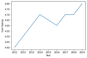
Python3
import seaborn as sn
import matplotlib.pyplot as plt
import pandas as pd
data = pd.read_csv("C:\\Users\\Vanshi\\Desktop\\gfg\\bestsellers.csv")
data = data.iloc[2:10, :]
sn.lineplot(x="Year", y="User Rating", data=data)
plt.show()
|
Output:
Setting different styles
A line plot can also be displayed in different background style using set() function available under seaborn module itself.
Syntax:
set()
Attributes:
- Context: plotting context parameters
- Style: defines style
- Palette: sets a color palette
- Font
- Font_scale: sets font size
- Color_codes: If set True then palette is activated, short hand notations for colors can be remapped from the palette.
- rc: parameter to over-ride the above parameters
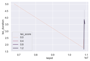
Example:
Python
import seaborn as sn
import matplotlib.pyplot as plt
import pandas as pd
data = pd.read_csv("C:\\Users\\Vanshi\\Desktop\\gfg\\cumulative.csv")
data = data.iloc[2:10, :]
sn.lineplot(x="kepid", y="koi_duration", data=data, hue="koi_score")
sn.set(style="darkgrid")
plt.show()
|
Output:
Multiple Line Plot
Functionalities at times dictate data to be compared against one another and for such cases a multiple plot can be drawn. A multiple line plot helps differentiate between data so that it can be studied and understood with respect to some other data. Each lineplot basically follows the concept of a single line plot but differs on the way it is presented on the screen. Lineplot of each data can be made different by changing its color, line style, size or all listed, and a scale can be used to read it.
To differentiate on the basis of color
lineplot(x,y,data,hue)
where, hue decides on basis of which variable the data is supposed to be displayed
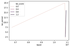
Example:
Python3
import seaborn as sn
import matplotlib.pyplot as plt
import pandas as pd
data = pd.read_csv("C:\\Users\\Vanshi\\Desktop\\gfg\\cumulative.csv")
data = data.iloc[2:10, :]
sn.lineplot(x="kepid", y="koi_period", data=data, hue="koi_score")
plt.show()
|
To differentiate on the basis of line style
lineplot(x,y,data,style)
where, style decides on basis of which variable the data is supposed to be displayed
Example:
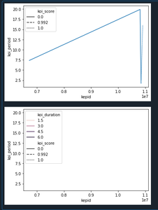
Python3
import seaborn as sn
import matplotlib.pyplot as plt
import pandas as pd
data = pd.read_csv("C:\\Users\\Vanshi\\Desktop\\gfg\\cumulative.csv")
data = data.iloc[2:10, :]
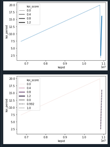
sn.lineplot(x="kepid", y="koi_period", data=data, style="koi_score")
plt.show()
sn.lineplot(x="kepid", y="koi_period", data=data,
hue="koi_score", style="koi_score")
plt.show()
|
Output:
To differentiate on the basis of size
lineplot(x,y,data,size)
where, size decides on basis of which variable the data is supposed to be displayed
Example:
Python3
import seaborn as sn
import matplotlib.pyplot as plt
import pandas as pd
data = pd.read_csv("C:\\Users\\Vanshi\\Desktop\\gfg\\cumulative.csv")
data = data.iloc[2:10, :]
sn.lineplot(x="kepid", y="koi_period", data=data, size="koi_score")
plt.show()
sn.lineplot(x="kepid", y="koi_period", data=data,
size="koi_score", hue="koi_score", style="koi_score")
plt.show()
|
Output:
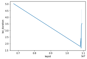
Error Bars in Line Plot
Error bars are used to show error rates in a line plot which can be used to study intervals in a plot. For this, err_style attribute can be employed. This takes only two attributes, either band or bars.
Syntax:
lineplot(x,y,data,err_style)
Example:
Python3
import seaborn as sn
import matplotlib.pyplot as plt
import pandas as pd
data = pd.read_csv("C:\\Users\\Vanshi\\Desktop\\gfg\\cumulative.csv")
data = data.iloc[2:10, :]
sn.lineplot(x="kepid", y="koi_duration", data=data, err_style="band")
plt.show()
|
Output:
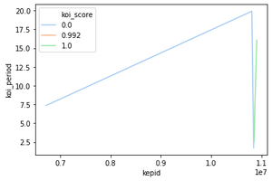
Color Palette along the Line Plot
The color scheme depicted by lines can be changed using a palette attribute along with hue. Different colors supported using palette can be chosen from- SEABORN COLOR PALETTE
Syntax:
lineplot(x,y,data,hue,palette)
Example:
Dataset used- (Data shows an exoplanet space research dataset compiled by nasa.)
Python3
import seaborn as sn
import matplotlib.pyplot as plt
import pandas as pd
data = pd.read_csv("C:\\Users\\Vanshi\\Desktop\\gfg\\cumulative.csv")
data = data.iloc[2:10,:]
sn.lineplot(x = "kepid", y = "koi_period",data=data, hue="koi_score", palette="pastel")
plt.show()
|
Output:
Share your thoughts in the comments
Please Login to comment...