Scatterplot using Seaborn in Python
Last Updated :
05 Nov, 2020
Seaborn is an amazing visualization library for statistical graphics plotting in Python. It provides beautiful default styles and color palettes to make statistical plots more attractive. It is built on the top of matplotlib library and also closely integrated into the data structures from pandas.
Scatter Plot
Scatterplot can be used with several semantic groupings which can help to understand well in a graph. They can plot two-dimensional graphics that can be enhanced by mapping up to three additional variables while using the semantics of hue, size, and style parameters. All the parameter control visual semantic which are used to identify the different subsets. Using redundant semantics can be helpful for making graphics more accessible.
Syntax: seaborn.scatterplot(x=None, y=None, hue=None, style=None, size=None, data=None, palette=None, hue_order=None, hue_norm=None, sizes=None, size_order=None, size_norm=None, markers=True, style_order=None, x_bins=None, y_bins=None, units=None, estimator=None, ci=95, n_boot=1000, alpha=’auto’, x_jitter=None, y_jitter=None, legend=’brief’, ax=None, **kwargs)
Parameters:
x, y: Input data variables that should be numeric.
data: Dataframe where each column is a variable and each row is an observation.
size: Grouping variable that will produce points with different sizes.
style: Grouping variable that will produce points with different markers.
palette: Grouping variable that will produce points with different markers.
markers: Object determining how to draw the markers for different levels.
alpha: Proportional opacity of the points.
Returns: This method returns the Axes object with the plot drawn onto it.
Creating a Scatter Plot
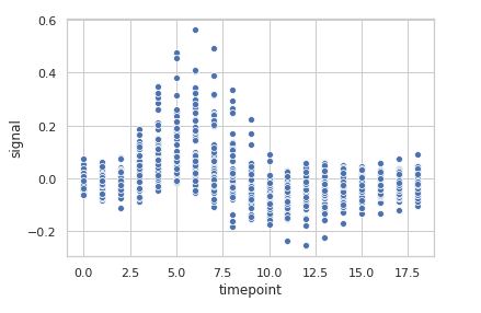
Let’s visualize of “fmri” dataset using seaborn.scatterplot() function. We will only use the x, y parameters of the function.
Code:
Python3
import seaborn
seaborn.set(style='whitegrid')
fmri = seaborn.load_dataset("fmri")
seaborn.scatterplot(x="timepoint",
y="signal",
data=fmri)
|
Output:
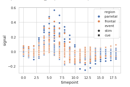
Grouping data points on the basis of category, here as region and event.
Python3
import seaborn
seaborn.set(style='whitegrid')
fmri = seaborn.load_dataset("fmri")
seaborn.scatterplot(x="timepoint",
y="signal",
hue="region",
style="event",
data=fmri)
|
Output:
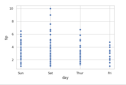
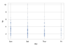
Basic visualization of “tips” dataset using Scatterplot.
Python3
import seaborn
seaborn.set(style='whitegrid')
tip = seaborn.load_dataset('tips')
seaborn.scatterplot(x='day', y='tip', data=tip)
|
Output:
Grouping variables in Seaborn Scatter Plot with different attributes
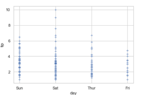
1. Adding the marker attributes
The circle is used to represent the data point and the default marker here is a blue circle. In the above output, we are seeing the default output for the marker, but we can customize this blue circle with marker attributes.
Python3
seaborn.scatterplot(x='day', y='tip', data= tip, marker = '+')
|
Output:
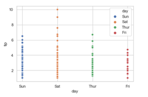
2. Adding the hue attributes.
It will produce data points with different colors. Hue can be used to group to multiple data variable and show the dependency of the passed data values are to be plotted.
Syntax: seaborn.scatterplot( x, y, data, hue)
Python3
seaborn.scatterplot(x='day', y='tip', data=tip, hue='time')
|
Output:
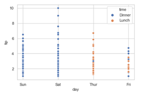
In the above example, we can see how the tip and day bill is related to whether it was lunchtime or dinner time. The blue color has represented the Dinner and the orange color represents the Lunch.
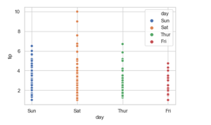
Let’s check for a hue = ” day “
Python3
seaborn.scatterplot(x='day', y='tip', data=tip, hue='day')
|
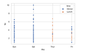
3. Adding the style attributes.
Grouping variable that will produce points with different markers. Using style we can generate the scatter grouping variable that will produce points with different markers.
Syntax:
seaborn.scatterplot( x, y, data, style)
Python3
seaborn.scatterplot(x='day', y='tip', data=tip, hue="time", style="time")
|
Output:
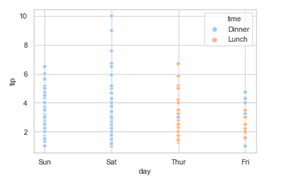
4. Adding the palette attributes.
Using the palette we can generate the point with different colors. In this below example we can see the palette can be responsible for a generate the scatter plot with different colormap values.
Syntax:
seaborn.scatterplot( x, y, data, palette=”color_name”)
Python3
seaborn.scatterplot(x='day', y='tip', data=tip, hue='time', palette='pastel')
|
Output:
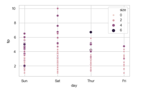
5. Adding size attributes.
Using size we can generate the point and we can produce points with different sizes.
Syntax:
seaborn.scatterplot( x, y, data, size)
Python3
seaborn.scatterplot(x='day', y='tip', data=tip ,hue='size', size = "size")
|
Output:
6. Adding legend attributes.
.Using the legend parameter we can turn on (legend=full) and we can also turn off the legend using (legend = False).
If the legend is “brief”, numeric hue and size variables will be represented with a sample of evenly spaced values.
If the legend is “full”, every group will get an entry in the legend.
If False, no legend data is added and no legend is drawn.
Syntax: seaborn.scatterplot( x, y, data, legend=”brief)
Python3
seaborn.scatterplot(x='day', y='tip', data=tip, hue='day',
sizes=(30, 200), legend='brief')
|
Output:
7. Adding alpha attributes.
Using alpha we can control proportional opacity of the points. We can decrease and increase the opacity.
Syntax: seaborn.scatterplot( x, y, data, alpha=”0.2″)
Python3
seaborn.scatterplot(x='day', y='tip', data=tip, alpha = 0.1)
|
Output:
Share your thoughts in the comments
Please Login to comment...