Python – seaborn.FacetGrid() method
Last Updated :
15 Jul, 2020
Seaborn is a Python data visualization library based on matplotlib. It provides a high-level interface for drawing attractive and informative statistical graphics. Seaborn helps resolve the two major problems faced by Matplotlib; the problems are ?
- Default Matplotlib parameters
- Working with data frames
As Seaborn compliments and extends Matplotlib, the learning curve is quite gradual. If you know Matplotlib, you are already half way through Seaborn.
seaborn.FacetGrid() :
- FacetGrid class helps in visualizing distribution of one variable as well as the relationship between multiple variables separately within subsets of your dataset using multiple panels.
- A FacetGrid can be drawn with up to three dimensions ? row, col, and hue. The first two have obvious correspondence with the resulting array of axes; think of the hue variable as a third dimension along a depth axis, where different levels are plotted with different colors.
- FacetGrid object takes a dataframe as input and the names of the variables that will form the row, column, or hue dimensions of the grid. The variables should be categorical and the data at each level of the variable will be used for a facet along that axis.
seaborn.FacetGrid( data, \*\*kwargs)
Seaborn.FacetGrid uses many arguments as input, main of which are described below in form of table:
| Argument |
Description |
Value |
| data |
Tidy (“long-form”) dataframe where each column is a variable and each row is an observation. |
DataFrame |
| row, col, hue |
Variables that define subsets of the data, which will be drawn on separate facets in the grid. See the “*_order“ parameters to control the order of levels of this variable. |
strings |
| palette |
Colors to use for the different levels of the “hue“ variable. |
palette name, list, or dict, optional |
Below is the implementation of above method:
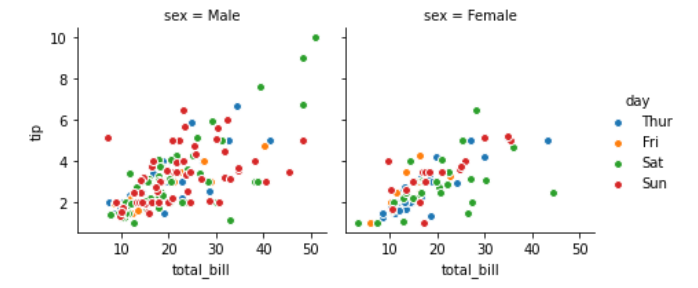
Example 1:
Python3
import seaborn
import matplotlib.pyplot as plt
df = seaborn.load_dataset('tips')
graph = seaborn.FacetGrid(df, col ="sex", hue ="day")
graph.map(plt.scatter, "total_bill", "tip", edgecolor ="w").add_legend()
plt.show()
|
Output :
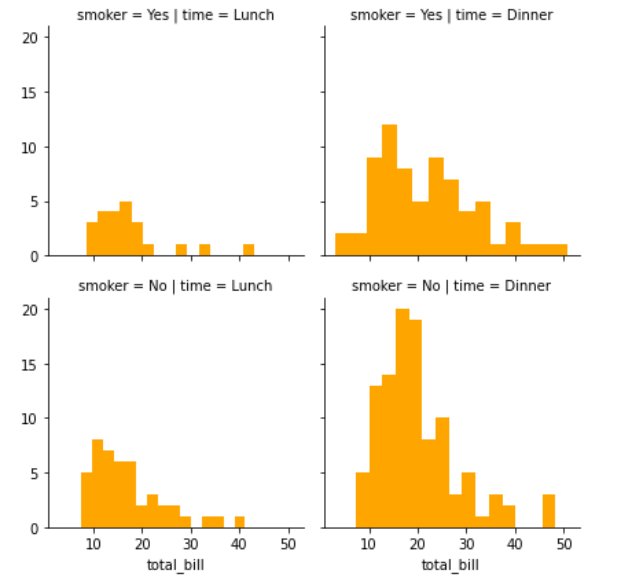
Example 2:
Python3
import seaborn
import matplotlib.pyplot as plt
df = seaborn.load_dataset('tips')
graph = seaborn.FacetGrid(df, row ='smoker', col ='time')
graph.map(plt.hist, 'total_bill', bins = 15, color ='orange')
plt.show()
|
Output :
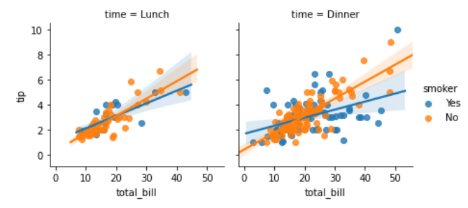
Example 3:
Python3
import seaborn
import matplotlib.pyplot as plt
df = seaborn.load_dataset('tips')
graph = seaborn.FacetGrid(df, col ='time', hue ='smoker')
graph.map(seaborn.regplot, "total_bill", "tip").add_legend()
plt.show()
|
Output :
Share your thoughts in the comments
Please Login to comment...