Seaborn is an amazing visualization library for statistical graphics plotting in Python. It provides beautiful default styles and color palettes to make statistical plots more attractive. It is built on the top of matplotlib library and also closely integrated to the data structures from pandas.
Seaborn.barplot()
seaborn.barplot() method is used to draw a barplot. A bar plot represents an estimate of central tendency for a numeric variable with the height of each rectangle and provides some indication of the uncertainty around that estimate using error bars.
Syntax : seaborn.barplot(x=None, y=None, hue=None, data=None, order=None, hue_order=None, estimator=<function mean at 0x7fa4c4f67940>, ci=95, n_boot=1000, units=None, seed=None, orient=None, color=None, palette=None, saturation=0.75, errcolor=’.26′, errwidth=None, capsize=None, dodge=True, ax=None, **kwargs)
Parameters : This method is accepting the following parameters that are described below :
- x, y : This parameter take names of variables in data or vector data, Inputs for plotting long-form data.
- hue : (optional) This parameter take column name for colour encoding.
- data : (optional) This parameter take DataFrame, array, or list of arrays, Dataset for plotting. If x and y are absent, this is interpreted as wide-form. Otherwise it is expected to be long-form.
- color : (optional) This parameter take matplotlib color, Color for all of the elements, or seed for a gradient palette.
Returns : Returns the Axes object with the plot drawn onto it.
Grouping variables in Seaborn barplot with different attributes
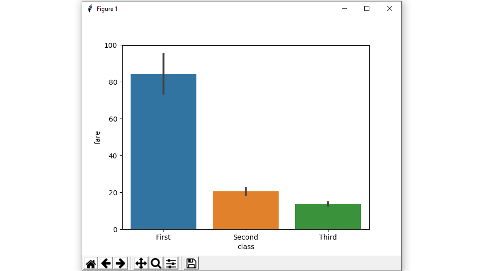
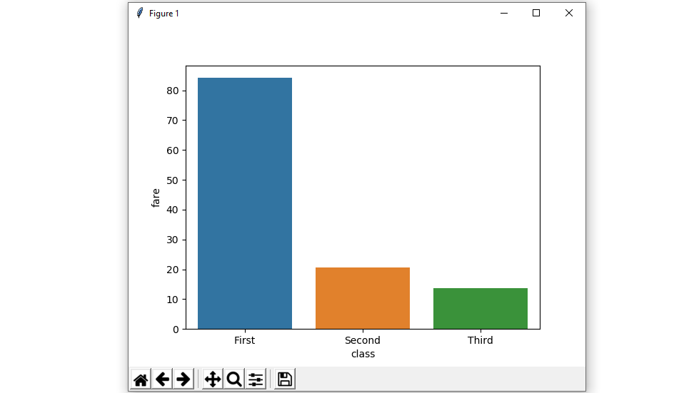
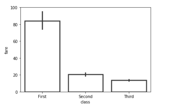
Example 1: Draw a set of vertical bar plots grouped by a categorical variable.
Creating a simple bar plot using seaborn.
Syntax:
seaborn.barplot( x, y, data)
Python3
import seaborn as sns
import matplotlib.pyplot as plt
df = sns.load_dataset('titanic')
sns.barplot(x = 'class', y = 'fare', data = df)
plt.show()
|
Output :
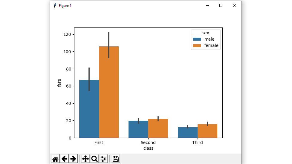
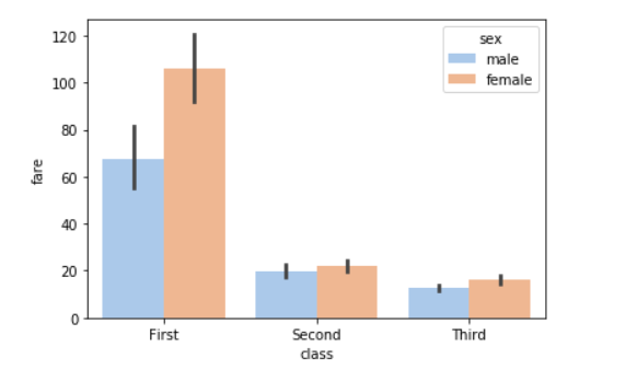
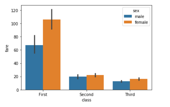
Example 2: Draw a set of vertical bars with nested grouping by two variables.
Creating a bar plot using hue parameter with two variables.
Syntax:
seaborn.barplot( x, y, data, hue)
Python3
import seaborn as sns
import matplotlib.pyplot as plt
df = sns.load_dataset('titanic')
sns.barplot(x = 'class', y = 'fare', hue = 'sex', data = df)
plt.show()
|
Output :
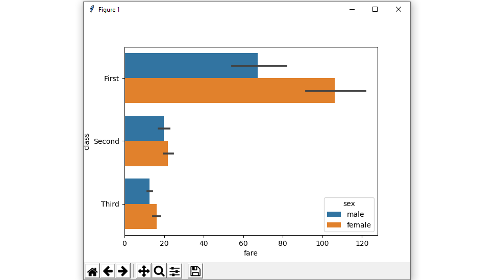
Example 3: shows a Horizontal barplot.
exchange the data variable instead of two data variables then it means that the axis denotes each of these data variables as an axis.
X denotes an x-axis and y denote a y-axis.
Python3
import seaborn as sns
import matplotlib.pyplot as plt
df = sns.load_dataset('titanic')
sns.barplot(x = 'fare', y = 'class', hue = 'sex', data = df)
plt.show()
|
Output :
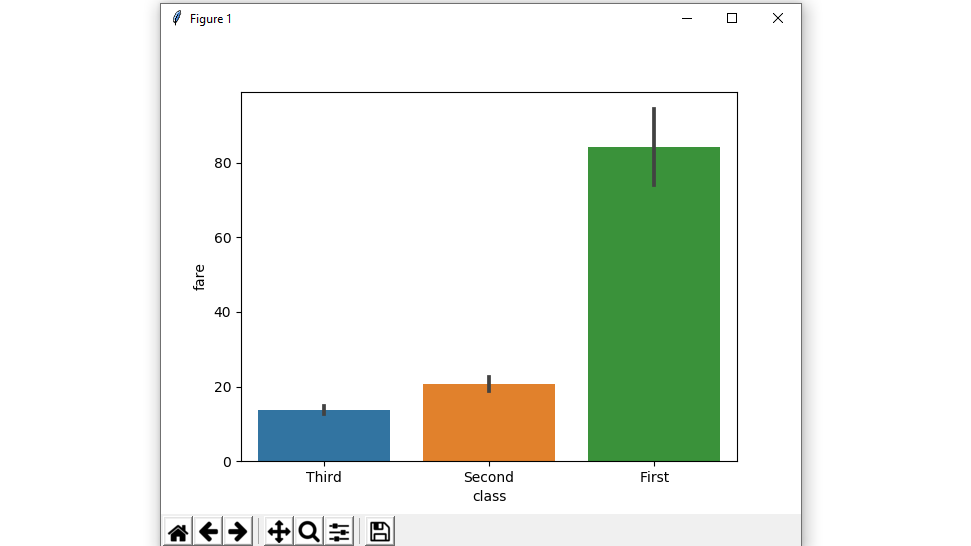
Example 4: Plot all bars in a given order.
Control barplot order by passing an explicit order.
Python3
import seaborn as sns
import matplotlib.pyplot as plt
df = sns.load_dataset('titanic')
sns.barplot(x = 'class', y = 'fare', data = df,
order = ["Third", "Second", "First"])
plt.show()
|
Output :
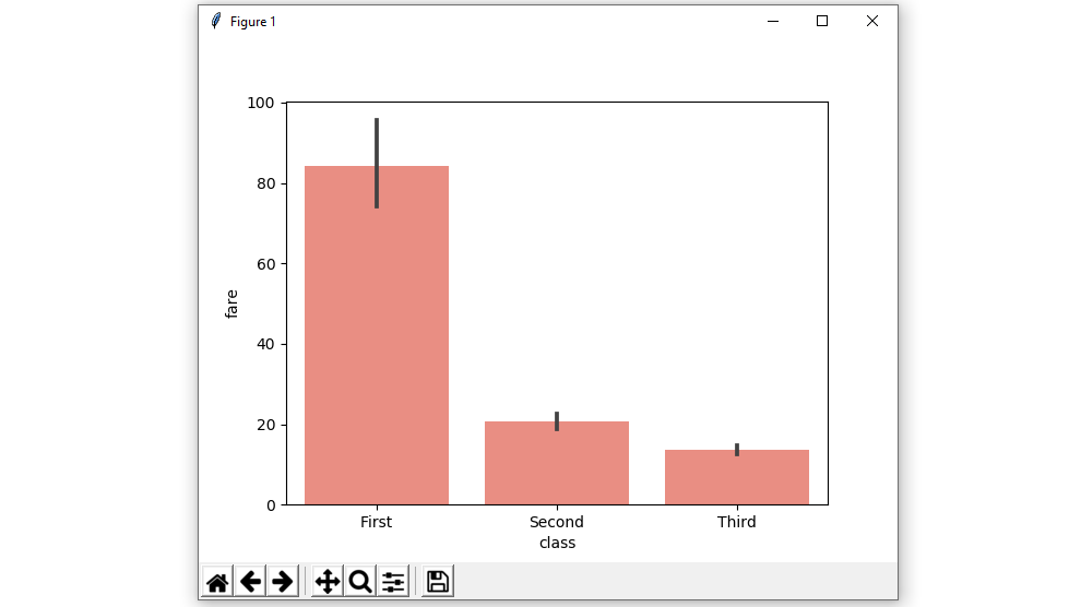
Example 5: Plot all bars in a single color using color attributes.
Color for all of the elements.
Syntax:
seaborn.barplot( x, y, data, color)
Python3
import seaborn as sns
import matplotlib.pyplot as plt
df = sns.load_dataset('titanic')
sns.barplot(x = 'class', y = 'fare', data = df, color = "salmon")
plt.show()
|
Output :
Example 6: barplot without error bars using ci attributes.
We will use None it means no bootstrapping will be performed, and error bars will not be drawn
Syntax:
seaborn.barplot( x, y, data, ci)
Python3
import seaborn as sns
import matplotlib.pyplot as plt
df = sns.load_dataset('titanic')
sns.barplot(x = 'class', y = 'fare', data = df, ci = None)
plt.show()
|
Output :
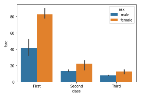
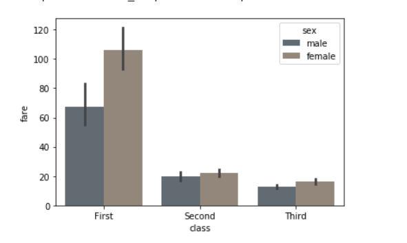
Example 7: Colors to use for the different levels of the hue variable using palette.
Using the palette we can generate the point with different colors. In this below example we can see the palette can be responsible for a generate the barplot with different colormap values.
Syntax:
seaborn.barplot( x, y, data, palette=”color_name”)
Python3
import seaborn as sns
import matplotlib.pyplot as plt
df = sns.load_dataset('titanic')
sns.barplot(x = 'class', y = 'fare',
hue = 'sex', data = df, palette='pastel')
plt.show()
|
Output:
Possible values of palette are:
Accent, Accent_r, Blues, Blues_r, BrBG, BrBG_r, BuGn, BuGn_r, BuPu, BuPu_r, CMRmap, CMRmap_r, Dark2, Dark2_r,
GnBu, GnBu_r, Greens, Greens_r, Greys, Greys_r, OrRd, OrRd_r, Oranges, Oranges_r, PRGn, PRGn_r, Paired, Paired_r,
Pastel1, Pastel1_r, Pastel2, Pastel2_r, PiYG, PiYG_r, PuBu, PuBuGn, PuBuGn_r, PuBu_r, PuOr, PuOr_r, PuRd, PuRd_r,
Purples, Purples_r, RdBu, RdBu_r, RdGy, RdGy_r, RdPu, RdPu_r, RdYlBu, RdYlBu_r, RdYlGn, RdYlGn_r, Reds, Reds_r, Set1,
Set1_r, Set2, Set2_r, Set3, Set3_r, Spectral, Spectral_r, Wistia, Wistia_r, YlGn, YlGnBu, YlGnBu_r, YlGn_r, YlOrBr,
YlOrBr_r, YlOrRd, YlOrRd_r, afmhot, afmhot_r, autumn, autumn_r, binary, binary_r, bone, bone_r, brg, brg_r, bwr, bwr_r,
cividis, cividis_r, cool, cool_r, coolwarm, coolwarm_r, copper, copper_r, cubehelix, cubehelix_r, flag, flag_r, gist_earth,
gist_earth_r, gist_gray, gist_gray_r, gist_heat, gist_heat_r, gist_ncar, gist_ncar_r, gist_rainbow, gist_rainbow_r, gist_stern,
Example 8: Using the statistical function NumPy.median and NumPy.mean to estimate within each categorical bin.
Python3
import seaborn as sns
from numpy import median
import matplotlib.pyplot as plt
df = sns.load_dataset('titanic')
sns.barplot(x = 'class', y = 'fare', hue = 'sex', data = df, estimator=median)
plt.show()
|
Output:
For Numpy.mean:
Python3
from numpy import mean
sns.barplot(x = 'class', y = 'fare', hue = 'sex', data = df, estimator=mean)
|
Output:
Example 9: Using the saturation parameter.
The proportion of the original saturation to draw colors at. Large patches often look better with slightly desaturated colors, but set this to 1 if you want the plot colors to perfectly match the input color spec.
Syntax:
seaborn.barplot( x, y, data, saturation)
Python3
import seaborn as sns
import matplotlib.pyplot as plt
df = sns.load_dataset('titanic')
sns.barplot(x = 'class', y = 'fare', hue = 'sex', data = df,saturation = 0.1)
plt.show()
|
Output:
Example 10: Use matplotlib.axes.Axes.bar() parameters to control the style.
We can set Width of the gray lines that frame the plot elements using linewidth. Whenever we increase linewidth than the point also will increase automatically.
Syntax:
seaborn.barplot(x, y, data, linewidth, edgecolor)
Python3
import seaborn as sns
import matplotlib.pyplot as plt
df = sns.load_dataset('titanic')
sns.barplot(x="class", y="fare", data=df,
linewidth=2.5, facecolor=(1, 1, 1, 0),
errcolor=".2", edgecolor=".2")
|
Output:
Like Article
Suggest improvement
Share your thoughts in the comments
Please Login to comment...