Grouped Boxplots in Python with Seaborn
Last Updated :
26 Nov, 2020
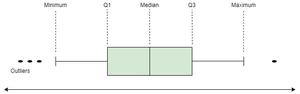
Boxplot depicts the distribution of quantitative data facilitating comparisons between different variables, continuous or categorical. It is a common data dispersion measure. Boxplots consist of a five-number summary which helps in detecting and removing outliers from the dataset.
- Minimum observation
- Q1 (25% or Quartile 1)
- Median or Q2
- Q3 (75% or Quartile 2)
- Maximum Observation
Grouped Boxplots are used to visualize the data having multiple subgroups. Also, we can visualize three variables at a time with grouped boxplot where one variable is numerical and the other two are categorical variables.
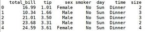
We will be using the Seaborn library of Python to create Grouped Boxplots. We will use dataset ‘tips’ from the Seaborn library.
Python3
import seaborn as sns
data = sns.load_dataset('tips')
print(data.head(5))
|
Output:
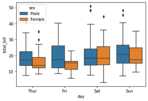
Example 1: Let us create a boxplot to know the distribution of the ‘total_bill’ on each ‘day’ of the ‘tips’ dataset. But we also want to group it on the basis of ‘sex’ attribute. So we will plot a grouped boxplots for these three attributes where ‘sex’ and ‘day’ are categorical attributes and ‘total_bill’ is a numeric attribute.
Python3
sns.boxplot(x = data['day'],
y = data['total_bill'],
hue = data['sex'])
|
Output:
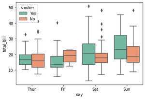
Example 2: The next example is similar to the previous one. The only difference is the value of the ‘hue’ parameter taken as the ‘smoker’ attribute. Here we want to know the distribution of ‘total_bill’ vs ‘day’ group on the basis of if a person smokes or not.
Also, we have learned how to change the colors of the boxplots using the ‘palette’ attribute of the boxplot().
Python3
sns.boxplot(x = data['day'],
y = data['total_bill'],
hue = data['smoker'],
palette = 'Set2')
|
Output:
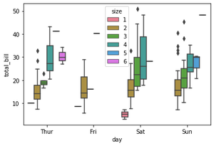
Example 3: In this example, we will cover how to draw more than 2 grouped boxplots. if the value for the ‘hue’ parameter has more than 2 categories, then we can plot more than 2 grouped boxplots as shown below.
Here, ‘hue’ = data[‘size’] has six categories, and so we can see more than 2 grouped boxplots using the same method as above.
Python3
sns.boxplot(x = data['day'],
y = data['total_bill'],
hue = data['size'],
palette = 'husl')
|
Output:
Share your thoughts in the comments
Please Login to comment...