Python Seaborn – Catplot
Last Updated :
26 Nov, 2020
Seaborn is a Python data visualization library based on matplotlib. It provides a high-level interface for drawing attractive and informative statistical graphics. Seaborn helps resolve the two major problems faced by Matplotlib; the problems are?
- Default Matplotlib parameters
- Working with data frames
As Seaborn compliments and extends Matplotlib, the learning curve is quite gradual. If you know Matplotlib, you are already half-way through Seaborn. Seaborn library offers many advantages over other plotting libraries:
- It is very easy to use and requires less code syntax
- Works really well with `pandas` data structures, which is just what you need as a data scientist.
- It is built on top of Matplotlib, another vast and deep data visualization library.
Syntax: seaborn.catplot(*, x=None, y=None, hue=None, data=None, row=None, col=None, kind=’strip’, color=None, palette=None, **kwargs)
Parameters
- x, y, hue: names of variables in data
Inputs for plotting long-form data. See examples for interpretation.
- data: DataFrame
Long-form (tidy) dataset for plotting. Each column should correspond to a variable, and each row should correspond to an observation.
- row, col: names of variables in data, optional
Categorical variables that will determine the faceting of the grid.
- kind: str, optional
The kind of plot to draw, corresponds to the name of a categorical axes-level plotting function. Options are: “strip”, “swarm”, “box”, “violin”, “boxen”, “point”, “bar”, or “count”.
- color: matplotlib color, optional
Color for all of the elements, or seed for a gradient palette.
- palette: palette name, list, or dict
Colors to use for the different levels of the hue variable. Should be something that can be interpreted by color_palette(), or a dictionary mapping hue levels to matplotlib colors.
- kwargs: key, value pairings
Other keyword arguments are passed through to the underlying plotting function.
Examples:
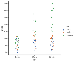
If you are working with data that involves any categorical variables like survey responses, your best tools to visualize and compare different features of your data would be categorical plots. Plotting categorical plots it is very easy in seaborn. In this example x,y and hue take the names of the features in your data. Hue parameters encode the points with different colors with respect to the target variable.
Python3
import seaborn as sns
exercise = sns.load_dataset("exercise")
g = sns.catplot(x="time", y="pulse",
hue="kind",
data=exercise)
|
Output:
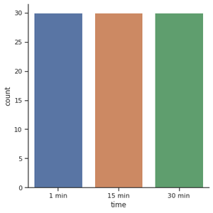
For the count plot, we set a kind parameter to count and feed in the data using data parameters. Let’s start by exploring the time feature. We start off with catplot() function and use x argument to specify the axis we want to show the categories.
Python3
import seaborn as sns
sns.set_theme(style="ticks")
exercise = sns.load_dataset("exercise")
g = sns.catplot(x="time",
kind="count",
data=exercise)
|
Output:
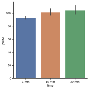
Another popular choice for plotting categorical data is a bar plot. In the count plot example, our plot only needed a single variable. In the bar plot, we often use one categorical variable and one quantitative. Let’s see how the time compares to each other.
Python3
import seaborn as sns
exercise = sns.load_dataset("exercise")
g = sns.catplot(x="time",
y="pulse",
kind="bar",
data=exercise)
|
Output:
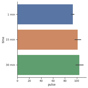
For creating the horizontal bar plot we have to change the x and y features. When you have lots of categories or long category names it’s a good idea to change the orientation.
Python3
import seaborn as sns
exercise = sns.load_dataset("exercise")
g = sns.catplot(x="pulse",
y="time",
kind="bar",
data=exercise)
|
Output:
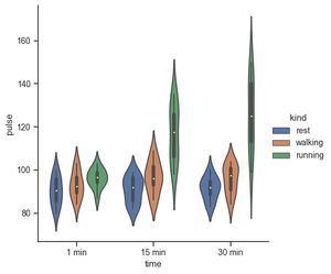
Use a different plot kind to visualize the same data:
Python3
import seaborn as sns
exercise = sns.load_dataset("exercise")
g = sns.catplot(x="time",
y="pulse",
hue="kind",
data=exercise,
kind="violin")
|
Output:
Python3
import seaborn as sns
exercise = sns.load_dataset("exercise")
g = sns.catplot(x="time",
y="pulse",
hue="kind",
col="diet",
data=exercise)
|
Output:
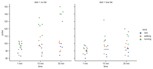
Make many column facets and wrap them into the rows of the grid. The aspect will change the width while keeping the height constant.
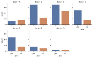
Python3
titanic = sns.load_dataset("titanic")
g = sns.catplot(x="alive", col="deck", col_wrap=4,
data=titanic[titanic.deck.notnull()],
kind="count", height=2.5, aspect=.8)
|
Output:
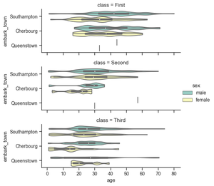
Plot horizontally and pass other keyword arguments to the plot function:
Python3
g = sns.catplot(x="age", y="embark_town",
hue="sex", row="class",
data=titanic[titanic.embark_town.notnull()],
orient="h", height=2, aspect=3, palette="Set3",
kind="violin", dodge=True, cut=0, bw=.2)
|
Output:
Box plots are visuals that can be a little difficult to understand but depict the distribution of data very beautifully. It is best to start the explanation with an example of a box plot. I am going to use one of the common built-in datasets in Seaborn:
Python3
tips = sns.load_dataset('tips')
sns.catplot(x='day',
y='total_bill',
data=tips,
kind='box');
|
Output:
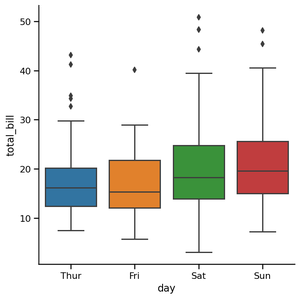
Outlier Detection Using Box Plot:
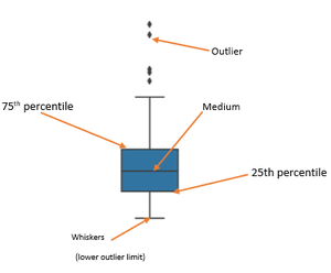
The edges of the blue box are the 25th and 75th percentiles of the distribution of all bills. This means that 75% of all the bills on Thursday were lower than 20 dollars, while another 75% (from the bottom to the top) was higher than almost 13 dollars. The horizontal line in the box shows the median value of the distribution.
- Find Inter Quartile Range (IQR) by subtracting the 25th percentile from the 75th: 75% — 25%
- The lower outlier limit is calculated by subtracting 1.5 times of IQR from the 25th: 25% — 1.5*IQR
- The upper outlier limit is calculated by adding 1.5 times of IQR to the 75th: 75% + 1.5*IQR
Share your thoughts in the comments
Please Login to comment...