How to Make Histograms with Density Plots with Seaborn histplot?
Last Updated :
29 Oct, 2021
Histograms are visualization tools that represent the distribution of a set of continuous data. In a histogram, the data is divided into a set of intervals or bins (usually on the x-axis) and the count of data points that fall into each bin corresponding to the height of the bar above that bin. These bins may or may not be equal in width but are adjacent (with no gaps).
A density plot (also known as kernel density plot) is another visualization tool for evaluating data distributions. It can be considered as a smoothed histogram. The peaks of a density plot help display where values are concentrated over the interval. There are a variety of smoothing techniques. Kernel Density Estimation (KDE) is one of the techniques used to smooth a histogram.
Seaborn is a data visualization library based on matplotlib in Python. In this article, we will use seaborn.histplot() to plot a histogram with a density plot.
Syntax: seaborn.histplot(data, x, y, hue, stat, bins, binwidth, discrete, kde, log_scale)
Parameters:-
- data: input data in the form of Dataframe or Numpy array
- x, y (optional): key of the data to be positioned on the x and y axes respectively
- hue (optional): semantic data key which is mapped to determine the color of plot elements
- stat (optional): count, frequency, density or probability
Return: This method returns the matplotlib axes with the plot drawn on it.
Example 1: We will generate the data using the random.randn() method.
Python3
import seaborn as sns
import numpy as np
import pandas as pd
np.random.seed(1)
num_var = np.random.randn(1000)
num_var = pd.Series(num_var, name = "Numerical Variable")
sns.histplot(data = num_var, kde = True)
|
Output:
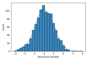
By default kde parameter of seaborn.histplot is set to false. So, by setting the kde to true, a kernel density estimate is computed to smooth the distribution and a density plotline is drawn.
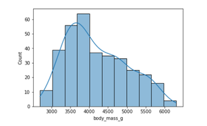
Example 2: Let us use the sample dataset, Penguins, from the Seaborn library in this example. This dataset shows the characteristics (body mass, flipper length, bill length gender) of different penguin species on different islands.
Python3
import numpy as np
import pandas as pd
import seaborn as sns
penguins = sns.load_dataset("penguins")
sns.histplot(data = penguins, x = "body_mass_g", kde = True)
|
Output:
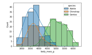
We can also visualize the distribution of body mass for multiple species in a single plot. The hue parameter maps the semantic variable ‘species’.
Python3
sns.histplot(data = penguins, x = "body_mass_g", kde = True, hue = "species")
|
Output:
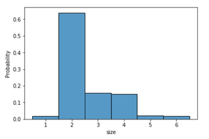
Example 3: This example uses the sample dataset, Tips, from the Seaborn library which records the tips received by a restaurant server. It consists of the tip received total bill or cost of the meal, gender of the customer, size of the customer party, day, time and whether a smoker is present at the party or not. Instead of the count of data points, the histogram in this example is normalized so that each bar’s height shows a probability.
Python3
import numpy as np
import pandas as pd
import seaborn as sns
tips = sns.load_dataset("tips")
sns.histplot(data = tips, x = "size", stat = "probability", discrete = True)
|
Output:
Share your thoughts in the comments
Please Login to comment...