KDE Plot Visualization with Pandas and Seaborn
Last Updated :
21 Dec, 2023
Kernel Density Estimate (KDE) plot, a visualization technique that offers a detailed view of the probability density of continuous variables. In this article, we will be using Iris Dataset and KDE Plot to visualize the insights of the dataset.
What is KDE Plot?
KDE Plot described as Kernel Density Estimate is used for visualizing the Probability Density of a continuous variable. It depicts the probability density at different values in a continuous variable. We can also plot a single graph for multiple samples which helps in more efficient data visualization. It provides a smoothed representation of the underlying distribution of a dataset.
The KDE plot visually represents the distribution of data, providing insights into its shape, central tendency, and spread. It is particularly useful when dealing with continuous data or when you want to explore the distribution without making assumptions about a specific parametric form (e.g., assuming the data follows a normal distribution). KDE plots are commonly used in statistical software packages and libraries for data visualization, such as Seaborn and Matplotlib in Python.
Implementation
Let’s Import seaborn and matplotlib module for visualizations of kde plot.
Python3
import pandas as pd
import matplotlin.pyplot as plt
|
Creating a Univariate Seaborn KDE Plot
To start our exploration, we delve into the creation of a Univariate Seaborn KDE plot, visualizing the probability distribution of a single continuous attribute.
We can visualize the probability distribution of a sample against a single continuous attribute.
Python3
from sklearn import datasets
import pandas as pd
import seaborn as sns
import matplotlib.pyplot as plt
%matplotlib inline
iris = datasets.load_iris()
iris_df = pd.DataFrame(iris.data, columns=['Sepal_Length',
'Sepal_Width', 'Patal_Length', 'Petal_Width'])
iris_df['Target'] = iris.target
iris_df['Target'].replace([0], 'Iris_Setosa', inplace=True)
iris_df['Target'].replace([1], 'Iris_Vercicolor', inplace=True)
iris_df['Target'].replace([2], 'Iris_Virginica', inplace=True)
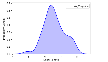
sns.kdeplot(iris_df.loc[(iris_df['Target']=='Iris_Virginica'),
'Sepal_Length'], color='b', shade=True, label='Iris_Virginica')
plt.xlabel('Sepal Length')
plt.ylabel('Probability Density')
|
Output:
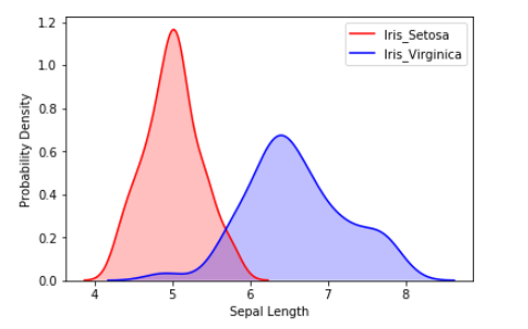
We can also visualize the probability distribution of multiple samples in a single plot.
Python3
sns.kdeplot(iris_df.loc[(iris_df['Target']=='Iris_Setosa'),
'Sepal_Length'], color='r', shade=True, label='Iris_Setosa')
sns.kdeplot(iris_df.loc[(iris_df['Target']=='Iris_Virginica'),
'Sepal_Length'], color='b', shade=True, label='Iris_Virginica')
plt.xlabel('Sepal Length')
plt.ylabel('Probability Density')
|
Output:
Creating a Bivariate Seaborn Kdeplot
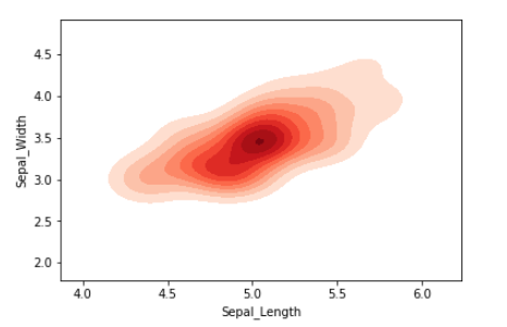
Moving beyond univariate analysis, we extend our visualization prowess to the Bivariate Seaborn KDE plot. This sophisticated technique enables the examination of the probability distribution of a sample against multiple continuous attributes.
Python3
iris_setosa = iris_df.query("Target=='Iris_Setosa'")
iris_virginica = iris_df.query("Target=='Iris_Virginica'")
sns.kdeplot(iris_setosa['Sepal_Length'],
iris_setosa['Sepal_Width'],
color='r', shade=True, label='Iris_Setosa',
cmap="Reds", shade_lowest=False)
|
Output:
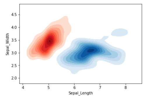
We can also visualize the probability distribution of multiple samples in a single plot.
Python3
sns.kdeplot(iris_setosa['Sepal_Length'],
iris_setosa['Sepal_Width'],
color='r', shade=True, label='Iris_Setosa',
cmap="Reds", shade_lowest=False)
sns.kdeplot(iris_virginica['Sepal_Length'],
iris_virginica['Sepal_Width'], color='b',
shade=True, label='Iris_Virginica',
cmap="Blues", shade_lowest=False)
plt.xlabel('Sepal Length')
plt.ylabel('Sepal Width')
plt.title('Bivariate Seaborn KDE Plot')
plt.legend()
plt.show()
|
Output:
Conclusion
In conclusion, the KDE plot emerges as a formidable ally in the quest for data insights. Its ability to visualize probability density across various attributes empowers data analysts and scientists to discern hidden patterns and make informed decisions. Whether employed for univariate or bivariate analysis, the KDE plot stands as a versatile and indispensable tool in the toolkit of data visualization.
Frequently Asked Questions(FAQs)
1.What is the purpose of KDE plot?
The KDE plot visually represents the probability density of a continuous variable, offering insights into the data’s distribution, shape, and central tendency.
2.What is the use of KDE in Python?
In Python, KDE (Kernel Density Estimation) is used for efficient visualization of probability density functions, especially in statistical libraries like Seaborn and Matplotlib.
3.What is the difference between histogram and KDE plot?
While histograms display data distribution through bins, KDE plots use a smooth curve to estimate probability density, providing a continuous and visually refined representation of the underlying distribution.
4.What does a kernel density plot show?
A kernel density plot shows the smoothed probability density of a dataset. It highlights peaks, modes, and trends, aiding in the visual exploration of continuous variable distributions.
Share your thoughts in the comments
Please Login to comment...