Seaborn is an amazing visualization library for statistical graphics plotting in Python. It provides beautiful default styles and color palettes to make statistical plots more attractive. It is built on the top of matplotlib library and also closely integrated to the data structures from pandas.
Seaborn.countplot()
seaborn.countplot() method is used to Show the counts of observations in each categorical bin using bars.
Syntax : seaborn.countplot(x=None, y=None, hue=None, data=None, order=None, hue_order=None, orient=None, color=None, palette=None, saturation=0.75, dodge=True, ax=None, **kwargs)
Parameters : This method is accepting the following parameters that are described below:
- x, y: This parameter take names of variables in data or vector data, optional, Inputs for plotting long-form data.
- hue : (optional) This parameter take column name for colour encoding.
- data : (optional) This parameter take DataFrame, array, or list of arrays, Dataset for plotting. If x and y are absent, this is interpreted as wide-form. Otherwise it is expected to be long-form.
- order, hue_order : (optional) This parameter take lists of strings. Order to plot the categorical levels in, otherwise the levels are inferred from the data objects.
- orient : (optional)This parameter take “v” | “h”, Orientation of the plot (vertical or horizontal). This is usually inferred from the dtype of the input variables but can be used to specify when the “categorical” variable is a numeric or when plotting wide-form data.
- color : (optional) This parameter take matplotlib color, Color for all of the elements, or seed for a gradient palette.
- palette : (optional) This parameter take palette name, list, or dict, Colors to use for the different levels of the hue variable. Should be something that can be interpreted by color_palette(), or a dictionary mapping hue levels to matplotlib colors.
- saturation : (optional) This parameter take float value, Proportion of the original saturation to draw colors at. Large patches often look better with slightly desaturated colors, but set this to 1 if you want the plot colors to perfectly match the input color spec.
- dodge : (optional) This parameter take bool value, When hue nesting is used, whether elements should be shifted along the categorical axis.
- ax : (optional) This parameter take matplotlib Axes, Axes object to draw the plot onto, otherwise uses the current Axes.
- kwargs : This parameter take key, value mappings, Other keyword arguments are passed through to matplotlib.axes.Axes.bar().
Returns: Returns the Axes object with the plot drawn onto it.
The below examples illustrate the countplot() method of the seaborn library.
Grouping variables in Seaborn countplot with different attributes
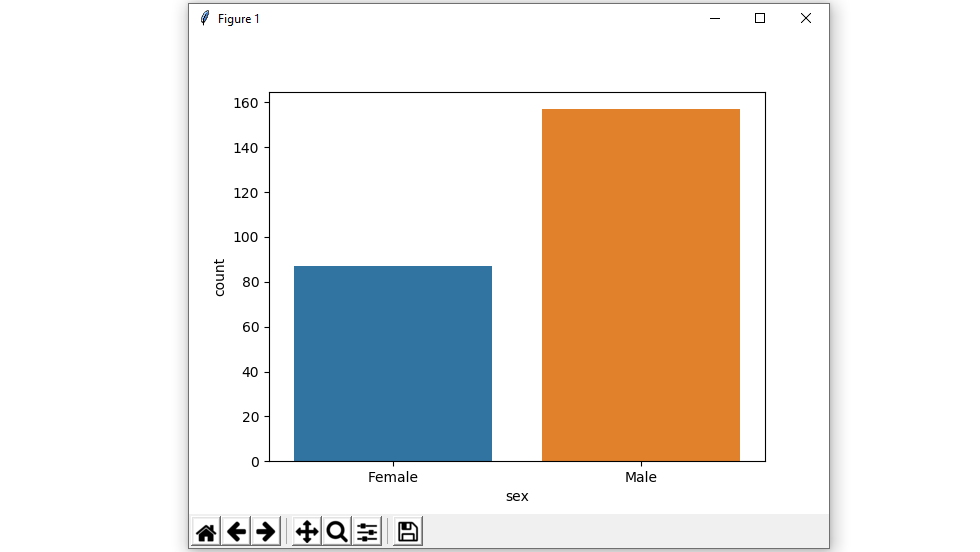
Example 1: Show value counts for a single categorical variable.
If we use only one data variable instead of two data variables then it means that the axis denotes each of these data variables as an axis.
X denotes an x-axis and y denote a y-axis.
Syntax:
seaborn.countplot(x)
Python3
import seaborn as sns
import matplotlib.pyplot as plt
df = sns.load_dataset('tips')
sns.countplot(x ='sex', data = df)
plt.show()
|
Output :
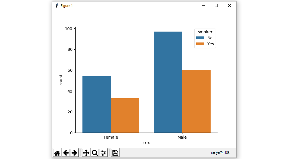
Example 2 : Show value counts for two categorical variables and using hue parameter:
While the points are plotted in two dimensions, another dimension can be added to the plot by coloring the points according to a third variable.
Syntax:
seaborn.countplot(x, y, hue, data);
Python3
import seaborn as sns
import matplotlib.pyplot as plt
df = sns.load_dataset('tips')
sns.countplot(x ='sex', hue = "smoker", data = df)
plt.show()
|
Output :
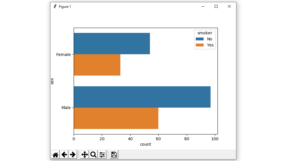
Example 3 : Plot the bars horizontally.
In the above example, we see how to plot a single horizontal countplot and here can perform multiple horizontal count plots with the exchange of the data variable with another axis.
Python3
import seaborn as sns
import matplotlib.pyplot as plt
df = sns.load_dataset('tips')
sns.countplot(y ='sex', hue = "smoker", data = df)
plt.show()
|
Output :
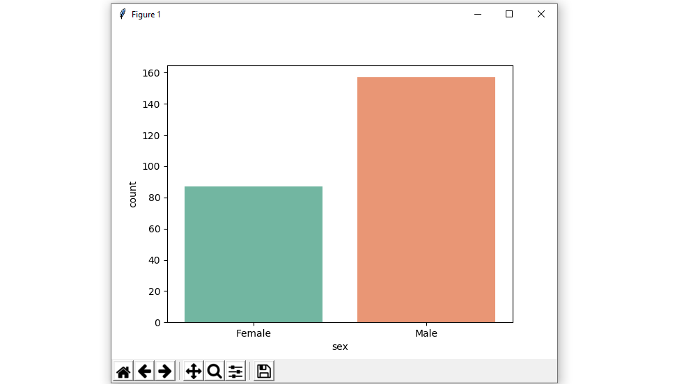
Example 4 : Use different color palette attributes.
Using the palette we can generate the point with different colors. In this below example we can see the palette can be responsible for a generate the countplot with different colormap values.
Syntax:
seaborn.countplot(x, y, data, hue, palette)
Python3
import seaborn as sns
import matplotlib.pyplot as plt
df = sns.load_dataset('tips')
sns.countplot(x ='sex', data = df, palette = "Set2")
plt.show()
|
Output :
Possible values of palette are:
Accent, Accent_r, Blues, Blues_r, BrBG, BrBG_r, BuGn, BuGn_r, BuPu, BuPu_r, CMRmap, CMRmap_r, Dark2, Dark2_r,
GnBu, GnBu_r, Greens, Greens_r, Greys, Greys_r, OrRd, OrRd_r, Oranges, Oranges_r, PRGn, PRGn_r, Paired, Paired_r,
Pastel1, Pastel1_r, Pastel2, Pastel2_r, PiYG, PiYG_r, PuBu, PuBuGn, PuBuGn_r, PuBu_r, PuOr, PuOr_r, PuRd, PuRd_r,
Purples, Purples_r, RdBu, RdBu_r, RdGy, RdGy_r, RdPu, RdPu_r, RdYlBu, RdYlBu_r, RdYlGn, RdYlGn_r, Reds, Reds_r, Set1,
Set1_r, Set2, Set2_r, Set3, Set3_r, Spectral, Spectral_r, Wistia, Wistia_r, YlGn, YlGnBu, YlGnBu_r, YlGn_r, YlOrBr,
YlOrBr_r, YlOrRd, YlOrRd_r, afmhot, afmhot_r, autumn, autumn_r, binary, binary_r, bone, bone_r, brg, brg_r, bwr, bwr_r,
cividis, cividis_r, cool, cool_r, coolwarm, coolwarm_r, copper, copper_r, cubehelix, cubehelix_r, flag, flag_r, gist_earth,
gist_earth_r, gist_gray, gist_gray_r, gist_heat, gist_heat_r, gist_ncar, gist_ncar_r, gist_rainbow, gist_rainbow_r, gist_stern,
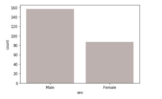
Example 5: using a color parameter in the plot.
Using color attributes we are Color for all the elements.
Syntax:
seaborn.countplot(x, y, data, color)
Python3
import seaborn as sns
import matplotlib.pyplot as plt
df = sns.load_dataset('titanic')
sns.countplot(x = 'class', y = 'fare',
hue = 'sex',
data = df,color="salmon")
plt.show()
|
Output:
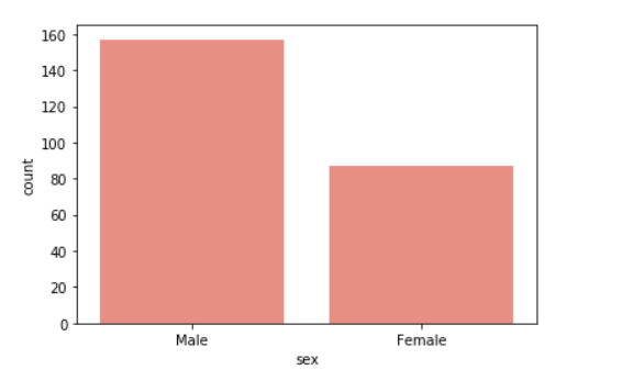
Example 6: Using a saturation parameter in the plot.
Proportion of the original saturation to draw colors at. Large patches often look better with slightly desaturated colors, but set this to 1 if you want the plot colors to perfectly match the input color spec.
Syntax:
seaborn.colorplot(x, y, data, saturation)
Python3
import seaborn as sns
import matplotlib.pyplot as plt
df = sns.load_dataset('titanic')
sns.countplot(x ='sex', data = df,
color="salmon",
saturation = 0.1)
plt.show()
|
Output:
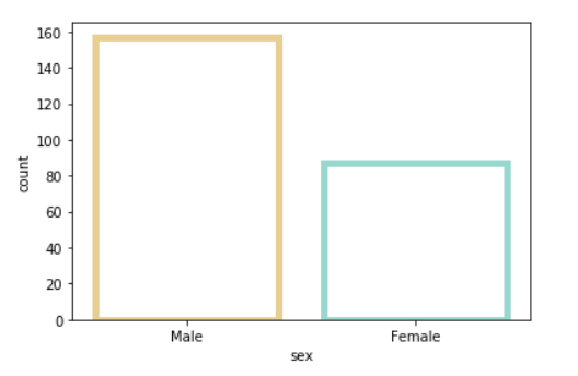
Example 7: Use matplotlib.axes.Axes.bar() parameters to control the style.
We can set Width of the gray lines that frame the plot elements using linewidth. Whenever we increase linewidth than the point also will increase automatically.
Syntax:
seaborn.countplot(x, y, data, linewidth, edgecolor)
Python3
import seaborn as sns
import matplotlib.pyplot as plt
df = sns.load_dataset('titanic')
sns.countplot(x ='sex', data = df,color="salmon", facecolor=(0, 0, 0, 0),
linewidth=5,
edgecolor=sns.color_palette("BrBG", 2))
plt.show()
|
Output:
Colormap Possible values are:
Accent, Accent_r, Blues, Blues_r, BrBG, BrBG_r, BuGn, BuGn_r, BuPu, BuPu_r,
CMRmap, CMRmap_r, Dark2, Dark2_r, GnBu, GnBu_r, Greens, Greens_r, Greys, Greys_r,
OrRd, OrRd_r, Oranges, Oranges_r, PRGn, PRGn_r, Paired, Paired_r, Pastel1, Pastel1_r,
Pastel2, Pastel2_r, PiYG, PiYG_r, PuBu, PuBuGn, PuBuGn_r, PuBu_r, PuOr, PuOr_r, PuRd,
PuRd_r, Purples, Purples_r, RdBu, RdBu_r, RdGy, RdGy_r, RdPu, RdPu_r, RdYlBu, RdYlBu_r,
RdYlGn, RdYlGn_r, Reds, Reds_r, Set1, Set1_r, Set2, Set2_r, Set3, Set3_r, Spectral,
Share your thoughts in the comments
Please Login to comment...