Seaborn Heatmap – A comprehensive guide
Last Updated :
12 Nov, 2020
Heatmap is defined as a graphical representation of data using colors to visualize the value of the matrix. In this, to represent more common values or higher activities brighter colors basically reddish colors are used and to represent less common or activity values, darker colors are preferred. Heatmap is also defined by the name of the shading matrix. Heatmaps in Seaborn can be plotted by using the seaborn.heatmap() function.
seaborn.heatmap()
Syntax: seaborn.heatmap(data, *, vmin=None, vmax=None, cmap=None, center=None, annot_kws=None, linewidths=0, linecolor=’white’, cbar=True, **kwargs)
Important Parameters:
- data: 2D dataset that can be coerced into an ndarray.
- vmin, vmax: Values to anchor the colormap, otherwise they are inferred from the data and other keyword arguments.
- cmap: The mapping from data values to color space.
- center: The value at which to center the colormap when plotting divergent data.
- annot: If True, write the data value in each cell.
- fmt: String formatting code to use when adding annotations.
- linewidths: Width of the lines that will divide each cell.
- linecolor: Color of the lines that will divide each cell.
- cbar: Whether to draw a colorbar.
All the parameters except data are optional.
Returns: An object of type matplotlib.axes._subplots.AxesSubplot
Let us understand the heatmap with examples.
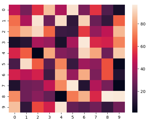
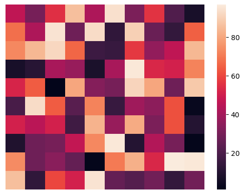
Basic Heatmap
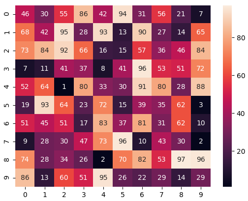
Making a heatmap with the default parameters. We will be creating a 10×10 2-D data using the randint() function of the NumPy module.
Python3
import numpy as np
import seaborn as sn
import matplotlib.pyplot as plt
data = np.random.randint(low = 1,
high = 100,
size = (10, 10))
print("The data to be plotted:\n")
print(data)
hm = sn.heatmap(data = data)
plt.show()
|
Output:
The data to be plotted:

[[46 30 55 86 42 94 31 56 21  7]
[68 42 95 28 93 13 90 27 14 65]
[73 84 92 66 16 15 57 36 46 84]
[ 7 11 41 37  8 41 96 53 51 72]
[52 64  1 80 33 30 91 80 28 88]
[19 93 64 23 72 15 39 35 62  3]
[51 45 51 17 83 37 81 31 62 10]
[ 9 28 30 47 73 96 10 43 30  2]
[74 28 34 26  2 70 82 53 97 96]
[86 13 60 51 95 26 22 29 14 29]]
We’ll be using this same data in all the examples.
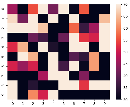
Anchoring the colormap
If we set the vmin value to 30 and the vmax value to 70, then only the cells with values between 30 and 70 will be displayed. This is called anchoring the colormap.
Python3
import numpy as np
import seaborn as sn
import matplotlib.pyplot as plt
data = np.random.randint(low=1,
high=100,
size=(10, 10))
vmin = 30
vmax = 70
hm = sn.heatmap(data=data,
vmin=vmin,
vmax=vmax)
plt.show()
|
Output:
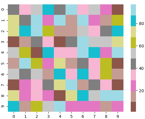
Choosing the colormap
In this, we will be looking at the cmap parameter. Matplotlib provides us with multiple colormaps, you can look at all of them here. In our example, we’ll be using tab20.
Python3
import numpy as np
import seaborn as sn
import matplotlib.pyplot as plt
data = np.random.randint(low=1,
high=100,
size=(10, 10))
cmap = "tab20"
hm = sn.heatmap(data=data,
cmap=cmap)
plt.show()
|
Output:

Centering the colormap
Centering the cmap to 0 by passing the center parameter as 0.
Python3
import numpy as np
import seaborn as sn
import matplotlib.pyplot as plt
data = np.random.randint(low=1,
high=100,
size=(10, 10))
cmap = "tab20"
center = 0
hm = sn.heatmap(data=data,
cmap=cmap,
center=center)
plt.show()
|
Output:
Displaying the cell values
If we want to display the value of the cells, then we pass the parameter annot as True. fmt is used to select the datatype of the contents of the cells displayed.
Python3
import numpy as np
import seaborn as sn
import matplotlib.pyplot as plt
data = np.random.randint(low=1,
high=100,
size=(10, 10))
annot = True
hm = sn.heatmap(data=data,
annot=annot)
plt.show()
|
Output:
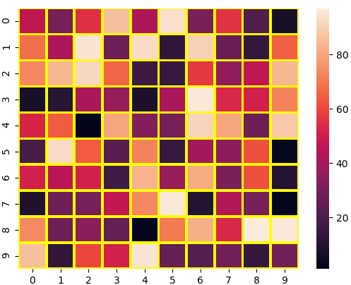
Customizing the separating line
We can change the thickness and the color of the lines separating the cells using the linewidths and linecolor parameters respectively.
Python3
import numpy as np
import seaborn as sn
import matplotlib.pyplot as plt
data = np.random.randint(low=1,
high=100,
size=(10, 10))
linewidths = 2
linecolor = "yellow"
hm = sn.heatmap(data=data,
linewidths=linewidths,
linecolor=linecolor)
plt.show()
|
Output:
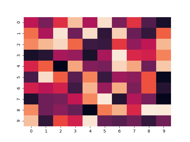
Hiding the colorbar
We can disable the colorbar by setting the cbar parameter to False.
Python3
import numpy as np
import seaborn as sn
import matplotlib.pyplot as plt
data = np.random.randint(low=1,
high=100,
size=(10, 10))
cbar = False
hm = sn.heatmap(data=data,
cbar=cbar)
plt.show()
|
Output:
Removing the labels
We can disable the x-label and the y-label by passing False in the xticklabels and yticklabels parameters respectively.
Python3
import numpy as np
import seaborn as sn
import matplotlib.pyplot as plt
data = np.random.randint(low=1,
high=100,
size=(10, 10))
xticklabels = False
yticklabels = False
hm = sn.heatmap(data=data,
xticklabels=xticklabels,
yticklabels=yticklabels)
plt.show()
|
Output:
Like Article
Suggest improvement
Share your thoughts in the comments
Please Login to comment...