Visualizing Relationship between variables with scatter plots in Seaborn
Last Updated :
29 Aug, 2020
To understand how variables in a dataset are related to one another and how that relationship is dependent on other variables, we perform statistical analysis. This Statistical analysis helps to visualize the trends and identify various patterns in the dataset. One of the functions which can be used to get the relationship between two variables in Seaborn is relplot().
Relplot() combines FacetGrid with either of the two axes-level functions scatterplot() and lineplot(). Scatterplot is default kind of relplot(). Using this we can visualize joint distribution of two variables through a cloud of points. We can draw scatterplot in seaborn using various ways. The most common one is when both the variables are numeric.
Example: Let’s take an example of a dataset that consists a data of CO2 emissions of different vehicles. To get the dataset click here.
import pandas as pd
import numpy as np
import matplotlib.pyplot as plt
import seaborn as sns
sns.set(style ="darkgrid")
dataset = pd.read_csv('FuelConsumption.csv')
|
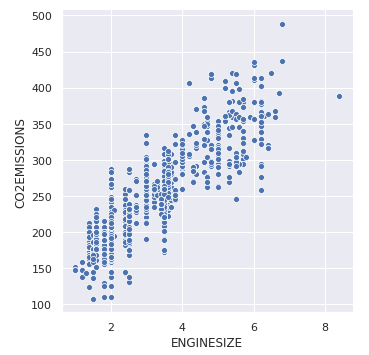
Let’s plot the basic scatterplot for visualizing the relation between the target variable “CO2EMISSIOnS” and “ENGINE SIZE”
sns.relplot(x ="ENGINESIZE", y ="CO2EMISSIONS",
data = dataset);
|
Output:
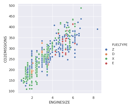
We can add visualize one more variable by adding another dimension to the plot. This can be done by using “hue”, which colors the points of the third variable, thus adding a meaning to it.
sns.relplot(x ="ENGINESIZE", y ="CO2EMISSIONS",
hue ="FUELTYPE", data = dataset);
|
Output:
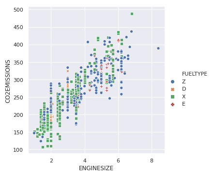
To highlight the different classes, we can add marker styles
sns.relplot(x ="ENGINESIZE", y ="CO2EMISSIONS",
hue ="FUELTYPE", style ="FUELTYPE",
data = dataset);
|
Output:
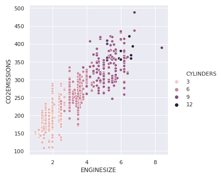
In the previous example, hue semantic was for a categorical variable, so it had a default qualitative palette. But if we use a numerical variable instead of categorical, then the default palette used is sequential, which can be modified too.
sns.relplot(x ="ENGINESIZE", y ="CO2EMISSIONS",
hue ="CYLINDERS", data = dataset);
|
Output:
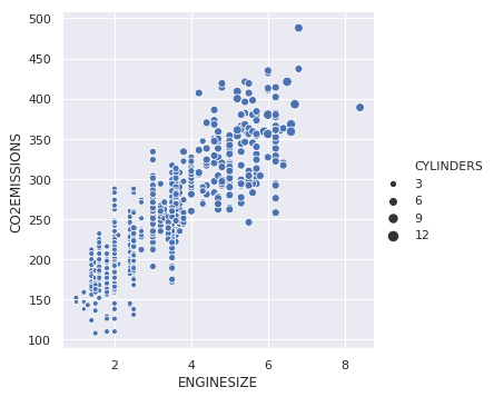
We can also change the size of points for the third variable.
sns.relplot(x ="ENGINESIZE", y ="CO2EMISSIONS",
size ="CYLINDERS", data = dataset);
|
Output:
Like Article
Suggest improvement
Share your thoughts in the comments
Please Login to comment...