How to Add Outline or Edge Color to Histogram in Seaborn?
Last Updated :
02 Dec, 2020
Seaborn is an amazing visualization library for statistical graphics plotting in Python. It provides beautiful default styles and color palettes to make statistical plots more attractive. It is built on the top of matplotlib library and also closely integrated into the data structures from pandas.
Seaborn aims to make visualization of the central part of exploring and understanding data. It provides dataset-oriented APIs, so that we can switch between different visual representations for the same variables for a better understanding of the dataset.
In this article, we are going to add an outline or edge color to a histogram. The task can be done using the seaborn.distplot() method.
Syntax: seaborn.distplot(aSeries)
Parameters
- aSeries, 1d-array, or list: Observed data. If this is a Series object with a name attribute, the name will be used to label the data axis.
- binsargument for matplotlib hist(), or None, optional: Specification of hist bins. If unspecified, as reference rule is used that tries to find a useful default.
- colormatplotlib color, optional: Color to plot everything but the fitted curve in.
- labelstring, optional: Legend label for the relevant component of the plot.
- axmatplotlib axis, optional: If provided, plot on this axis.
Returns
- axmatplotlib Axes: Returns the Axes object with the plot for further tweaking.
We are mainly going to use the hist_kws parameters of this method like edgecolor, color, linewidth, etc, as it deals with the outline and edges of the histogram, it takes a dictionary value.
Below are some examples which depict how to add an outline or edge color to Histogram:
Example 1:
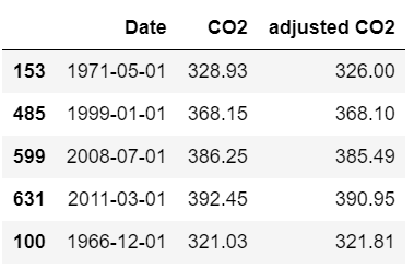
Below is the dataset through which the histogram is to be illustrated:
Python3
import seaborn
from vega_datasets import data
dataset = data.co2_concentration()
dataset.sample(n=5)
|
Output:
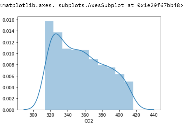
Now illustrating a histogram and also adding an outline to it.
Python3
seaborn.distplot(dataset['CO2'])
|
Output:
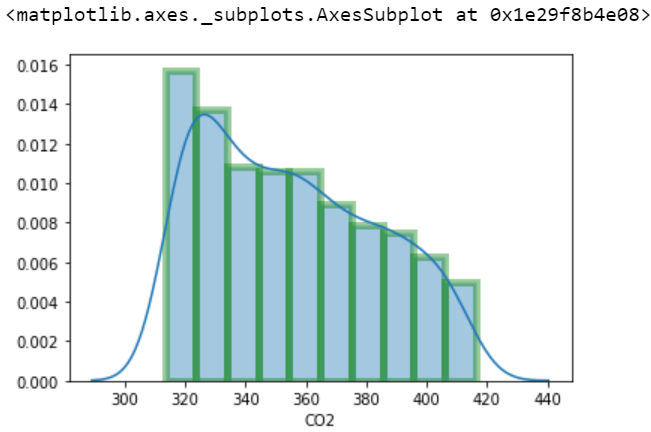
Also, illustrating a histogram and adding an edge color to it.
Python3
sns.distplot(dataset['CO2'],
hist_kws=dict(edgecolor="green", linewidth=5))
|
Output:
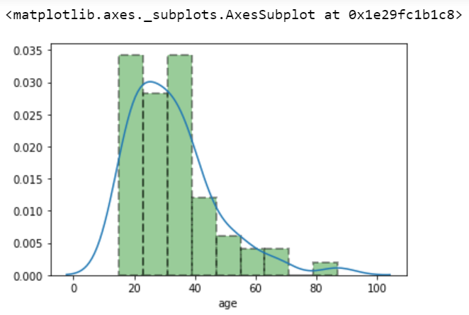
Example 2:
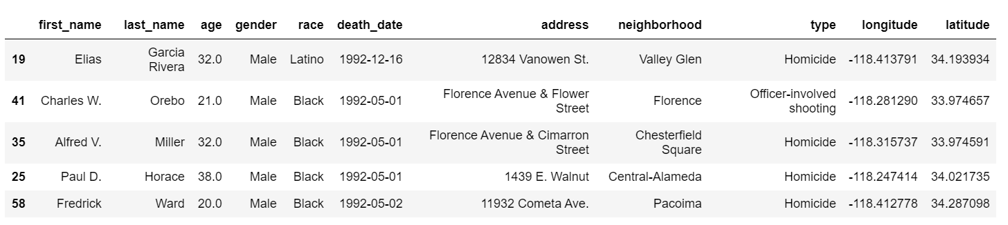
Here is another dataset through which a histogram is to be depicted:
Python3
import seaborn
from vega_datasets import data
dataset = data.la_riots()
dataset.sample(n=5)
|
Now below is the illustration:
Python3
sns.distplot(dataset['age'],
hist_kws={'color':'green', 'edgecolor':'black',
'linewidth':2, 'linestyle':'--'})
|
Output:
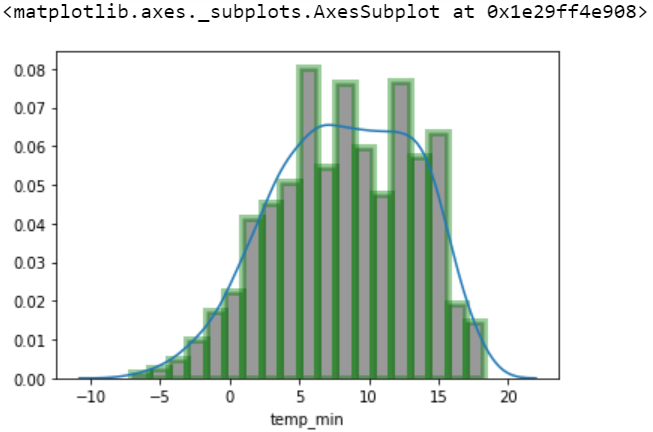
Example 3:
Here is another example to add an outline or edge color to Histogram.
Python3
import seaborn
from vega_datasets import data
dataset = data.seattle_weather()
dataset.sample(n=5)
sns.distplot(dataset['temp_min'],
hist_kws={'color': 'black', 'edgecolor': 'green',
'linewidth': 5})
|
Output:
Like Article
Suggest improvement
Share your thoughts in the comments
Please Login to comment...