Seaborn is an amazing visualization library for statistical graphics plotting in Python. It provides beautiful default styles and color palettes to make statistical plots more attractive. It is built on the top of matplotlib library and also closely integrated into the data structures from pandas.
Violin Plot
A violin plot plays a similar activity that is pursued through whisker or box plot do. As it shows several quantitative data across one or more categorical variables. It can be an effective and attractive way to show multiple data at several units. A “wide-form” Data Frame helps to maintain each numeric column which can be plotted on the graph. It is possible to use NumPy or Python objects, but pandas objects are preferable because the associated names will be used to annotate the axes.
Syntax: seaborn.violinplot(x=None, y=None, hue=None, data=None, order=None, hue_order=None, bw=’scott’, cut=2, scale=’area’, scale_hue=True, gridsize=100, width=0.8, inner=’box’, split=False, dodge=True, orient=None, linewidth=None, color=None, palette=None, saturation=0.75, ax=None, **kwargs)
Parameters:
x, y, hue: Inputs for plotting long-form data.
data: Dataset for plotting.
scale: The method used to scale the width of each violin.
Returns: This method returns the Axes object with the plot drawn onto it.
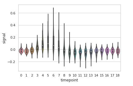
Example 1: Basic visualization of “fmri” dataset using violinplot()
Python3
import seaborn
seaborn.set(style = 'whitegrid')
fmri = seaborn.load_dataset("fmri")
seaborn.violinplot(x ="timepoint",
y ="signal",
data = fmri)
|
Output:
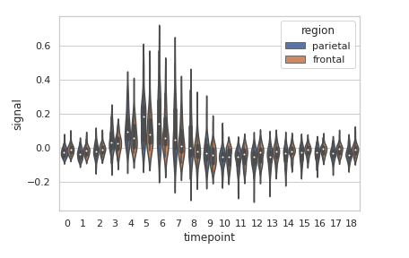
Example 2: Grouping data points on the basis of category, here as region and event.
Python3
import seaborn
seaborn.set(style = 'whitegrid')
fmri = seaborn.load_dataset("fmri")
seaborn.violinplot(x ="timepoint",
y ="signal",
hue ="region",
style ="event",
data = fmri)
|
Output:
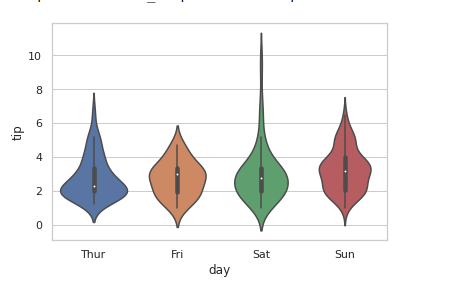
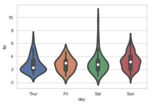
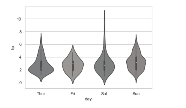
Example 3: Basic visualization of “tips” dataset using lineplot()
Python3
import seaborn
seaborn.set(style = 'whitegrid')
tip = seaborn.load_dataset('tips')
seaborn.violinplot(x ='day', y ='tip', data = tip)
|
Output:
Grouping variables in Seaborn violinplot with different attributes:
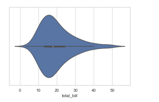
1.Draw a single horizontal swarm plot using only one axis:
If we use only one data variable instead of two data variables then it means that the axis denotes each of these data variables as an axis.
X denotes an x-axis and y denote a y-axis.
Syntax:
seaborn.violinplot(x)
Code:
Python3
import seaborn
seaborn.set(style="whitegrid")
tips = seaborn.load_dataset("tips")
seaborn.violinplot(x=tip["total_bill"])
|
Output:
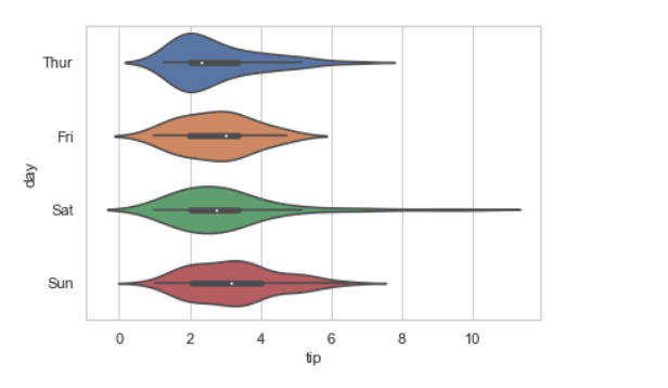
2. Draw horizontal violinplot:
In the above example we see how to plot a single horizontal violinplot plot and here can perform multiple horizontal plot with exchange the data variable with another axis.
Python3
import seaborn
seaborn.set(style="whitegrid")
tips = seaborn.load_dataset("tips")
seaborn.violinplot(x="tip", y="day", data=tip)
|
Output:
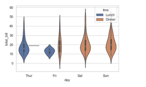
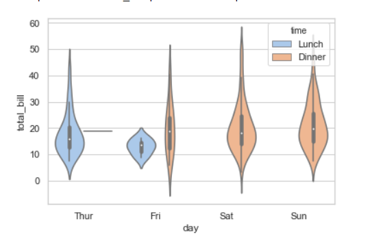
3. Using hue parameter:
While the points are plotted in two dimensions, another dimension can be added to the plot by coloring the points according to a third variable.
Syntax:
sns.violinplot(x, y, hue, data)
Python3
import seaborn
seaborn.set(style="whitegrid")
tips = seaborn.load_dataset("tips")
seaborn.violinplot(x="day", y="total_bill", hue="time", data=tips)
|
Output:
4. Draw outlines around the data points using linewidth:
Width of the gray lines that frame the plot elements. Whenever we increase linewidth than the point also will increase automatically.
Syntax:
seaborn.violinplot(x, y, data, linewidth)
Python3
import seaborn
seaborn.set(style="whitegrid")
tips = seaborn.load_dataset("tips")
seaborn.violinplot(x ='day', y ='tip', data = tip, linewidth = 4)
|
Output:
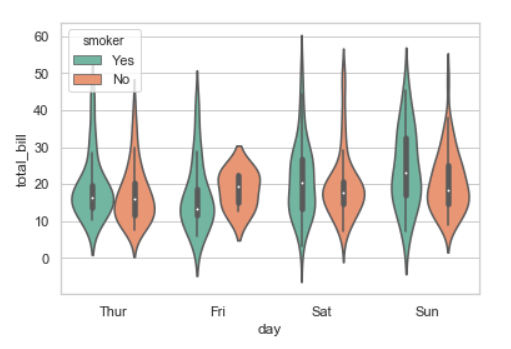
5. Draw each level of the hue variable at different locations on the major categorical axis:
When using hue nesting, setting dodge should be True will separate the point for different hue levels along the categorical axis. And Palette is used for the different levels of the hue variable.
Syntax:
seaborn.violinplot(x, y, data, hue, palette, dodge)
Python3
import seaborn
seaborn.set(style="whitegrid")
tips = seaborn.load_dataset("tips")
seaborn.violinplot(x="day", y="total_bill", hue="smoker",
data=tips, palette="Set2", dodge=True)
|
Output:
Possible values of palette are:
Accent, Accent_r, Blues, Blues_r, BrBG, BrBG_r, BuGn, BuGn_r, BuPu, BuPu_r, CMRmap, CMRmap_r, Dark2, Dark2_r,
GnBu, GnBu_r, Greens, Greens_r, Greys, Greys_r, OrRd, OrRd_r, Oranges, Oranges_r, PRGn, PRGn_r, Paired, Paired_r,
Pastel1, Pastel1_r, Pastel2, Pastel2_r, PiYG, PiYG_r, PuBu, PuBuGn, PuBuGn_r, PuBu_r, PuOr, PuOr_r, PuRd, PuRd_r,
Purples, Purples_r, RdBu, RdBu_r, RdGy, RdGy_r, RdPu, RdPu_r, RdYlBu, RdYlBu_r, RdYlGn, RdYlGn_r, Reds, Reds_r, Set1,
Set1_r, Set2, Set2_r, Set3, Set3_r, Spectral, Spectral_r, Wistia, Wistia_r, YlGn, YlGnBu, YlGnBu_r, YlGn_r, YlOrBr,
YlOrBr_r, YlOrRd, YlOrRd_r, afmhot, afmhot_r, autumn, autumn_r, binary, binary_r, bone, bone_r, brg, brg_r, bwr, bwr_r,
cividis, cividis_r, cool, cool_r, coolwarm, coolwarm_r, copper, copper_r, cubehelix, cubehelix_r, flag, flag_r, gist_earth,
gist_earth_r, gist_gray, gist_gray_r, gist_heat, gist_heat_r, gist_ncar, gist_ncar_r, gist_rainbow, gist_rainbow_r, gist_stern,
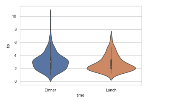
7. Control violin order by passing an explicit order:
Python3
import seaborn
seaborn.set(style="whitegrid")
tips = seaborn.load_dataset("tips")
seaborn.violinplot(x="time", y="tip", data=tips,
order=["Dinner", "Lunch"])
|
Output:
8. Adding the palette attributes:
Using the palette we can generate the point with different colors. In this below example we can see the palette can be responsible for a generate the violinplot with different colormap values.
Syntax:
seaborn.violinplot( x, y, data, palette=”color_name”)
Python3
import seaborn
seaborn.set(style="whitegrid")
tips = seaborn.load_dataset("tips")
seaborn.violinplot(x='day', y='total_bill',
data=tips, hue='time', palette='pastel')
|
Output:
9. Adding the saturation parameter:
Proportion of the original saturation to draw colors at. Large patches often look better with slightly desaturated colors, but set this to 1 if you want the plot colors to perfectly match the input color spec.
Syntax:
seaborn.violinplot(x, y, data, saturation)
Python3
import seaborn
seaborn.set(style="whitegrid")
tips = seaborn.load_dataset("tips")
seaborn.violinplot(x ='day', y ='tip',
data = tip, saturation =0.03)
|
Output:
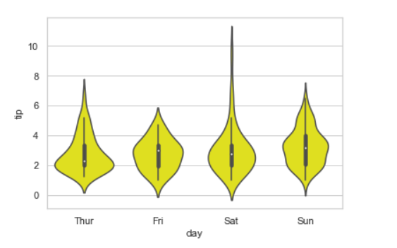
10. Adding color parameter:
It will Color for all the elements or seed for a gradient palette.
Syntax:
seaborn.violinplot(x, y, data, color)
Python3
import seaborn
seaborn.set(style="whitegrid")
tips = seaborn.load_dataset("tips")
seaborn.violinplot(x ='day', y ='tip', data = tip, color = "Yellow")
|
Output:
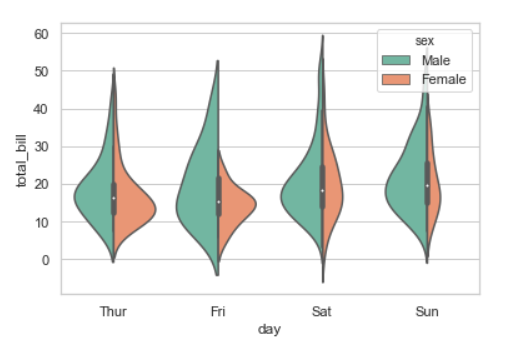
11. Scale the violin width by the number of observations in each bin:
Python3
import seaborn
seaborn.set(style="whitegrid")
tips = seaborn.load_dataset("tips")
seaborn.violinplot(x="day", y="total_bill", hue="sex",
data=tip, palette="Set2", split=True,
scale="count")
|
Output:
Share your thoughts in the comments
Please Login to comment...