How to Show Mean on Boxplot using Seaborn in Python?
Last Updated :
16 Jun, 2021
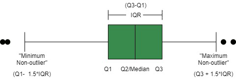
A boxplot is a powerful data visualization tool used to understand the distribution of data. It splits the data into quartiles, and summarises it based on five numbers derived from these quartiles:
- median: the middle value of data. marked as Q2, portrays the 50th percentile.
- first quartile: the middle value between “minimum non-outlier” and median. marked as Q1, portrays the 25th percentile.
- third quartile: the middle value between “maximum non-outlier” and median. marked as Q3, portrays the 75th percentile.
- “maximum non-outlier”: calculated by (Q3 + 1.5*IQR). All values above this are considered outliers.
- “minimum non-outlier”: calculated by (Q1 – 1.5*IQR). All values below this are considered outliers.
It can also represent the symmetrically, skewness, and the spread of data.
In Python 3, We can graph a boxplot using three methods, using matplotlib, using pandas, or using seaborn. Here, we will use seaborn, which is a matplotlib wrapper that provides close integration with pandas data structures and better palette options than matplotlib. We will use seaborn.boxplot() method, and then we will learn how to show mean on boxplot.
Step 1: Importing the libraries and loading the dataset
Python3
import seaborn as sns
import matplotlib.pyplot as plt
df = sns.load_dataset("titanic")
print(df.head())
|
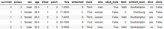
First 5 rows of dataset
Step 2: plot a basic boxplot using seaborn.boxplot()
Python3
plt.figure(figsize=(10, 8))
sns.boxplot(x='survived',
y='age',
data=df)
plt.ylabel("Age", size=14)
plt.xlabel("Survived", size=14)
plt.title("Titanic Dataset", size=18)
|
We observe that median is shown as a quartile line, but the mean is not shown.
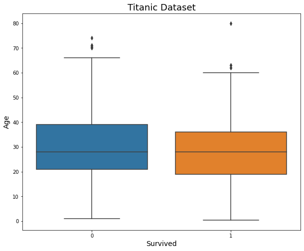
simple boxplot
Step 3: To show mean, we use an extra keyword argument in the boxplot function. We set showmeans as True.
Python3
plt.figure(figsize=(10, 8))
sns.boxplot(x='survived',
y='age',
data=df,
showmeans=True)
plt.ylabel("Age", size=14)
plt.xlabel("Survived", size=14)
plt.title("Titanic Dataset", size=18)
|
Now, we observe that the mean is marked as a green triangle, which doesn’t go well with our color scheme.

plotting mean using showmeans keyword argument
Step 4: To set up our customized marker and markercolor, we will use ‘meanprops’ keyword argument as shown in the code below.
Python3
plt.figure(figsize=(10, 8))
sns.boxplot(x='survived',
y='age',
data=df,
showmeans=True,
meanprops={"marker": "+",
"markeredgecolor": "black",
"markersize": "10"})
plt.ylabel("Age", size=14)
plt.xlabel("Survived", size=14)
plt.title("Titanic Dataset", size=18)
|

Share your thoughts in the comments
Please Login to comment...