How to Color Scatterplot by a variable in Matplotlib?
Last Updated :
24 Jan, 2021
In this article, we are going to see how to color scatterplot by variable in Matplotlib. Here we will use matplotlib.pyplot.scatter() methods matplotlib library is used to draw a scatter plot. Scatter plots are widely used to represent relations among variables and how change in one affects the other.
Syntax: matplotlib.pyplot.scatter(x_axis_data, y_axis_data,s=None, c=None, marker=None, cmap=None, vmin=None, vmax=None, alpha=None, linewidths=None, edgecolors=None)
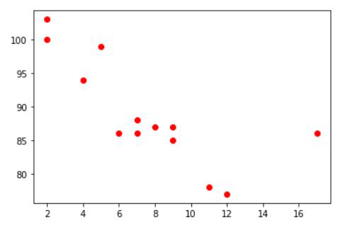
Example 1: Color Scatterplot by variable values.
In this example, We are going to see how to color scatterplot with their variable value. Here we will plot a simple scatterplot with x and y data, Then will use c attributes for coloring the point(Scatterplot variable points).
Python3
import matplotlib.pyplot as plt
x =[5, 7, 8, 7, 2, 17, 2, 9,
4, 11, 12, 9, 6]
y =[99, 86, 87, 88, 100, 86,
103, 87, 94, 78, 77, 85, 86]
plt.scatter(x, y, c = 'red')
plt.show()
|
Output:
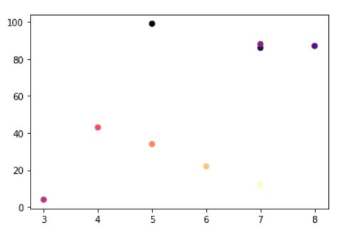
Example 2: Color Scatterplot point with dependent values.
In this example, We will plot a variable depending on another variable. Sometimes we need precisely based visualization so in this case, It can help us to visualize the data that depend on another variable. Here we will use three different values for each point and use colormap with specific data.
Python3
import matplotlib.pyplot as plt
x =[5, 7, 8, 7, 3, 4, 5, 6, 7]
y =[99, 86, 87, 88, 4, 43, 34, 22, 12]
z = [1,2,3,4, 5, 6, 7, 8, 9]
plt.scatter(x, y, c = z , cmap = "magma")
|
Output:
Like Article
Suggest improvement
Share your thoughts in the comments
Please Login to comment...