How To Make Scatter Plot with Regression Line using Seaborn in Python?
Last Updated :
02 Dec, 2020
In this article, we will learn how to male scatter plots with regression lines using Seaborn in Python. Let’s discuss some concepts :
- Seaborn : Seaborn is a tremendous visualization library for statistical graphics plotting in Python. It provides beautiful default styles and color palettes to make statistical plots more attractive. It is built on the highest of matplotlib library and also closely integrated to the info structures from pandas.
- Scatter Plot : Scatter plots are wont to observe the relationship between variables and uses dots to represent the connection between them. The scatter() method within the matplotlib library is employed to draw a scatter plot. Scatter plots are widely wont to represent relationships among variables and the way change in one affects the opposite.
- Regression Plot : Two main functions in seaborn are wont to visualize a linear relationship as determined through regression. These functions, regplot() and lmplot() are closely related and share much of their core functionality.
Adding a regression curve to a scatterplot between two numerical variables is a good way to ascertain the linear trend. And we also will see an example of customizing the scatter plot with a regression curve.
Steps Required
- Import Library (Seaborn)
- Import or load or create data.
- Plot the graph with the help of regplot() or lmplot() method.
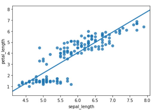
Example 1: Using regplot() method
This method is used to plot data and a linear regression model fit. There are a number of mutually exclusive options for estimating the regression model.
Python3
import seaborn as sb
df = sb.load_dataset('iris')
sb.regplot(x = "sepal_length",
y = "petal_length",
ci = None,
data = df)
|
Output :
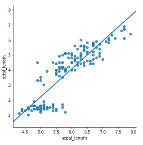
Example 2: Using lmplot() method
The lmplot is another most basic plot. It shows a line representing a linear regression model along with data points on the 2D-space and x and y can be set as the horizontal and vertical labels respectively.
Python3
import seaborn as sb
df = sb.load_dataset('iris')
sb.lmplot(x = "sepal_length",
y = "petal_length",
ci = None,
data = df)
|
Output :
Share your thoughts in the comments
Please Login to comment...