Create Scatter Plot with smooth Line using Python
Last Updated :
15 Mar, 2021
A curve can be smoothened to reach a well approximated idea of the visualization. In this article, we will be plotting a scatter plot with the smooth line with the help of the SciPy library. To plot a smooth line scatter plot we use the following function:
- scipy.interpolate.make_interp_spline() from the SciPy library computes the coefficients of interpolating B-spline. By importing, this function from the Scipy library and added the parameter, It is quite easier to get the smooth line to scatter plot.
Syntax:
scipy.interpolate.make_interp_spline(x, y, k=3, t=None, bc_type=None, axis=0, check_finite=True)
Parameters:
- x:-Abscissas
- y:-Ordinates
- k:-B-spline degree
- t:-Knots
- bc_type:-Boundary conditions
- axis:-Interpolation axis
- check_finite:-Whether to check that the input arrays contain only finite numbers
Return: a BSpline object of the degree k and with knots t.
- np.linspace() function is imported from NumPy library used to get evenly spaced numbers over a specified interval used to draw a smooth line scatter plot.
Syntax:
numpy.linspace(start, stop, num=50, endpoint=True, retstep=False, dtype=None, axis=0)
Parameters:
- start:-The starting value of the sequence.
- stop:-The end value of the sequence.
- num:-Number of samples to generate.
- endpoint:-If True, stop is the last sample.
- retstep:-If True, return (samples, step), where the step is the spacing between samples.
- dtype:-The type of the output array.
- axis:- The axis in the result to store the samples.
Return: A array of num equally spaced samples in the closed interval
Approach
- Import module
- Create or load data
- Create a scatter plot
- Create a smoothened curve from the points of the scatter plot
- Display plot
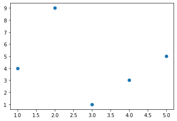
Let us start with a sample scatter plot.
Example:
Python3
import numpy as np
import matplotlib.pyplot as plt
x = np.array([1, 2, 3, 4, 5])
y = np.array([4, 9, 1, 3, 5])
plt.scatter(x, y)
plt.show()
|
Output:
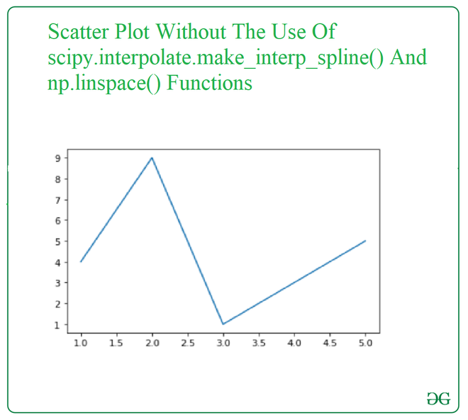
Now let’s visualize the scatter plot by joining points of the plot so that an uneven curve can appear i.e. without smoothening so that difference can be apparent.
Example:
Python3
import numpy as np
import matplotlib.pyplot as plt
x = np.array([1, 2, 3, 4, 5])
y = np.array([4, 9, 1, 3, 5])
plt.plot(x, y)
plt.show()
|
Output:
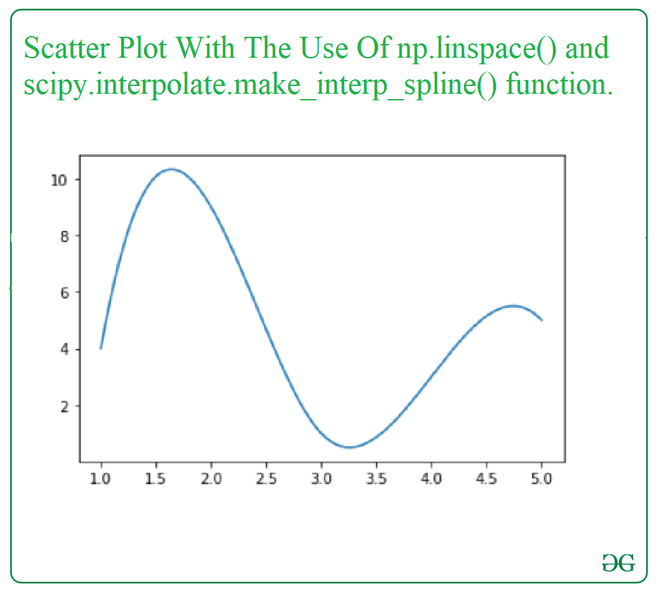
Now, We will be looking at the same example as above with the use of np.linspace() and scipy.interpolate.make_interp_spline() function.
Example:
Python3
import numpy as np
import matplotlib.pyplot as plt
from scipy.interpolate import make_interp_spline
x = np.array([1, 2, 3, 4, 5])
y = np.array([4, 9, 1, 3, 5])
xnew = np.linspace(x.min(), x.max(), 300)
gfg = make_interp_spline(x, y, k=3)
y_new = gfg(xnew)
plt.plot(xnew, y_new)
plt.show()
|
Output:
Share your thoughts in the comments
Please Login to comment...