Scatter Plot with Regression Line using Altair in Python
Last Updated :
24 Jan, 2021
Prerequisite: Altair
In this article, we are going to discuss how to plot to scatter plots with a regression line using the Altair library.
Scatter Plot and Regression Line
- The values of two different numeric variables is represented by dots or circle in Scatter Plot. Scatter Plot is also known as aka scatter chart or scatter graph. The position of each dot in the horizontal and vertical axis indicates a value for an individual data point.
- Scatter plots are beneficial to observe the relationship between the variables.
- Regression Line is the straight line that best fits the data so that the overall distance from the line to the points plotted on the chart is the smallest.
Installation:
To install the Altair library, write the below command on your command prompt.
pip install altair
In this article for datasets, we are using the vega_datasets package, to install write the below command on your command prompt.
pip install vega_datasets
Approach:
- Import the necessary libraries.
- Create or load the dataset from the vega_dataset package.
- To plot the scatter plot using Altair library, we have to give three important elements to plot as follows.
- In the first element altair.Chart(dataset) pass the dataset as the parameter.
- In the second element with a dot (.) add mark_point() this element specifies the type of chart we are plotting.
- In the third element with a dot (.) add encode() in which pass the columns between which we are plotting the scatter plot.
- Store this scatter plot in a variable named “fig”.
- Then plot the regression line transform_regression() function and pass the columns as a parameter on which regression line is plotted and add this to the scatter plot which is stored in “fig” variable.
- Store the scatter plot with regression line in variable let be named as “final_plot”.
- In case written the program code in python file use save() function to save the plot and you can view that plot on Chrome browser by using CTRL+O command then open the saved plot to visualize.
- Otherwise, if written in Jupyter notebook or notebook environment use show() to visualize the plot.
- To know how to use Jupyter Notebook: Getting started with Jupyter Notebook.
- For better understanding, let’s do some examples by using airports and seattle_weather dataset that comes with the Vega dataset package.
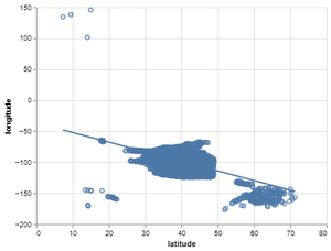
Example 1: Default Scatter plot with Regression line on airports dataset.
Python
import altair as alt
from vega_datasets import data
airport = data.airports()
fig = alt.Chart(airport).mark_point().encode(x='latitude',y='longitude')
final_plot = fig + fig.transform_regression('latitude','longitude').mark_line()
final_plot.save('output1.html')
|
Output:
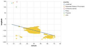
Example 2: Scatter Plot with Regression Line by setting up the color using airport dataset.
Python
import altair as alt
from vega_datasets import data
airport = data.airports()
fig = alt.Chart(airport).mark_point().encode(
x='latitude',y='longitude',color='country')
final_plot = fig + fig.transform_regression('latitude','longitude').mark_line()
final_plot.save('output2.html')
|
Output:
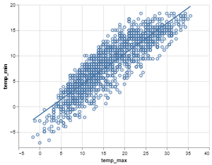
Example 3: Default Scatter Plot with Regression Line using seattle_weather dataset.
Python
import altair as alt
from vega_datasets import data
weather_data = data.seattle_weather()
fig = alt.Chart(weather_data).mark_point().encode(x='temp_max',y='temp_min')
final_plot = fig + fig.transform_regression('temp_max','temp_min').mark_line()
final_plot.save('output3.html')
|
Output:
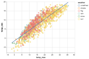
Example 4: Scatter Plot with Regression Line by setting up color using seattle_weather dataset.
Python
import altair as alt
from vega_datasets import data
weather_data = data.seattle_weather()
fig = alt.Chart(weather_data).mark_point().encode(
x='temp_max',y='temp_min',color='weather')
final_plot = fig + fig.transform_regression('temp_max','temp_min').mark_line()
final_plot.save('output4.html')
|
Output:
Like Article
Suggest improvement
Share your thoughts in the comments
Please Login to comment...