Horizontal Boxplots with Points using Seaborn in Python
Last Updated :
26 Nov, 2020
Seaborn is an amazing visualization library for statistical graphics plotting in Python. It provides beautiful default styles and color palettes to make statistical plots more attractive. It is built on the top of matplotlib library and also closely integrated into the data structures from pandas.
Seaborn aims to make visualization of the central part of exploring and understanding data. It provides dataset-oriented APIs, so that we can switch between different visual representations for the same variables for a better understanding of the dataset.
Why horizontal Boxplots will be used instead of boxplots?
They are useful when you have numerous groups with larger names. Boxplots works fine when we have a limited number of groups and short names of groups. But if we have longer titles they would overlap each other in boxplots, and it will get difficult to read the data and taking insights from the graph. Horizontal boxplots solve that problem very easily.
Below is the step-by-step Approach to illustrate Horizontal Boxplots using Seaborn module:
Python3
import sklearn
import numpy as np
import matplotlib.pyplot as plt
import pandas as pd
import seaborn as sns
|
Python3
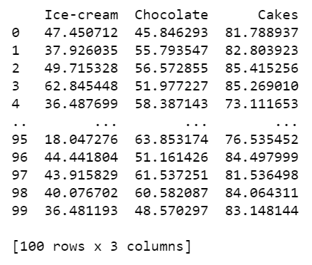
np.random.seed(42)
df = pd.DataFrame({
'Ice-cream': np.random.normal(40, 15, 100),
'Chocolate': np.random.normal(60, 10, 100),
'Cakes': np.random.normal(80, 5, 100)
})
print(df)
|
Output:
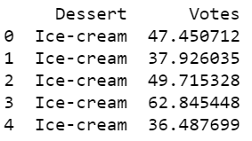
Mostly data we come across are in wide format. For example when you scrape a website. This data is in the wide form Convert the data into long-form by using pandas melt function.
Python3
data_df = df.melt(var_name='Dessert', value_name='Votes')
print(data_df.head())
|
Output:
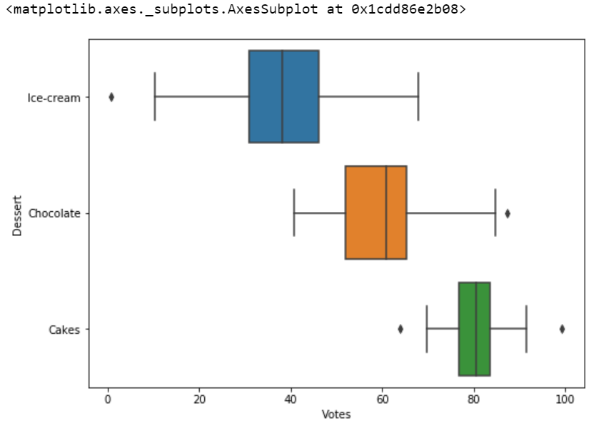
- Plot this data into a boxplot.
Python3
plt.figure(figsize=(8.3,6))
sns.boxplot(y="Dessert", x="Votes", data=data_df)
|
Output:
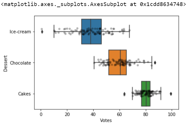
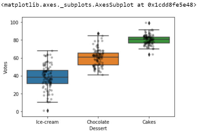
After plotting the data points into the boxplot. Strip plot can also be drawn on its own but it will complement while using with boxplot or violin plot.
Python3
sns.boxplot(y="Dessert", x="Votes", data=data_df)
sns.stripplot(y="Dessert", x="Votes", color='black',
alpha=0.3, data=data_df)
|
Output:
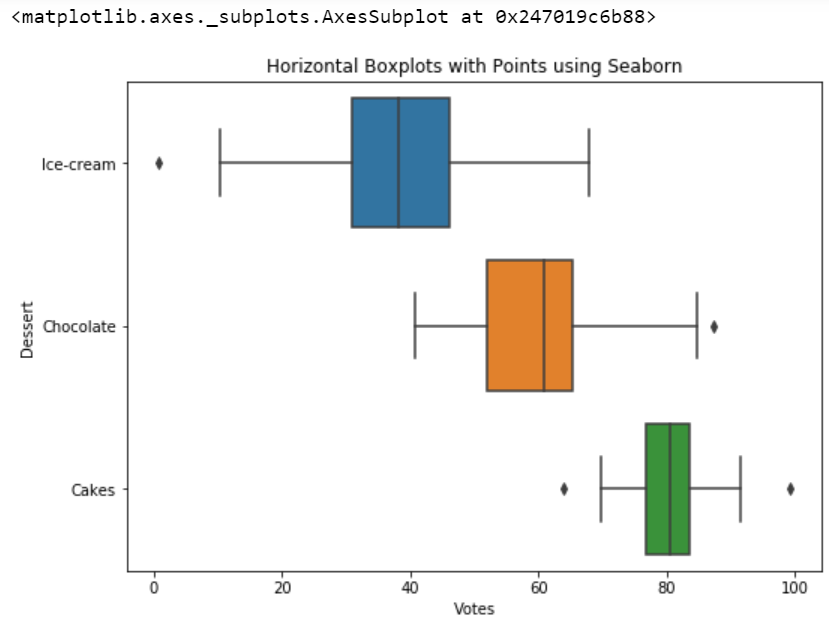
Changing our boxplot into the horizontal boxplot with data points by simply swapping the axes when we have numerous columns then names overlap with each other, so then we use a horizontal boxplot.
Python3
sns.boxplot(x="Dessert", y="Votes", data=data_df)
sns.stripplot(x="Dessert", y="Votes", color='black',
alpha=0.3, data=data_df)
|
Output:
Below is the complete program based on the above approach:
Python3
import sklearn
import numpy as np
import matplotlib.pyplot as plt
import pandas as pd
import seaborn as sns
np.random.seed(42)
df = pd.DataFrame({
'Ice-cream': np.random.normal(40, 15, 100),
'Chocolate': np.random.normal(60, 10, 100),
'Cakes': np.random.normal(80, 5, 100)
})
data_df = df.melt(var_name='Dessert', value_name='Votes')
plt.figure(figsize=(8.3, 6))
plt.title('Horizontal Boxplots with Points using Seaborn')
sns.boxplot(y="Dessert", x="Votes", data=data_df)
|
Output:
Like Article
Suggest improvement
Share your thoughts in the comments
Please Login to comment...