Seaborn – Bubble Plot
Last Updated :
11 Dec, 2020
Seaborn is an amazing visualization library for statistical graphics plotting in Python. It provides beautiful default styles and color palettes to make statistical plots more attractive. It is built on the top of matplotlib library and also closely integrated to the data structures from pandas.
Scatter plots are used to observe relationship between variables and uses dots to represent the relationship between them. Bubble plots are scatter plots with bubbles (color filled circles) rather than information focuses. Bubbles have various sizes dependent on another variable in the data. Likewise, Bubbles can be of various color dependent on another variable in the dataset.
Let us load the required module and the simplified Iris data as a Pandas Data frame:
Python3
import matplotlib.pyplot as plt
import pandas as pd
import seaborn as sns
df = pd.read_csv(data)
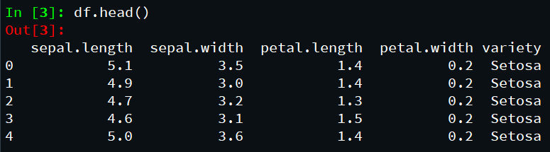
df.head()
|
Output:
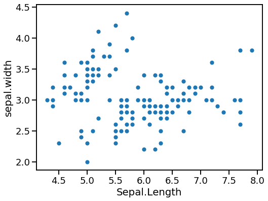
Scatter plot with Seaborn:
As stated earlier than, bubble is a unique form of scatter plot with bubbles as opposed to easy facts points in scatter plot. Let us first make a simple scatter plot the usage of Seaborn’s scatterplot() function.
Python3
import matplotlib.pyplot as plt
import pandas as pd
import seaborn as sns
df = pd.read_csv(data)
df.head()
sns.set_context("talk", font_scale=1.1)
plt.figure(figsize=(8, 6))
sns.scatterplot(x="sepal.length",
y="sepal.width",
data=df)
plt.xlabel("Sepal.Length")
plt.ylabel("sepal.width")
|
Output:
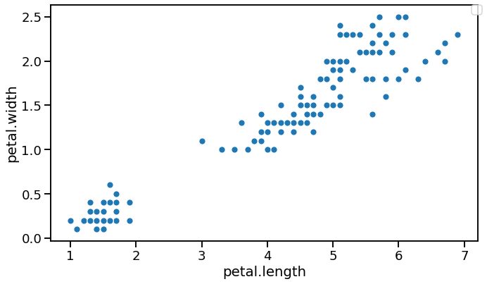
Bubble plot with Seaborn scatterplot():
To make bubble plot in Seaborn, we are able to use scatterplot() function in Seaborn with a variable specifying size argument in addition to x and y-axis variables for scatter plot.
In this bubble plot instance, we have length= ”body_mass_g”. And this will create a bubble plot with unique bubble sizes based at the body length variable.
Python3
import matplotlib.pyplot as plt
import pandas as pd
import seaborn as sns
df = pd.read_csv(data)
df.head()
sns.set_context("talk", font_scale=1.1)
plt.figure(figsize=(10, 6))
sns.scatterplot(x="petal.length",
y="petal.width",
data=df)
plt.legend(bbox_to_anchor=(1.01, 1), borderaxespad=0)
plt.xlabel("petal.length")
plt.ylabel("petal.width")
plt.tight_layout()
plt.savefig("Bubble_plot_Seaborn_scatterplot.png",
format='png', dpi=150)
|
Output:
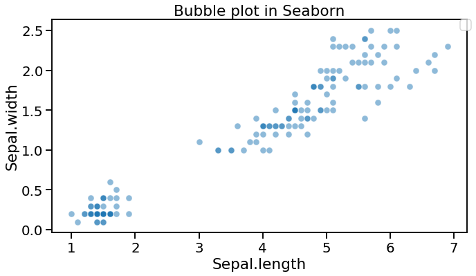
The below example depicts a bubble plot having colored bubbles:
Python3
import matplotlib.pyplot as plt
import pandas as pd
import seaborn as sns
df = pd.read_csv(data)
df.head()
sns.set_context("talk", font_scale=1.2)
plt.figure(figsize=(10,6))
sns.scatterplot(x='petal.length',
y='petal.width',
sizes=(20,500),
alpha=0.5,
data= df)
plt.legend(bbox_to_anchor=(1.01, 1),borderaxespad=0)
plt.xlabel("Sepal.length")
plt.ylabel("Sepal.width")
plt.title("Bubble plot in Seaborn")
plt.tight_layout()
|
Output:
Bubble plot with explicit size ranges Seaborn scatterplot()
We can alter the air bubble plot made with Seaborn without any problem. Something that we notice from the bubble plot above is that the bubble size range is by all accounts little. It will be extraordinary in the event that we could differ the littlest and biggest bubble sizes.
With the contention sizes in Seaborn‘s scatterplot() work, we can indicate ranges for the bubble sizes. In this air pocket plot model underneath, we utilized sizes=(20,500).
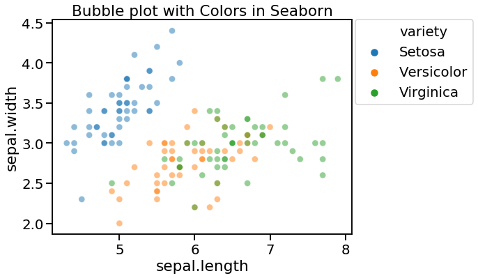
Python3
import matplotlib.pyplot as plt
import pandas as pd
import seaborn as sns
df = pd.read_csv(data)
df.head()
sns.set_context("talk", font_scale=1.2)
plt.figure(figsize=(10, 6))
sns.scatterplot(x='sepal.length',
y='sepal.width',
sizes=(20, 500),
alpha=0.5,
hue='variety',
data=df)
plt.legend(bbox_to_anchor=(1.01, 1), borderaxespad=0)
plt.xlabel("sepal.length")
plt.ylabel("sepal.width")
plt.title("Bubble plot with Colors in Seaborn")
plt.tight_layout()
|
Output:
Presently our bubble plot looks much better with the lowest bubble comparing to the lowest weight and the greatest bubble relates to the biggest weight. At the point when you have more factors in the information, we can shade the bubble by the fourth factor. To color the bubble plot by a variable, we determine tone contention.
Like Article
Suggest improvement
Share your thoughts in the comments
Please Login to comment...