A Data Visualization Duel: Line Charts vs. Area Charts
Last Updated :
16 Oct, 2023
In R Programming Language Data visualization is a crucial tool for conveying information effectively. When it comes to representing data trends and patterns over time, two popular choices are line charts and area charts. In this article, we’ll stage a “duel” between line charts and area charts, exploring their characteristics, use cases, advantages, and potential pitfalls to help you choose the right visualization technique for your data.
Line Charts
Line charts use lines to connect data points. Each data point represents a specific value at a given point in time or along the x-axis.
The line chart can be used for the following analysis:
- Trend Analysis: Line charts are excellent for displaying trends over time, such as stock price fluctuations, temperature changes, or website traffic over the course of a year.
- Comparisons: Line charts can be used to compare multiple trends on the same graph, making it easy to see how different variables evolve simultaneously.
Advantages
The advantages of the line chart are as follows:
- Clarity: Line charts provide a clear and concise representation of trends, making them easy to interpret.
- Precision: The use of lines allows for precise identification of individual data points.
- Anomalies: Line charts are effective at highlighting anomalies or sudden changes in data.
- Overcrowding: When too many lines are plotted on the same chart, it can become cluttered and challenging to interpret.
- Misleading Scaling: Care must be taken when scaling the axes, as altering the scaling can impact the perceived significance of trends.
Basic Line Chart
R
time <- 1:10
values <- c(10, 12, 15, 7, 20, 18, 25, 22, 28, 30)
plot(time, values, type = "o", col = "pink", xlab = "Time", ylab = "Values",
main = "Line Chart Example")
|
Output:

Line Charts
We define two vectors, time and values, to represent the x-axis (time) and y-axis (values) data points.
Create a Line Chart: We use the plot() function to create a line chart. The type = “o” argument specifies that we want both lines and points, and col = “blue” sets the color of the line and points to blue. We also label the axes and add a title to the chart.
Area Charts
An area chart is similar to a line chart, except the region below the lines in an area chart is filled with color or shading, making it simple to view the overall value across multiple data series. Area charts are frequently used to display trends and compare the contributions of various groups to the overall picture.
- Cumulative Data: Area charts are useful for displaying cumulative data, such as total sales over time or a running total of website visitors.
- Proportional Data: They can be used to show the proportion of different categories contributing to a whole, such as market share over time.
Advantages
The advantages of the area chart are as follows:
- Emphasis on Accumulation: Area charts highlight the accumulation of values over time, making them suitable for visualizing cumulative data.
- Comparative Analysis: They enable easy comparison of the relative contributions of different categories.
- Ambiguity: The filled area can sometimes make it challenging to discern precise values, especially when multiple areas overlap.
- Not Ideal for Negative Values: Area charts are less suitable for displaying data with negative values as the filled areas may overlap in confusing ways.
Basic Area Chart
R
library(ggplot2)
time <- 1:10
values <- c(3, 5, 9, 12, 7, 15, 20, 18, 25, 30)
data <- data.frame(Time = time, Values = values)
basic_area_plot <- ggplot(data, aes(x = Time, y = Values)) +
geom_area(fill = "green", alpha = 0.5) +
labs(title = "Basic Area Plot", x = "Time", y = "Values") +
theme_minimal()
print(basic_area_plot)
|
Output:

Area plot
- We load the ggplot2 library.
- We define some sample data in a data frame with two columns: Time and Values.
- We create an area plot using ggplot and geom_area. The aes function specifies the mapping of data to aesthetics, where x is mapped to the Time column, and y is mapped to the Values column.
- geom_area is used to create the area plot. We specify the fill parameter to set the fill color of the area (in this case, blue), and alpha controls the transparency of the fill.
- We add a title, labels for the x-axis and y-axis using labs, and choose a minimal theme with theme_minimal.
Combine Line and Area Plot
R
library(ggplot2)
time <- 1:10
values <- c(3, 5, 9, 12, 7, 15, 20, 18, 25, 30)
data <- data.frame(Time = time, Values = values)
combined_plot <- ggplot(data, aes(x = Time, y = Values)) +
geom_area(fill = "blue", alpha = 0.3) +
geom_line(color = "red", size = 1.5) +
labs(title = "Combined Area Plot and Line Chart", x = "Time", y = "Values") +
theme_minimal()
print(combined_plot)
|
Output:
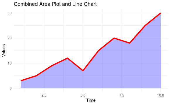
Combined Area & Line Plot
- We define some sample data in a data frame with two columns: Time and Values.
- We create a combined plot using ggplot with two geometries.
- geom_area creates the area plot with a blue fill (fill = “blue”) and a transparency level of 0.3 (alpha = 0.3).
- geom_line adds the line chart on top of the area plot, making it red (color = “red”) and with a thicker line (size = 1.5).
- We add a title, x-axis label, and y-axis label using labs.
- Finally, you apply a minimal theme to the plot with theme_minimal().
Customize the Combine Plot
R
library(ggplot2)
time <- 1:10
values <- c(3, 5, 9, 12, 7, 15, 20, 18, 25, 30)
data <- data.frame(Time = time, Values = values)
combined_plot <- ggplot(data, aes(x = Time, y = Values)) +
geom_area(fill = "yellow", alpha = 0.5) +
geom_line(color = "red", size = 1.5) +
geom_point(shape = 21, fill = "white", color = "blue", size = 3) +
labs(title = "Advanced Combined Plot", x = "Time", y = "Values") +
theme_minimal() +
theme(legend.position = "bottom",
legend.title = element_blank(),
axis.text = element_text(size = 12),
plot.title = element_text(size = 16, hjust = 0.5),
plot.margin = margin(20, 20, 20, 20))
print(combined_plot)
|
Output:

Customize the Combine Plot
- We create a ggplot object called combined_plot.
- ggplot(data, aes(x = Time, y = Values)): This sets up the basic plot with the Time variable on the x-axis and the Values variable on the y-axis.
- geom_area(fill = “yellow”, alpha = 0.5): This adds an area plot with a yellow fill and 0.5 transparency (alpha) to the plot.
- geom_line(color = “red”, size = 1.5): This adds a line chart in red with a thickness of 1.5 to the plot.
- geom_point(shape = 21, fill = “white”, color = “blue”, size = 3): This adds customized points to the plot with a white fill, blue border, and size of 3.
- labs(title = “Advanced Combined Plot”, x = “Time”, y = “Values”): This sets the plot title and axis labels.
- theme_minimal(): This applies a minimal theme to the plot for a cleaner look.
- theme: This customizes various plot elements, including the legend position, axis text size, plot title size, and plot margins.
Line chart vs Area chart
Line charts and area charts are both types of data visualization techniques used to represent data over a continuous interval and here are some distinct differences.
Line chart
|
Area chart
|
|
Line charts display data as a series of data points connected by straight lines.
|
An area chart is similar to a line chart, except the region below the lines in an area chart is filled with color or shading, making it simple to view the overall value across multiple data series.
|
|
Line charts emphasize the trend or pattern in the data, making it easy to observe fluctuations or changes over time or across a continuous variable.
|
Area charts are designed to emphasize the magnitude or proportion of the data as it varies over time or across a continuous variable.
|
|
Line charts are particularly effective when showing changes in one variable or comparing the changes in multiple variables over the same time or continuous range.
|
Area charts are typically used to compare the contribution of multiple variables to a whole, showing how each part changes over time.
|
Conclusion
Line charts are excellent for emphasizing trends and changes in continuous data and are ideal for time series analysis. Area charts are powerful for highlighting the cumulative effect and the composition of data. The choice between line charts and area charts depends on our data and the story we want to convey. Sometimes, a combination of both chart types may be the most effective way to present complex data.
Share your thoughts in the comments
Please Login to comment...