Matplotlib Tutorial
Last Updated :
08 Apr, 2024
Matplotlib is easy to use and an amazing visualizing library in Python. It is built on NumPy arrays and designed to work with the broader SciPy stack and consists of several plots like line, bar, scatter, histogram, etc.
In this article, you’ll gain a comprehensive understanding of the diverse range of plots and charts supported by Matplotlib, empowering you to create compelling and informative visualizations for your data analysis tasks.
Matplotlib Getting Started
Before we start we will check if Python is Installed in your system, If not follow this article:
Creating Different Types of Plot
In data visualization, creating various types of plots is essential for effectively conveying insights from data. Below, we’ll explore how to create different types of plots using Matplotlib, a powerful plotting library in Python.
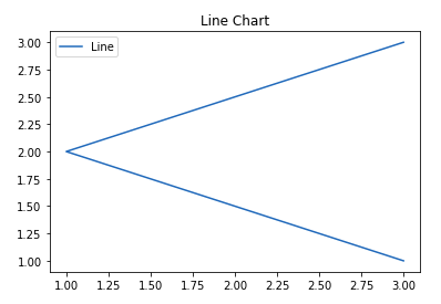
Line graphs are commonly used to visualize trends over time or relationships between variables. We’ll learn how to create visually appealing line graphs to represent such data.
Example
Python3
import matplotlib.pyplot as plt
# data to display on plots
x = [3, 1, 3]
y = [3, 2, 1]

# This will plot a simple line chart
# with elements of x as x axis and y
# as y axis
plt.plot(x, y)
plt.title("Line Chart")

# Adding the legends
plt.legend(["Line"])
plt.show()
Output
A stem plot, also known as a stem-and-leaf plot, is a type of plot used to display data along a number line. Stem plots are particularly useful for visualizing discrete data sets, where the values are represented as “stems” extending from a baseline, with data points indicated as “leaves” along the stems. let’s understand the components of a typical stem plot:
- Stems: The stems represent the main values of the data and are typically drawn vertically along the y-axis.
- Leaves: The leaves correspond to the individual data points and are plotted horizontally along the stems.
- Baseline: The baseline serves as the reference line along which the stems are drawn.
Example
Python3
# importing libraries
import matplotlib.pyplot as plt
import numpy as np

x = np.linspace(0.1, 2 * np.pi, 41)
y = np.exp(np.sin(x))

plt.stem(x, y, use_line_collection = True)
plt.show()
Output

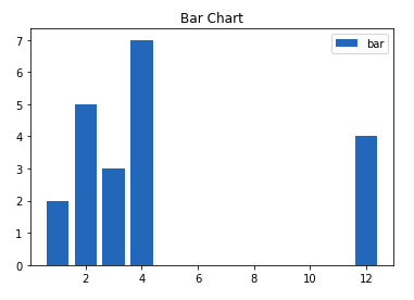
A bar plot or bar chart is a graph that represents the category of data with rectangular bars with lengths and heights that is proportional to the values which they represent. The bar plots can be plotted horizontally or vertically. A bar chart describes the comparisons between the discrete categories. It can be created using the bar() method.
Example
Python3
import matplotlib.pyplot as plt
# data to display on plots
x = [3, 1, 3, 12, 2, 4, 4]
y = [3, 2, 1, 4, 5, 6, 7]

# This will plot a simple bar chart
plt.bar(x, y)

# Title to the plot
plt.title("Bar Chart")

# Adding the legends
plt.legend(["bar"])
plt.show()
Output
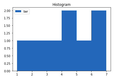
A histogram is basically used to represent data in the form of some groups. It is a type of bar plot where the X-axis represents the bin ranges while the Y-axis gives information about frequency. To create a histogram the first step is to create a bin of the ranges, then distribute the whole range of the values into a series of intervals, and count the values which fall into each of the intervals. Bins are clearly identified as consecutive, non-overlapping intervals of variables.
Example
Python3
import matplotlib.pyplot as plt
# data to display on plots
x = [1, 2, 3, 4, 5, 6, 7, 4]
# This will plot a simple histogram
plt.hist(x, bins = [1, 2, 3, 4, 5, 6, 7])
# Title to the plot
plt.title("Histogram")
# Adding the legends
plt.legend(["bar"])
plt.show()
Output
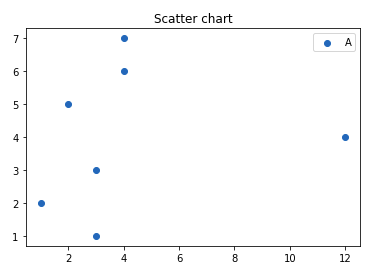
Scatter plots are ideal for visualizing the relationship between two continuous variables. We’ll see how scatter plots help identify patterns, correlations, or clusters within data points.
Python3
import matplotlib.pyplot as plt
# data to display on plots
x = [3, 1, 3, 12, 2, 4, 4]
y = [3, 2, 1, 4, 5, 6, 7]

# This will plot a simple scatter chart
plt.scatter(x, y)

# Adding legend to the plot
plt.legend("A")

# Title to the plot
plt.title("Scatter chart")
plt.show()
Output
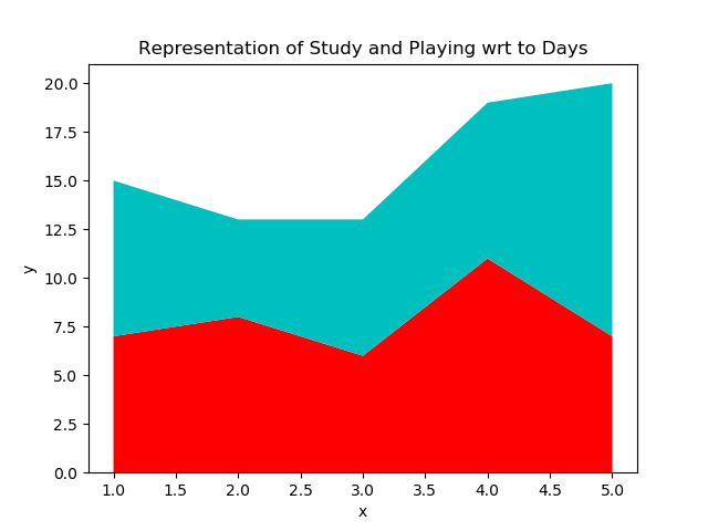
Stackplot, also known as a stacked area plot, is a type of plot that displays the contribution of different categories or components to the total value over a continuous range, typically time. It is particularly useful for illustrating changes in the distribution of data across multiple categories or groups.
Python3
import matplotlib.pyplot as plt

# List of Days
days = [1, 2, 3, 4, 5]

# No of Study Hours
Studying = [7, 8, 6, 11, 7]

# No of Playing Hours
playing = [8, 5, 7, 8, 13]

# Stackplot with X, Y, colors value
plt.stackplot(days, Studying, playing,
            colors =['r', 'c'])

# Days
plt.xlabel('Days')

# No of hours
plt.ylabel('No of Hours')

# Title of Graph
plt.title('Representation of Study and \
Playing wrt to Days')

# Displaying Graph
plt.show()
Output
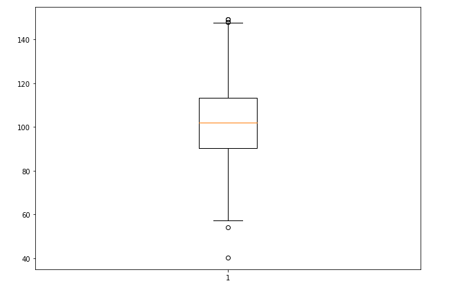
A box plot, also known as a box-and-whisker plot, provides a visual summary of the distribution of a dataset. It represents key statistical measures such as the median, quartiles, and potential outliers in a concise and intuitive manner. Box plots are particularly useful for comparing distributions across different groups or identifying anomalies in the data.
Python3
# Import libraries
import matplotlib.pyplot as plt
import numpy as np


# Creating dataset
np.random.seed(10)
data = np.random.normal(100, 20, 200)

fig = plt.figure(figsize =(10, 7))

# Creating plot
plt.boxplot(data)

# show plot
plt.show()
Output
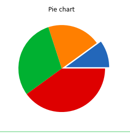
A Pie Chart is a circular statistical plot that can display only one series of data. The area of the chart is the total percentage of the given data. The area of slices of the pie represents the percentage of the parts of the data. The slices of pie are called wedges. The area of the wedge is determined by the length of the arc of the wedge.
Python3
import matplotlib.pyplot as plt
# data to display on plots
x = [1, 2, 3, 4]

# this will explode the 1st wedge
# i.e. will separate the 1st wedge
# from the chart
e  =(0.1, 0, 0, 0)

# This will plot a simple pie chart
plt.pie(x, explode = e)

# Title to the plot
plt.title("Pie chart")
plt.show()
Output
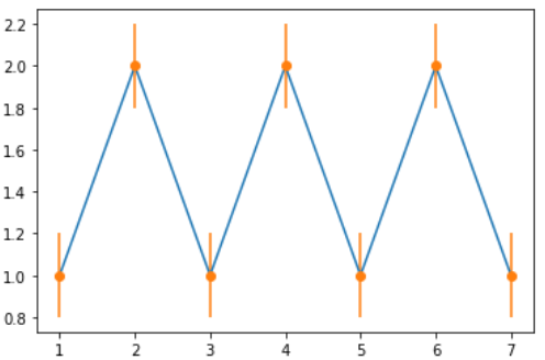
Error plots display the variability or uncertainty associated with each data point in a dataset. They are commonly used in scientific research, engineering, and statistical analysis to visualize measurement errors, confidence intervals, standard deviations, or other statistical properties of the data. By incorporating error bars into plots, we can convey not only the central tendency of the data but also the range of possible values around each point.
Python3
# importing matplotlib
import matplotlib.pyplot as plt


# making a simple plot
x =[1, 2, 3, 4, 5, 6, 7]
y =[1, 2, 1, 2, 1, 2, 1]

# creating error
y_error = 0.2

# plotting graph
plt.plot(x, y)

plt.errorbar(x, y,
            yerr = y_error,
            fmt ='o')
Output
A violin plot is a method of visualizing the distribution of numerical data and its probability density. It is similar to a box plot but provides additional insights into the data’s distribution by incorporating a kernel density estimation (KDE) plot mirrored on each side. This allows for a more comprehensive understanding of the data’s central tendency, spread, and shape.
Python3
import numpy as np
import matplotlib.pyplot as plt

# creating a list of
# uniformly distributed values
uniform = np.arange(-100, 100)

# creating a list of normally
# distributed values
normal = np.random.normal(size = 100)*30

# creating figure and axes to
# plot the image
fig, (ax1, ax2) = plt.subplots(nrows = 1,
                            ncols = 2,
                            figsize =(9, 4),
                            sharey = True)

# plotting violin plot for
# uniform distribution
ax1.set_title('Uniform Distribution')
ax1.set_ylabel('Observed values')
ax1.violinplot(uniform)

# plotting violin plot for
# normal distribution
ax2.set_title('Normal Distribution')
ax2.violinplot(normal)

# Function to show the plot
plt.show()
Output

Sometimes, data visualization requires a three-dimensional perspective. We’ll delve into creating 3D plots to visualize complex relationships and structures within multidimensional datasets.
Python3
import matplotlib.pyplot as plt
# Creating the figure object
fig = plt.figure()

# keeping the projection = 3d
# creates the 3d plot
ax = plt.axes(projection = '3d')
Output:
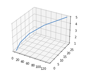
The above code lets the creation of a 3D plot in Matplotlib. We can create different types of 3D plots like scatter plots, contour plots, surface plots, etc. Let’s create a simple 3D line plot.
Python3
import matplotlib.pyplot as plt
x = [1, 2, 3, 4, 5]
y = [1, 4, 9, 16, 25]
z = [1, 8, 27, 64, 125]
# Creating the figure object
fig = plt.figure()
# keeping the projection = 3d
# creates the 3d plot
ax = plt.axes(projection = '3d')
ax.plot3D(z, y, x)
Output
Share your thoughts in the comments
Please Login to comment...