How to Change the Transparency of a Graph Plot in Matplotlib with Python?
Last Updated :
25 Nov, 2020
Matplotlib is a library in Python and it is numerical — mathematical extension for NumPy library. Pyplot is a state-based interface to a matplotlib module which provides a MATLAB-like interface. There are various plots that can be used in Pyplot are Line Plot, Contour, Histogram, Scatter, 3D Plot, etc.
In order to change the transparency of a graph plot in matplotlib we will use the matplotlib.pyplot.plot() function. The plot() function in pyplot module of matplotlib library is used to make 2D illustrations.
Syntax: matplotlib.pyplot.plot(\*args, scalex=True, scaley=True, data=None, \*\*kwargs)
Parameters: This method accept the following parameters that are described below:
- x, y: These parameter are the horizontal and vertical coordinates of the data points. x values are optional.
- fmt: This parameter is an optional parameter and it contains the string value.
- data: This parameter is an optional parameter and it is an object with labelled data.
Returns: This returns the following:
- lines : This returns the list of Line2D objects representing the plotted data.
Another argument that we are going to use is alpha argument, this argument is responsible for the transparency of any illustration depicted using matplotlib library. Its value ranges from 0 to 1, by default its value is 1 representing the opaqueness of the illustration.
Below are some examples which depict how to change the transparency of a Graph Plot using matplotlib library
Example 1:
Python3
import matplotlib.pyplot as plt
y = [0, 1, 2, 3, 4, 5]
x = [0, 5, 10, 15, 20, 25]
plt.plot(x, y, color='green', alpha=0.25)
plt.xlabel('x')
plt.ylabel('y')
plt.title("Linear graph")
plt.show()
|
Output:
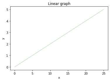
In the above program, the linear graph is depicted with transparency i.e alpha=0.25.
Example 2:
Python3
import matplotlib.pyplot as plt
x = [-5, -4, -3, -2, -1, 0, 1, 2, 3, 4, 5]
y = []
for i in range(len(x)):
y.append(max(0, x[i]))
plt.plot(x, y, color='green', alpha=0.75)
plt.xlabel('x')
plt.ylabel('y')
plt.title(label="ReLU function graph",
fontsize=40,
color="green")
|
Output:
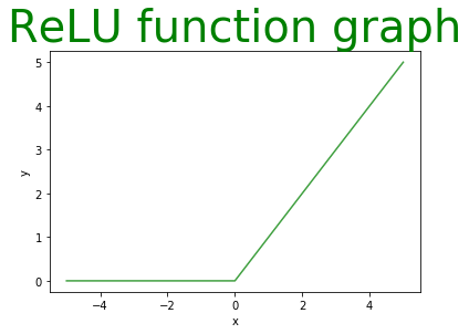
Here, the plot is quite opaque as the alphavalue is close to 1(opaque).
Example 3:
Python3
from matplotlib import pyplot
import numpy
signalTime = numpy.arange(0, 100, 0.5)
signalAmplitude = numpy.sin(signalTime)
pyplot.plot(signalTime, signalAmplitude,
color='green', alpha=0.1)
pyplot.xlabel('Time')
pyplot.ylabel('Amplitude')
pyplot.title("Signal",
loc='right',
rotation=45)
|
Output:
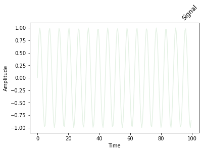
The above example depicts a signal with an alpha value 0.1.
Example 4:
Python3
import matplotlib.pyplot as plt
z = [i for i in range(0, 6)]
for i in range(0, 11, 2):
plt.plot(z, z, color='green', alpha=i/10)
plt.xlabel('x')
plt.ylabel('y')
print('\nIllustration with alpha =', i/10)
plt.show()
|
Output:
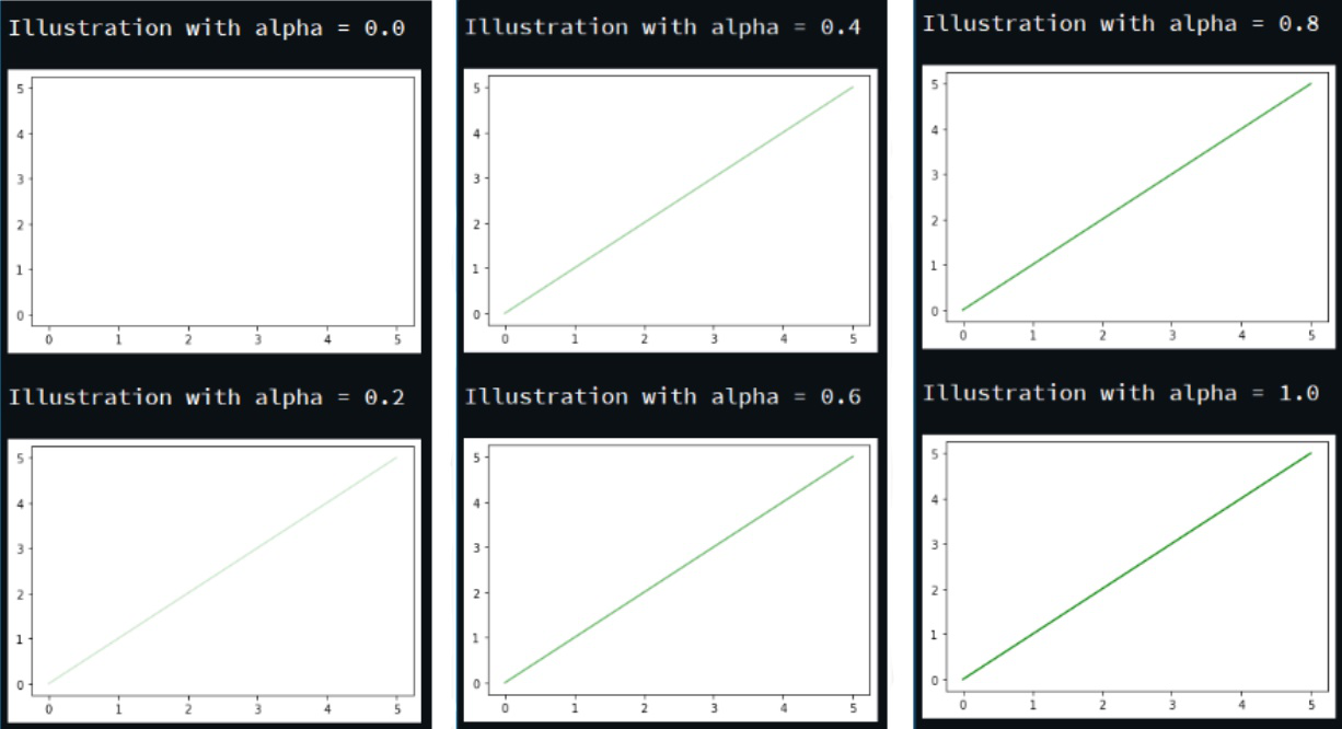
The above program depicts the same illustration with variable alpha values.
Share your thoughts in the comments
Please Login to comment...