How to create a Scatter Plot with several colors in Matplotlib?
Last Updated :
10 Jan, 2024
Matplotlib is a plotting library for creating static, animated, and interactive visualizations in Python. Matplotlib can be used in Python scripts, the Python and IPython shell, web application servers, and various graphical user interface toolkits like Tkinter, awxPython, etc. In this article, we will see how to create a scatter plot with different colors in Matplotlib.
Parameter Marker Color to Create a Scatter Plot
The possible values for marker color are:
- A single color format string.
- A 2-D array in which the rows are RGB or RGBA.
Create a Scatter Plot with Several Colors in Matplotlib Example
Below are some examples by which we can see how to customize Matplotlib plots with different colors and change colors in Matplotlib in Python:
- Creating Scatter Plots with Matplotlib
- Scatter Plot with Categorical Coloring
Matplotlib Customize Plot Colors Using Scatter Plots
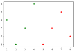
In this example, we are using the Matplotlib library to generate two scatter plots. The first set of data points (x=[1, 2, 3, 4], y=[4, 1, 3, 6]) is depicted as green dots, while the second set (x=[5, 6, 7, 8], y=[1, 3, 5, 2]) is shown in red. The plt.scatter() function is used to create each scatter plot, specifying the x and y coordinates along with the color (‘c’) of the markers.
Python3
import matplotlib.pyplot as plt
x = [1, 2, 3, 4]
y = [4, 1, 3, 6]
plt.scatter(x, y, c='green')
x = [5, 6, 7, 8]
y = [1, 3, 5, 2]
plt.scatter(x, y, c='red')
plt.show()
|
Output:
create a Scatter Plot with several colors in Matplotlib
Matplotlib Scatter Plot with Categorical Coloring using Colormap
Example 1: Create a Scatter Plot with RGB Colors
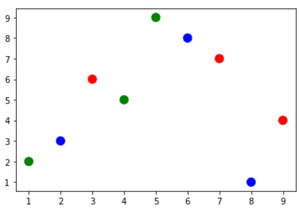
Colormap instances are used to convert data values (floats) from the interval [0, 1] to the RGBA color. In this example, the code utilizes the Matplotlib library to create a scatter plot. It first imports necessary modules, including matplotlib.pyplot and NumPy. Data points are represented by a 2D array ‘a’, with each column containing x and y coordinates.
Python3
import matplotlib.pyplot as plt
import numpy
a = numpy.array([[9, 1, 2, 7, 5, 8, 3, 4, 6],
[4, 2, 3, 7, 9, 1, 6, 5, 8]])
categories = numpy.array([0, 1, 2, 0, 1, 2, 0, 1, 2])
colormap = numpy.array(['r', 'g', 'b'])
plt.scatter(a[0], a[1], s=100, c=colormap[categories])
plt.show()
|
Output:
create a Scatter Plot with several colors in Matplotlib
Example 2: Create a Scatter Plot Using Color Codes
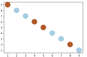
In this example, we are using Matplotlib to generate a scatter plot with specific data points and color-coded categories. Initially, essential modules such as Matplotlib and NumPy are imported. The data points are defined as a NumPy array ‘a,’ consisting of two arrays representing x and y coordinates.
Python3
import matplotlib.pyplot as plt
import numpy
a = numpy.array([[1, 2, 3, 4, 5, 6, 7, 8, 9],
[9, 8, 7, 6, 5, 4, 3, 2, 1]])
categories = numpy.array([0, 1, 1, 0, 0, 1, 1, 0, 1])
color1 = (0.69411766529083252, 0.3490196168422699,
0.15686275064945221, 1.0)
color2 = (0.65098041296005249, 0.80784314870834351,
0.89019608497619629, 1.0)
colormap = numpy.array([color1, color2])
plt.scatter(a[0], a[1], s=500, c=colormap[categories])
plt.show()
|
Output:
create a Scatter Plot with several colors in Matplotlib
Like Article
Suggest improvement
Share your thoughts in the comments
Please Login to comment...