Plot a pie chart in Python using Matplotlib
Last Updated :
10 Jan, 2024
A Pie Chart is a circular statistical plot that can display only one series of data. The area of the chart is the total percentage of the given data. Pie charts are commonly used in business presentations like sales, operations, survey results, resources, etc. as they provide a quick summary. In this article, let’s understand how to create pie chart in python with pie diagram.
How to draw pie chart?
Matplotlib API has pie() function in its pyplot module which create a pie chart representing the data in an array. let’s create pie chart in python.
Syntax: matplotlib.pyplot.pie(data, explode=None, labels=None, colors=None, autopct=None, shadow=False)
Parameters:
data represents the array of data values to be plotted, the fractional area of each slice is represented by data/sum(data). If sum(data)<1, then the data values returns the fractional area directly, thus resulting pie will have empty wedge of size 1-sum(data).
labels is a list of sequence of strings which sets the label of each wedge.
color attribute is used to provide color to the wedges.
autopct is a string used to label the wedge with their numerical value.
shadow is used to create shadow of wedge.
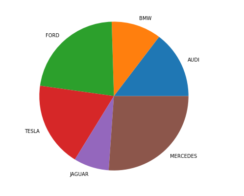
Let’s create a simple pie chart using the pie() function:
Python3
from matplotlib import pyplot as plt
import numpy as np
cars = ['AUDI', 'BMW', 'FORD',
'TESLA', 'JAGUAR', 'MERCEDES']
data = [23, 17, 35, 29, 12, 41]
fig = plt.figure(figsize=(10, 7))
plt.pie(data, labels=cars)
plt.show()
|
Output:
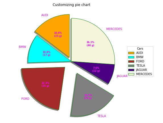
A pie chart can be customized on the basis several aspects. The startangle attribute rotates the plot by the specified degrees in counter clockwise direction performed on x-axis of pie chart. shadow attribute accepts boolean value, if its true then shadow will appear below the rim of pie. Wedges of the pie can be customized using wedgeprop which takes Python dictionary as parameter with name values pairs denoting the wedge properties like linewidth, edgecolor, etc. By setting frame=True axes frame is drawn around the pie chart.autopct controls how the percentages are displayed on the wedges. Let us try to modify the above pie chart in python.
The explode parameter separates a portion of the chart, and colors define each wedge’s color. The autopct function customizes text display, and legend and title functions enhance chart readability and aesthetics.
Python3
import numpy as np
import matplotlib.pyplot as plt
cars = ['AUDI', 'BMW', 'FORD',
'TESLA', 'JAGUAR', 'MERCEDES']
data = [23, 17, 35, 29, 12, 41]
explode = (0.1, 0.0, 0.2, 0.3, 0.0, 0.0)
colors = ("orange", "cyan", "brown",
"grey", "indigo", "beige")
wp = {'linewidth': 1, 'edgecolor': "green"}
def func(pct, allvalues):
absolute = int(pct / 100.*np.sum(allvalues))
return "{:.1f}%\n({:d} g)".format(pct, absolute)
fig, ax = plt.subplots(figsize=(10, 7))
wedges, texts, autotexts = ax.pie(data,
autopct=lambda pct: func(pct, data),
explode=explode,
labels=cars,
shadow=True,
colors=colors,
startangle=90,
wedgeprops=wp,
textprops=dict(color="magenta"))
ax.legend(wedges, cars,
title="Cars",
loc="center left",
bbox_to_anchor=(1, 0, 0.5, 1))
plt.setp(autotexts, size=8, weight="bold")
ax.set_title("Customizing pie chart")
plt.show()
|
Output:
Nested Pie Chart
Python3
from matplotlib import pyplot as plt
import numpy as np
size = 6
cars = ['AUDI', 'BMW', 'FORD',
'TESLA', 'JAGUAR', 'MERCEDES']
data = np.array([[23, 16], [17, 23],
[35, 11], [29, 33],
[12, 27], [41, 42]])
norm = data / np.sum(data)*2 * np.pi
left = np.cumsum(np.append(0,
norm.flatten()[:-1])).reshape(data.shape)
cmap = plt.get_cmap("tab20c")
outer_colors = cmap(np.arange(6)*4)
inner_colors = cmap(np.array([1, 2, 5, 6, 9,
10, 12, 13, 15,
17, 18, 20]))
fig, ax = plt.subplots(figsize=(10, 7),
subplot_kw=dict(polar=True))
ax.bar(x=left[:, 0],
width=norm.sum(axis=1),
bottom=1-size,
height=size,
color=outer_colors,
edgecolor='w',
linewidth=1,
align="edge")
ax.bar(x=left.flatten(),
width=norm.flatten(),
bottom=1-2 * size,
height=size,
color=inner_colors,
edgecolor='w',
linewidth=1,
align="edge")
ax.set(title="Nested pie chart")
ax.set_axis_off()
plt.show()
|
Output:
Conclusion
In summary, creating a pie chart in Python using Matplotlib’s pie() function is a straightforward process. Customizations such as explode, colors, autopct, and others offer flexibility in visual representation, making pie charts effective for summarizing data in business presentations.
Frequently Asked Questions (FAQs)
Q. How do you create a pie chart using matplotlib?
Use Matplotlib’s pie() function, providing data, labels, colors, and other optional parameters for customization.
Q.How do I show percentages in a pie chart using matplotlib?
Utilize the autopct parameter in the pie() function to display percentages on the wedges.
Q.How do you plot a pie chart?
Use Matplotlib’s pie() function, passing data, labels, and other optional parameters to create a pie chart in Python.
Q.How do you show values in a pie chart in Python?
The autopct parameter in Matplotlib’s pie() function allows you to display numerical values on the pie chart.
Q.Why use pie chart in Python?
Pie charts offer a visual representation of data percentages, making them effective for summarizing and presenting information in a clear and concise manner.
Share your thoughts in the comments
Please Login to comment...