Line chart in Matplotlib – Python
Last Updated :
09 Jan, 2024
Matplotlib is a data visualization library in Python. The pyplot, a sublibrary of Matplotlib, is a collection of functions that helps in creating a variety of charts. Line charts are used to represent the relation between two data X and Y on a different axis. In this article, we will learn about line charts and matplotlib simple line plots in Python.
Python Line chart in Matplotlib
Here, we will see some of the examples of a line chart in Python using Matplotlib:
Matplotlib Simple Line Plot
In this example, a simple line chart is generated using NumPy to define data values. The x-values are evenly spaced points, and the y-values are calculated as twice the corresponding x-values.
Python3
import matplotlib.pyplot as plt
import numpy as np
x = np.array([1, 2, 3, 4])
y = x*2
plt.plot(x, y)
plt.show()
|
Output:
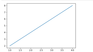
Simple line plot between X and Y data
We can see in the above output image that there is no label on the x-axis and y-axis. Since labeling is necessary for understanding the chart dimensions. In the following example, we will see how to add labels, Ident in the charts.
Python3
import matplotlib.pyplot as plt
import numpy as np
x = np.array([1, 2, 3, 4])
y = x*2
plt.plot(x, y)
plt.xlabel("X-axis")
plt.ylabel("Y-axis")
plt.title("Any suitable title")
plt.show()
|
Output:
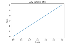
Simple line plot with labels and title
Line Chart with Annotations
In this example, a line chart is created using sample data points. Annotations displaying the x and y coordinates are added to each data point on the line chart for enhanced clarity.
Python3
import matplotlib.pyplot as plt
x = [1, 2, 3, 4, 5]
y = [2, 4, 6, 8, 10]
plt.figure(figsize=(8, 6))
plt.plot(x, y, marker='o', linestyle='-')
for i, (xi, yi) in enumerate(zip(x, y)):
plt.annotate(f'({xi}, {yi})', (xi, yi), textcoords="offset points", xytext=(0, 10), ha='center')
plt.title('Line Chart with Annotations')
plt.xlabel('X-axis Label')
plt.ylabel('Y-axis Label')
plt.grid(True)
plt.show()
|
Output:

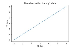
Multiple Line Charts Using Matplotlib
We can display more than one chart in the same container by using pyplot.figure() function. This will help us in comparing the different charts and also control the look and feel of charts.
Python3
import matplotlib.pyplot as plt
import numpy as np
x = np.array([1, 2, 3, 4])
y = x*2
plt.plot(x, y)
plt.xlabel("X-axis")
plt.ylabel("Y-axis")
plt.title("Any suitable title")
plt.show()
plt.figure()
x1 = [2, 4, 6, 8]
y1 = [3, 5, 7, 9]
plt.plot(x1, y1, '-.')
plt.show()
|
Output:
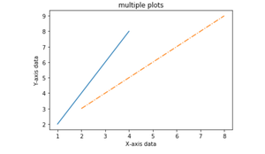
Multiple Plots on the Same Axis
Here, we will see how to add 2 plots within the same axis.
Python3
import matplotlib.pyplot as plt
import numpy as np
x = np.array([1, 2, 3, 4])
y = x*2
plt.plot(x, y)
x1 = [2, 4, 6, 8]
y1 = [3, 5, 7, 9]
plt.plot(x1, y1, '-.')
plt.xlabel("X-axis data")
plt.ylabel("Y-axis data")
plt.title('multiple plots')
plt.show()
|
Output:
Fill the Area Between Two Lines
Using the pyplot.fill_between() function we can fill in the region between two line plots in the same graph. This will help us in understanding the margin of data between two line plots based on certain conditions.
Python3
import matplotlib.pyplot as plt
import numpy as np
x = np.array([1, 2, 3, 4])
y = x*2
plt.plot(x, y)
x1 = [2, 4, 6, 8]
y1 = [3, 5, 7, 9]
plt.plot(x, y1, '-.')
plt.xlabel("X-axis data")
plt.ylabel("Y-axis data")
plt.title('multiple plots')
plt.fill_between(x, y, y1, color='green', alpha=0.5)
plt.show()
|
Output:
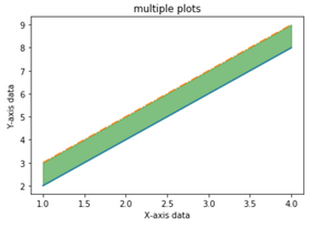
Fill the area between Y and Y1 data corresponding to X-axis data
Like Article
Suggest improvement
Share your thoughts in the comments
Please Login to comment...