Stacked Percentage Bar Plot In MatPlotLib
Last Updated :
21 Mar, 2024
A Stacked Percentage Bar Chart is a simple bar chart in the stacked form with a percentage of each subgroup in a group. Stacked bar plots represent different groups on the top of one another. The height of the bar depends on the resulting height of the combination of the results of the groups. It goes from the bottom to the value instead of going from zero to value. A percent stacked bar chart is almost the same as a stacked barchart. Subgroups are displayed on top of each other, but data are normalized to make in a sort that the sum of every subgroup is the same as the total for each one.
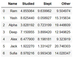
The dataset used in the following examples is shown below :
Procedure: The procedure to draw Stacked Percentage Bar Chart is the following steps which are described below with examples :
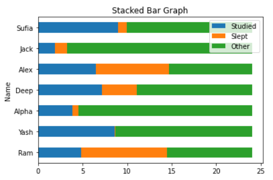
1. Draw a stacked bar chart using data (dataset, dictionary, etc.).
Python3
import pandas as pd
import matplotlib.pyplot as plt
df = pd.read_excel("Hours.xlsx")
print(df)
df.plot(
x = 'Name',
kind = 'barh',
stacked = True,
title = 'Stacked Bar Graph',
mark_right = True)
|
Output:
    Name   Studied     Slept      Other
0    Ram  4.855064  9.639962   9.504974
1   Yash  8.625440  0.058927  15.315634
2  Alpha  3.828192  0.723199  19.448609
3   Deep  7.150955  3.899420  12.949625
4   Alex  6.477900  8.198181   9.323919
5   Jack  1.922270  1.331427  20.746303
6  Sufia  8.978216  0.993438  14.028347
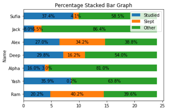
2. Add Percentage on subgroups of each group.
Python3
import pandas as pd
import numpy as np
import matplotlib.pyplot as plt
df = pd.read_excel("Hours.xlsx")
print(df)
df.plot(
x = 'Name',
kind = 'barh',
stacked = True,
title = 'Percentage Stacked Bar Graph',
mark_right = True)
df_total = df["Studied"] + df["Slept"] + df["Other"]
df_rel = df[df.columns[1:]].div(df_total, 0)*100
for n in df_rel:
for i, (cs, ab, pc) in enumerate(zip(df.iloc[:, 1:].cumsum(1)[n],
df[n], df_rel[n])):
plt.text(cs - ab / 2, i, str(np.round(pc, 1)) + '%',
va = 'center', ha = 'center')
|
Output:
     Name   Studied     Slept      Other
0    Ram  4.855064  9.639962   9.504974
1   Yash  8.625440  0.058927  15.315634
2  Alpha  3.828192  0.723199  19.448609
3   Deep  7.150955  3.899420  12.949625
4   Alex  6.477900  8.198181   9.323919
5   Jack  1.922270  1.331427  20.746303
6  Sufia  8.978216  0.993438  14.028347
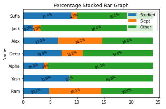
3. Edit the chart with some features (optional).
Python3
import pandas as pd
import numpy as np
import matplotlib.pyplot as plt
df = pd.read_xlsx("Hours.xlsx")
print(df)
df.plot(
x = 'Name',
kind = 'barh',
stacked = True,
title = 'Percentage Stacked Bar Graph',
mark_right = True)
df_total = df["Studied"] + df["Slept"] + df["Other"]
df_rel = df[df.columns[1:]].div(df_total, 0) * 100
for n in df_rel:
for i, (cs, ab, pc) in enumerate(zip(df.iloc[:, 1:].cumsum(1)[n],
df[n], df_rel[n])):
plt.text(cs - ab / 2, i, str(np.round(pc, 1)) + '%',
va = 'center', ha = 'center', rotation = 20, fontsize = 8)
|
Output:
    Name   Studied     Slept      Other
0    Ram  4.855064  9.639962   9.504974
1   Yash  8.625440  0.058927  15.315634
2  Alpha  3.828192  0.723199  19.448609
3   Deep  7.150955  3.899420  12.949625
4   Alex  6.477900  8.198181   9.323919
5   Jack  1.922270  1.331427  20.746303
6  Sufia  8.978216  0.993438  14.028347
Share your thoughts in the comments
Please Login to comment...