How to Create Multiple Subplots in Matplotlib in Python?
Last Updated :
16 Jan, 2024
To create multiple plots use matplotlib.pyplot.subplots method which returns the figure along with the objects Axes object or array of Axes object. nrows, ncols attributes of subplots() method determine the number of rows and columns of the subplot grid.
By default, it returns a figure with a single plot. For each axes object i.e. plot we can set a title (set via set_title()), an x-label (set via set_xlabel()), and a y-label set via set_ylabel()).
Let’s see how this works:
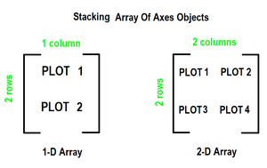
- When we call the subplots() method by stacking only in one direction it returns a 1D array of axes objects i.e. subplots.
- We can access these axes objects using indices just like we access elements of the array. To create specific subplots, call matplotlib.pyplot.plot() on the corresponding index of the axes. Refer to the following figure for a better understanding
Create Multiple Subplots in Matplotlib in Python
Here, we have various Ways to Matplotlib create subplots in Python. Here, we are using some generally used Ways to Matplotlib create subplots in Python those are following.
- 1-D Array of Subplots
- Using Stacking in Two Directions
- Using
plt.subplots with 2D Array of Subplots
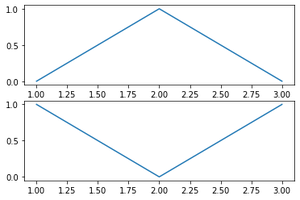
Subplots in Matplotlib Using 1-D Array of Subplots
In this example code utilizes Matplotlib to generate a figure with two subplots. The data, represented by arrays ‘x,’ ‘y,’ and ‘z,’ is plotted on separate axes within the figure. The resulting visualization displays distinct plots for the datasets ‘y’ and ‘z’ in the designated subplots.
Python3
import matplotlib.pyplot as plt
x = [1, 2, 3]
y = [0, 1, 0]
z = [1, 0, 1]
fig, ax = plt.subplots(2)
ax[0].plot(x, y)
ax[1].plot(x, z)
|
Output
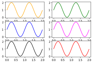
Subplots in Matplotlib Using Stacking in Two Directions
In this Python script, the Matplotlib library is imported, and NumPy is used for numerical operations. Data for plotting sine waves is generated. The script then creates a 3×2 grid of subplots, each plotting the same sine wave with different colors (orange, green, blue, magenta, black, and red).
Python3
import matplotlib.pyplot as plt
import numpy as np
x = np.arange(0.0, 2.0, 0.01)
y = 1 + np.sin(2 * np.pi * x)
fig, ((ax1, ax2), (ax3, ax4), (ax5, ax6)) = plt.subplots(3, 2)
ax1.plot(x, y, color="orange")
ax2.plot(x, y, color="green")
ax3.plot(x, y, color="blue")
ax4.plot(x, y, color="magenta")
ax5.plot(x, y, color="black")
ax6.plot(x, y, color="red")
|
Output
Subplots_fig2
Matplotlib Multiple Plots Same Figure
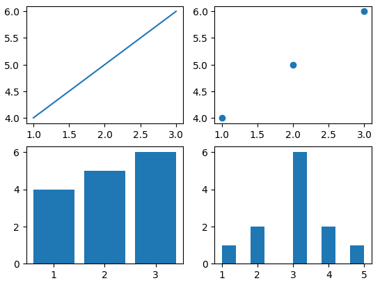
In this example Python script utilizes Matplotlib to create a 2×2 grid of subplots. Each subplot showcases a different type of plot: line plot, scatter plot, bar plot, and histogram. The Axes objects are accessed through the 2D array ‘axs,’ and specific data is visualized in each subplot, demonstrating the flexibility of Matplotlib for diverse plotting needs.
Python3
import matplotlib.pyplot as plt
fig, axs = plt.subplots(2, 2)
axs[0, 0].plot([1, 2, 3], [4, 5, 6])
axs[0, 1].scatter([1, 2, 3], [4, 5, 6])
axs[1, 0].bar([1, 2, 3], [4, 5, 6])
axs[1, 1].hist([1, 2, 2, 3, 3, 3, 3, 3, 3, 4, 4, 5])
plt.show()
|
Output
Share your thoughts in the comments
Please Login to comment...