Line plot styles in Matplotlib
Last Updated :
09 Jan, 2024
Python is a high-level, interpreted, and dynamically typed programming language that can be used to manage huge datasets. Python supports a wide variety of data visualization libraries like Matplotlib, Seaborn, Bokeh, Geoplotlib, Ggplot, and Plotly. Among all these libraries, Matplotlib is comparatively simple and easy to implement.
The Matplotlib library of Python is a popular choice for data visualization due to its wide variety of chart types and its properties that can be manipulated to create chart styles. The matplotlib.pyplot.plot(*args, **kwargs) method of matplotlib.pyplot is used to plot the graph and specify the graph style like color or line style.
Line Styles in Matplotlib
Below are the available line styles present in Matplotlib.
|
Character
|
Definition
|
|
–
|
Solid line
|
|
—
|
Dashed line
|
|
-.
|
dash-dot line
|
|
:
|
Dotted line
|
|
.
|
Point marker
|
|
o
|
Circle marker
|
|
,
|
Pixel marker
|
|
v
|
triangle_down marker
|
|
^
|
triangle_up marker
|
|
<
|
triangle_left marker
|
|
>
|
triangle_right marker
|
|
1
|
tri_down marker
|
|
2
|
tri_up marker
|
|
3
|
tri_left marker
|
|
4
|
tri_right marker
|
|
s
|
square marker
|
|
p
|
pentagon marker
|
|
*
|
star marker
|
|
h
|
hexagon1 marker
|
|
H
|
hexagon2 marker
|
|
+
|
Plus marker
|
|
x
|
X marker
|
|
D
|
Diamond marker
|
|
d
|
thin_diamond marker
|
|
|
|
vline marker
|
|
_
|
hline marker
|
Color code abbreviations that can be used along with the line styles
|
b
|
blue
|
|
g
|
green
|
|
r
|
red
|
|
c
|
cyan
|
|
m
|
magenta
|
|
y
|
yellow
|
|
k
|
black
|
|
w
|
white
|
Python Line Plot Styles in Matplotlib
Below are the examples by which we line plot styles in Matplotlib in Python:
Example 1: Plotting a Simple Line Plot Styles in Matplotlib
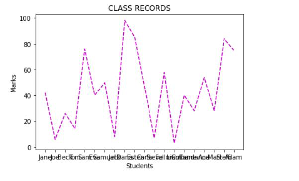
In this example, we use Matplotlib to visualize the marks of 20 students in a class. Each student’s name is paired with a randomly generated mark, and a dashed magenta line graph represents the distribution of these marks.
Python3
import matplotlib.pyplot as plt
import random as random
students = ["Jane","Joe","Beck","Tom",
"Sam","Eva","Samuel","Jack",
"Dana","Ester","Carla","Steve",
"Fallon","Liam","Culhane","Candance",
"Ana","Mari","Steffi","Adam"]
marks=[]
for i in range(0,len(students)):
marks.append(random.randint(0, 101))
plt.xlabel("Students")
plt.ylabel("Marks")
plt.title("CLASS RECORDS")
plt.plot(students,marks,'m--')
|
Output:
Example 2: Adding Markers to Line Plots
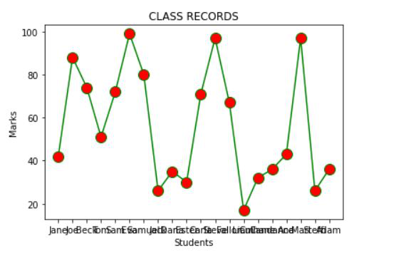
In this example, we visualize the marks of 20 students using a line plot. Each student’s name is plotted against their corresponding mark. The line is solid green, and data points are marked with red circles. By this example, we can understand how to change the line styles and markers in Matplotlib.
Python3
import matplotlib.pyplot as plt
import random as random
students = ["Jane","Joe","Beck","Tom","Sam",
"Eva","Samuel","Jack","Dana","Ester",
"Carla","Steve","Fallon","Liam","Culhane",
"Candance","Ana","Mari","Steffi","Adam"]
marks=[]
for i in range(0,len(students)):
marks.append(random.randint(0, 101))
plt.xlabel("Students")
plt.ylabel("Marks")
plt.title("CLASS RECORDS")
plt.plot(students, marks, color = 'green',
linestyle = 'solid', marker = 'o',
markerfacecolor = 'red', markersize = 12)
|
Output:
Example 3: Adding Grid Lines in Line Plots
In this example, we use Matplotlib to visualize the marks of 20 students in a class. The marks are displayed using a dashed magenta line graph. Grid lines are added to provide better readability and reference across the plot.
Python3
import matplotlib.pyplot as plt
import random as random
students = ["Jane", "Joe", "Beck", "Tom",
"Sam", "Eva", "Samuel", "Jack",
"Dana", "Ester", "Carla", "Steve",
"Fallon", "Liam", "Culhane", "Candance",
"Ana", "Mari", "Steffi", "Adam"]
marks = []
for i in range(0, len(students)):
marks.append(random.randint(0, 101))
plt.xlabel("Students")
plt.ylabel("Marks")
plt.title("CLASS RECORDS")
plt.plot(students, marks, 'm--')
plt.grid(True, which='both', linestyle='--', linewidth=0.5)
plt.show()
|
Output:

Related Article: Matplotlib.pyplot.colors() in Python
Share your thoughts in the comments
Please Login to comment...