How to set border for wedges in Matplotlib pie chart?
Last Updated :
17 Dec, 2020
Pie charts can be used for relative comparison of data. Python offers several data visualization libraries to work with. The Matplotlib library offers different types of graphs and inbuild methods and properties to manipulate the graph. The wedges in the pie chart can be given a border using the wedgeprops attribute of the pie() method of matplotlib.pyplot. Given below are two such examples to set a border to the wedges of the pie chart.
Syntax: wedgeprops : [dict | None]
Parameters:
dict: It is the property and its value. Example: {‘linewidth’:2} or {‘edgecolor’:’black’}
Default value: None
Example 1:
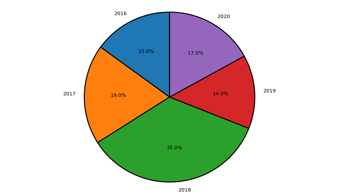
At first, the pyplot module of matplotlib package is imported. The years and profit arrays are initialized. Next, the graph is plotted with the given data. The autopct attribute is used to specify the distance of the text within the wedge from the Centre of the circle. The startangle attribute is used to decide the direction in which the chart will be plotted. By default, startangle is 0 which means the chart starts at positive X axis. Here the startangle is set to 90 which means the chart is rotated by 90 degrees and the chart starts at the positive Y axis. The wedgeprops attribute is used to set the properties of each wedge. The edgecolor is set to black and the linewidth is set to 2. Antialiasing is set to True to prevent the aliasing effect on the image.
Below is the Implementation:
Python3
import matplotlib.pyplot as plt
years = [2016, 2017, 2018, 2019, 2020]
profit = [15, 19, 35, 14, 17]
plt.pie(profit, labels = years, autopct = '%1.1f%%',
startangle = 90,
wedgeprops = {"edgecolor" : "black",
'linewidth': 2,
'antialiased': True})
plt.axis('equal')
plt.show()
|
Output:
Example 2:
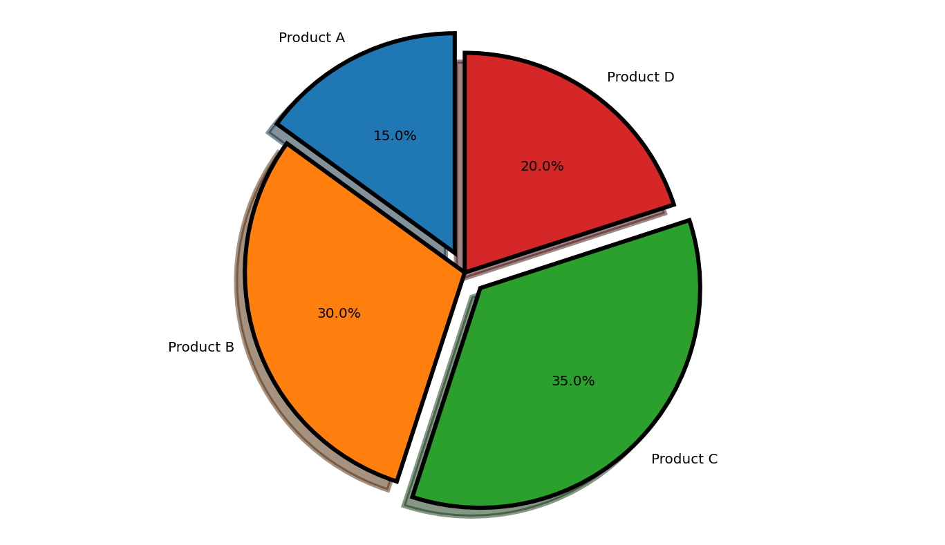
At first, the pyplot module of matplotlib package is imported. The product and stock arrays are initialized. The explode is an optional array-like structure used to separate certain parts of the pie. Next, the graph is plotted with the given data. The autopct attribute is used to specify the distance of the text within the wedge from the Centre of the circle. The shadow attribute is generated shadows for the split portions. The startangle attribute is used to decide the direction in which the chart will be plotted. By default, startangle is 0 which means the chart starts at the positive X axis. Here the startangle is set to 90 which means the chart is rotated by 90 degrees and the chart starts at the positive Y axis. The wedgeprops attribute is used to set the properties of each wedge. The edgecolor is set to black and the linewidth is set to 3. Antialiasing is set to true to prevent the aliasing effect on the image.
Below is the Implementation:
Python3
import matplotlib.pyplot as plt
product = 'Product A', 'Product B',
'Product C', 'Product D'
stock = [15, 30, 35, 20]
explode = (0.1, 0, 0.1, 0)
plt.pie(stock, explode = explode,
labels = product, autopct = '%1.1f%%',
shadow = True, startangle = 90,
wedgeprops= {"edgecolor":"black",
'linewidth': 3,
'antialiased': True})
plt.axis('equal')
plt.show()
|
Output:
Share your thoughts in the comments
Please Login to comment...