R – Statistics
Last Updated :
22 Feb, 2024
Statistics is a form of mathematical analysis that concerns the collection, organization, analysis, interpretation, and presentation of data. Statistical analysis helps to make the best use of the vast data available and improves the efficiency of solutions.
R – Statistics
R Programming Language is used for environment statistical computing and graphics. The following is an introduction to basic R Statistics concepts like normal distribution (bell curve), central tendency (the mean, median, and mode), variability (25%, 50%, 75% quartiles), variance, standard deviation, modality, and skewness.
Data Concepts
Data can be formed in different structures and different formats, before starting the concepts of R Statistics we need to know the data formats.
These are some formats:
Statistics in R
Plotting graphs in Statistics in R Programming Language
Following is a list of functions that are required to plot graphs for the representation of R Statistics data:
- plot() Function: This function is used to Draw a scatter plot with axes and titles.
Syntax:
plot(x, y = NULL, ylim = NULL, xlim = NULL, type = “b”….)
- data() function: This function is used to load specified data sets.
Syntax:
data(list = character(), lib.loc = NULL, package = NULL…..)
- table() Function: The table function is used to build a contingency table of the counts at each combination of factor levels.
table(x, row.names = NULL, ...)
- barplot() Function: It creates a bar plot with vertical/horizontal bars.
Syntax:
barplot(height, width = 1, names.arg = NULL, space = NULL…)
- pie() Function: This function is used to create a pie chart.
Syntax:
pie(x, labels = names(x), radius = 0.6, edges = 100, clockwise = TRUE …)
- hist() Function: The function hist() creates a histogram of the given data values.
Syntax:
hist(x, breaks = “Sturges”, probability = !freq, freq = NULL,…)
Note: You can find the information about each function using the “?” symbol before the beginning of each function.
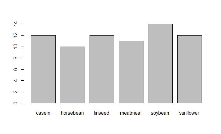
R built-in datasets are very useful to start with and develop skills, So we will be using a few Built-in datasets. Let’s start by creating a simple bar chart by using chickwts dataset and learn how to use datasets and few functions of RStudio for R Statistics.
Bar charts
A Bar chart represents categorical data with rectangular bars where the bars can be plotted vertically or horizontally.
R
?plot
?chickwts
data(chickwts)
plot(chickwts$feed)
|
Output:
R – Statistics
In the above code ‘?’ in front of a particular function means that it gives information about that function with its syntax. In R ‘#’ is used for commenting single line and there is no multiline comment in R. Here we are using chickwts as the dataset and feed is the attribute in the dataset.
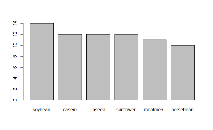
Plots graph in decreasing order
R
feeds=table(chickwts$feed)
barplot(feeds[order(feeds, decreasing=TRUE)])
|
Output:
R – Statistics
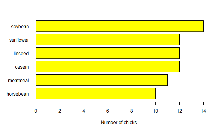
Plots Horizontal bars
R
feeds = table(chickwts$feed)
par(oma=c(1, 1, 1, 1))
par(mar=c(4, 5, 2, 1))
barplot(feeds[order(feeds, decreasing=TRUE)],
xlab="Number of chicks", las=1, col="yellow")
barplot(feeds[order(feeds)], horiz=TRUE,
xlab="Number of chicks", las=1, col="yellow")
|
Output:
R – Statistics
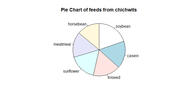
Pie charts
A pie chart is a circular statistical graph that is divided into slices to show the different sizes of the data.
R
data("chickwts")
d = table(chickwts$feed)
pie(d[order(d, decreasing=TRUE)],
clockwise=TRUE,
main="Pie Chart of feeds from chichwits", )
|
Output:
R – Statistics
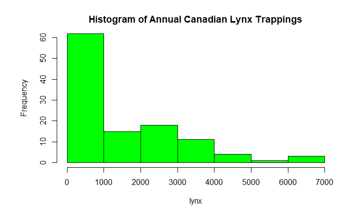
Histograms
Histograms are the representation of the distribution of data(numerical or categorical). It is similar to a bar chart but it groups data in terms of ranges.
R
data(lynx)
lynx
hist(lynx)
hist(lynx, col="green",
main="Histogram of Annual Canadian Lynx Trappings")
|
Output :
Time Series:
Start = 1821
End = 1934
Frequency = 1
  [1]  269  321  585  871 1475 2821 3928 5943 4950 2577  523   98  184
 [14]  279  409 2285 2685 3409 1824  409  151   45   68  213  546 1033
 [27] 2129 2536  957  361  377  225  360  731 1638 2725 2871 2119  684
 [40]  299  236  245  552 1623 3311 6721 4254  687  255  473  358  784
 [53] 1594 1676 2251 1426  756  299  201  229  469  736 2042 2811 4431
 [66] 2511  389   73   39   49   59  188  377 1292 4031 3495  587  105
 [79]  153  387  758 1307 3465 6991 6313 3794 1836  345  382  808 1388
 [92] 2713 3800 3091 2985 3790  674   81   80  108  229  399 1132 2432
[105] 3574 2935 1537  529  485  662 1000 1590 2657 3396
R – Statistics
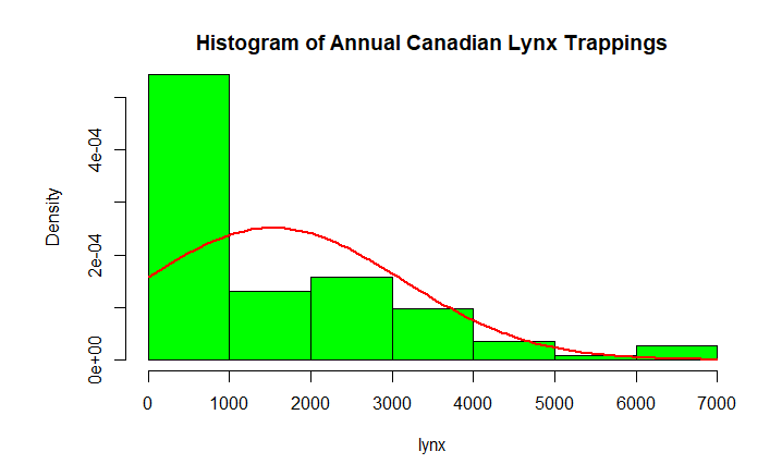
Plot The Distribution
R
data(lynx)
hist(lynx)
hist(lynx,col="green",
freq=FALSE ,main="Histogram of Annual Canadian Lynx Trappings")
curve(dnorm(x, mean=mean(lynx),
sd=sd(lynx)), col="red",
lwd=2, add=TRUE)
|
Output:
R – Statistics
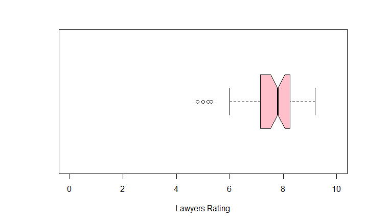
Box Plots
Box Plot is a function for graphically depicting groups of numerical data using quartiles. It represents the distribution of data and understanding mean, median, and variance.
R
?USJudgeRatings
boxplot(USJudgeRatings$RTEN, horizontal=TRUE,
xlab="Lawyers Rating", notch=TRUE,
ylim=c(0, 10), col="pink")
|
Output:
R – Statistics
USJudgeRating is a Build-in dataset with 6 attributes and RTEN is one of the attribute among it which is rating between 0 to 10 inclusive. We used it to for plotting a boxplot with different attributes of boxplot function.
Share your thoughts in the comments
Please Login to comment...