R – Pie Charts
Last Updated :
08 Jun, 2023
A pie chart is a circular statistical graphic, which is divided into slices to illustrate numerical proportions. It depicts a special chart that uses “pie slices”, where each sector shows the relative sizes of data. A circular chart cuts in the form of radii into segments describing relative frequencies or magnitude also known as a circle graph.
R – Pie Charts
R Programming Language uses the function pie() to create pie charts. It takes positive numbers as a vector input.
Syntax: pie(x, labels, radius, main, col, clockwise)
Parameters:
- x: This parameter is a vector that contains the numeric values which are used in the pie chart.
- labels: This parameter gives the description to the slices in pie chart.
- radius: This parameter is used to indicate the radius of the circle of the pie chart.(value between -1 and +1).
- main: This parameter is represents title of the pie chart.
- clockwise: This parameter contains the logical value which indicates whether the slices are drawn clockwise or in anti clockwise direction.
- col: This parameter give colors to the pie in the graph.
Creating a simple pie chart
To create a simple R pie chart:
- By using the above parameters, we can draw a pie chart.
- It can be described by giving simple labels.
Example:
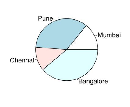
R
geeks<- c(23, 56, 20, 63)
labels <- c("Mumbai", "Pune", "Chennai", "Bangalore")
pie(geeks, labels)
|
Output:
R – Pie Charts
Pie chart including the title and colors
To create a color and title pie chart.
- Take all parameters which are required to make a R pie chart by giving a title to the chart and adding labels.
- We can add more features by adding more parameters with more colors to the points.
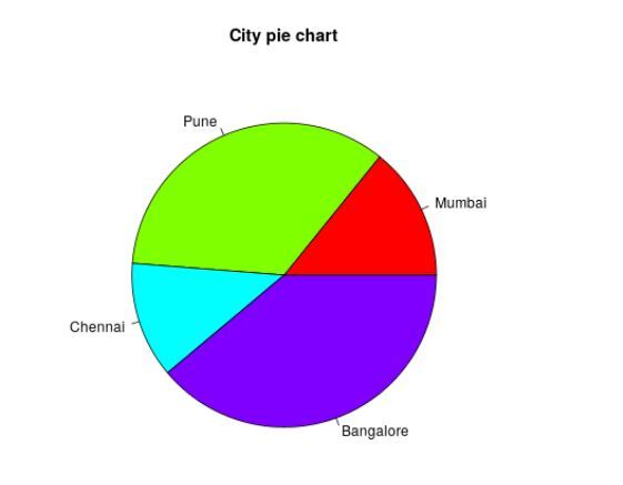
Example:
R
geeks<- c(23, 56, 20, 63)
labels <- c("Mumbai", "Pune", "Chennai", "Bangalore")
pie(geeks, labels, main = "City pie chart",
col = rainbow(length(geeks)))
|
Output:
R – Pie Charts
Slice Percentage & Chart Legend
To create chart legend and slice percentage, we can plot by doing the below methods.
- There are two more properties of the pie chart:
- slice percentage
- chart legend.
- We can show the chart in the form of percentages as well as add legends.
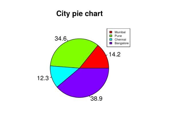
Example:
R
geeks <- c(23, 56, 20, 63)
labels <- c("Mumbai", "Pune", "Chennai", "Bangalore")
piepercent<- round(100 * geeks / sum(geeks), 1)
pie(geeks, labels = piepercent,
main = "City pie chart", col = rainbow(length(geeks)))
legend("topright", c("Mumbai", "Pune", "Chennai", "Bangalore"),
cex = 0.5, fill = rainbow(length(geeks)))
|
Output:
R – Pie Charts
Add pie chart color palettes
With the help of.pal function of the RColorBrewer package in R.
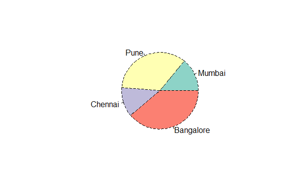
R
Get the library.
library(RColorBrewer)
geeks <- c(23, 56, 20, 63)
labelss <- c("Mumbai", "Pune", "Chennai", "Bangalore")
labels<- brewer.pal(length(geeks), "Set2")
pie(geeks, labels = labelss)
|
Output:

R – Pie Charts
modify the line type of the borders of the plot we can make use of the lty argument:
R
Get the library.
library(RColorBrewer)
geeks <- c(23, 56, 20, 63)
labelss <- c("Mumbai", "Pune", "Chennai", "Bangalore")
labels<- brewer.pal(length(geeks), "Set2")
pie(geeks, labels = labelss, col = color, lty = 2)
|
Output:
R – Pie Charts
Add shading lines with the density argument.
R
library(RColorBrewer)
geeks <- c(23, 56, 20, 63)
labelss <- c("Mumbai", "Pune", "Chennai", "Bangalore")
labels<- brewer.pal(length(geeks), "Set2")
pie(geeks, labels = labelss,col = color, density = 50, angle = 45)
|
Output:

R – Pie Charts
3D Pie Chart
Here we are going to create a 3D Pie chart using plotrix package and then we will use pie3D() function to plot 3D plot.
R
library(plotrix)
geeks <- c(23, 56, 20, 63)
labels <- c("Mumbai", "Pune", "Chennai", "Bangalore")
piepercent<- round(100 * geeks / sum(geeks), 1)
pie3D(geeks, labels = piepercent,
main = "City pie chart", col = rainbow(length(geeks)))
legend("topright", c("Mumbai", "Pune", "Chennai", "Bangalore"),
cex = 0.5, fill = rainbow(length(geeks)))
|
Output:

R – Pie Charts
Share your thoughts in the comments
Please Login to comment...