Boxplots in R Language
Last Updated :
05 Jul, 2023
A box graph is a chart that is used to display information in the form of distribution by drawing boxplots for each of them. This distribution of data is based on five sets (minimum, first quartile, median, third quartile, and maximum).
Boxplots are created in R by using the boxplot() function.
Syntax: boxplot(x, data, notch, varwidth, names, main)
Parameters:
- x: This parameter sets as a vector or a formula.
- data: This parameter sets the data frame.
- notch: This parameter is the label for horizontal axis.
- varwidth: This parameter is a logical value. Set as true to draw width of the box proportionate to the sample size.
- main: This parameter is the title of the chart.
- names: This parameter are the group labels that will be showed under each boxplot.
Creating a Dataset
To understand how we can create a boxplot:
- We use the data set “mtcars”.
- Let’s look at the columns “mpg” and “cyl” in mtcars.
R
input <- mtcars[, c('mpg', 'cyl')]
print(head(input))
|
Output:
                   mpg cyl
Mazda RX4         21.0   6
Mazda RX4 Wag     21.0   6
Datsun 710        22.8   4
Hornet 4 Drive    21.4   6
Hornet Sportabout 18.7   8
Valiant           18.1   6
Creating the Boxplot
Creating the Boxplot graph.
- Take the parameters which are required to make a boxplot.
- Now we draw a graph for the relation between “mpg” and “cyl”.
R
data(mtcars)
boxplot(disp ~ gear, data = mtcars,
main = "Displacement by Gear",
xlab = "Gear",
ylab = "Displacement")
|
Output:

Box plot in R
Boxplot using notch
To draw a boxplot using a notch:
- With the help of Notch, we can find out how the medians of different data groups match with each other.
R
data(mtcars)
my_colors <- c("#FFA500", "#008000", "#1E90FF", "#FF1493")
boxplot(disp ~ gear, data = mtcars,
main = "Displacement by Gear", xlab = "Gear", ylab = "Displacement",
col = my_colors, border = "black", notch = TRUE, notchwidth = 0.5,
medcol = "white", whiskcol = "black", boxwex = 0.5, outpch = 19,
outcol = "black")
legend("topright", legend = unique(mtcars$gear),
fill = my_colors, border = "black", title = "Gear")
|
Output:

Box Plot in R
col: Uses a vector of colours (my_colors) to change the fill colour of the boxes.
borders: Sets the box borders’ colour to black.
notch: To illustrate confidence intervals, a notch is added to the boxes.
notchwidth: Manages the notches’ width.
medcol: Makes the median line’s colour white.
whiskcol: Sets the whiskers’ colour to black with the whiskcol command.
boxwex: Modifies the boxes’ width.
outpch: Sets the outliers’ shapes to solid circles.
outcol: Changes the outliers’ colour to black.
Multiple Boxplot
Here we are creating multiple boxplots. The individual data for which a boxplot representation is required is based on the function.
R
data(mtcars)
variables <- c("mpg", "disp", "hp", "wt")
par(mfrow = c(1, length(variables)))
for (var in variables) {
boxplot(get(var) ~ gear, data = mtcars,
main = paste("Box Plot of", var),
xlab = "Gear",
ylab = var,
col = "skyblue",
border = "black",
notch = TRUE,
notchwidth = 0.5,
medcol = "white",
whiskcol = "black",
boxwex = 0.5,
outpch = 19,
outcol = "black")
}
par(mfrow = c(1, 1))
|
Output:
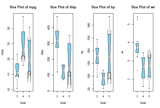
Multiple box plots in R
- In this code, we begin by listing the variables in the variables vector for which we wish to make box plots. I’ve added “mpg,” “disp,” “hp,” and “wt” in this example, but you can change this list to suit your needs.
- The charting layout is then created by using the par function and the syntax mfrow = c(1, length(variables)), which generates a grid with one row and as many columns as there are variables in the variables vector.
- We use the boxplot function inside the loop to generate a box plot for each variable. The get(var) function dynamically pulls the matching column values from the dataset. Using the given settings, we alter each box plot’s look.
Share your thoughts in the comments
Please Login to comment...