Pie plot using Plotly in Python
Last Updated :
28 Jun, 2021
Plotly is a Python library which is used to design graphs, especially interactive graphs. It can plot various graphs and charts like histogram, barplot, boxplot, spreadplot and many more. It is mainly used in data analysis as well as financial analysis. plotly is an interactive visualization library.
Pie Plot
A pie chart is a circular analytical chart, which is divided into region to symbolize numerical percentage. In px.pie, data anticipated by the sectors of the pie to set the values. All sector are classify in names. Pie chart is used usually to show the percentage with next corresponding slice of pie. Pie chart helps to make understand well because of its different portions and color codings.
Syntax: plotly.express.pie(data_frame=None, names=None, values=None, color=None, color_discrete_sequence=None, color_discrete_map={}, hover_name=None, hover_data=None, custom_data=None, labels={}, title=None, template=None, width=None, height=None, opacity=None, hole=None)
Parameters:
| Name |
Value |
Description |
| data_frame |
DataFrame or array-like or dict |
This argument needs to be passed for column names (and not keyword names) to be used. Array-like and dict are transformed internally to a pandas DataFrame. Optional: if missing, a DataFrame gets constructed under the hood using the other arguments |
| names |
str or int or Series or array-like |
Either a name of a column in data_frame, or a pandas Series or array_like object. Values from this column or array_like are used as labels for sectors. |
| values |
str or int or Series or array-like |
Either a name of a column in data_frame, or a pandas Series or array_like object. Values from this column or array_like are used to set values associated to sectors. |
| color |
str or int or Series or array-like |
Either a name of a column in data_frame, or a pandas Series or array_like object. Values from this column or array_like are used to assign color to marks. |
Example:
Python3
import plotly.express as px
import numpy
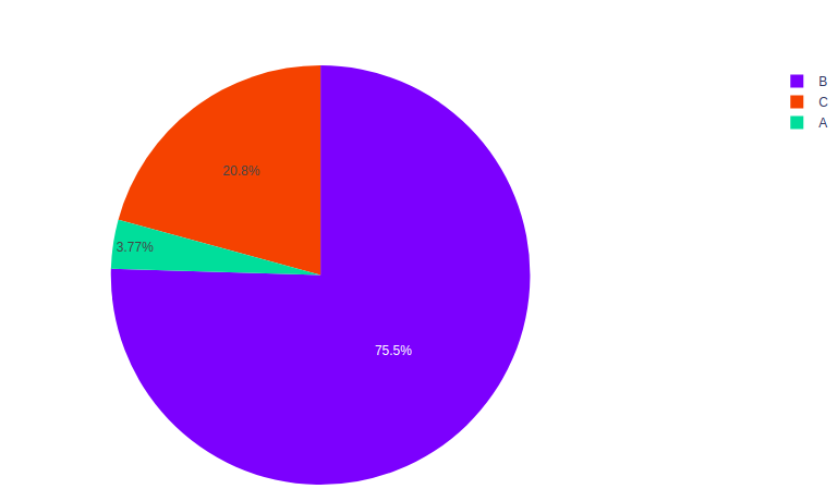
random_x = [100, 2000, 550]
names = ['A', 'B', 'C']
fig = px.pie(values=random_x, names=names)
fig.show()
|
Output:
Grouping Data
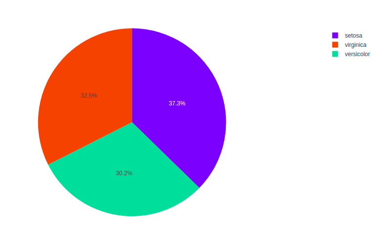
The same value for the names parameter are grouped together. Repeated labels visually groups rows or columns together to make the data easier to understand. Let’s see one example given below.
Example: The iris dataset contains many rows but only 3 species so the data is grouped according to the species.
Python3
import plotly.express as px
df = px.data.iris()
fig = px.pie(df, values="sepal_width", names="species")
fig.show()
|
Output:
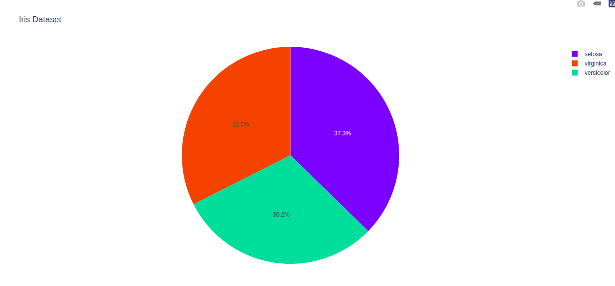
Customizing pie chart
The pie chart can be customized by using the px.pie, using some of its parameters such as hover_data and labels. Let’s see the below example for better understanding.
Example:
Python3
import plotly.express as px
df = px.data.iris()
fig = px.pie(df, values="sepal_width", names="species",
title='Iris Dataset', hover_data=['sepal_length'])
fig.show()
|
Output:
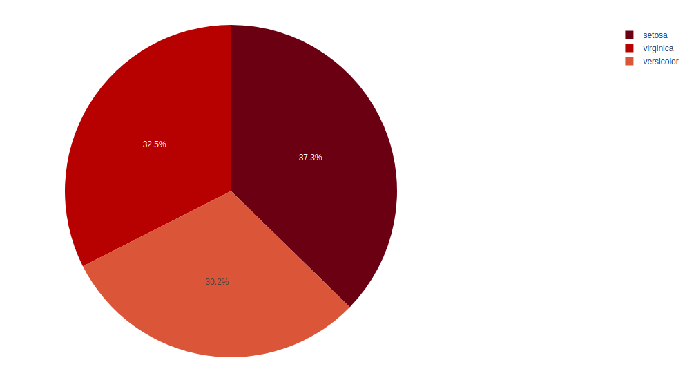
Setting Colors
The color of pie can be change in plotly module. Different colors help in to distinguish the data from each other, which help to understand the data more efficiently.
Example:
Python3
import plotly.express as px
df = px.data.iris()
fig = px.pie(df, values="sepal_width",
names="species",
color_discrete_sequence=px.colors.sequential.RdBu)
fig.show()
|
Output:
Like Article
Suggest improvement
Share your thoughts in the comments
Please Login to comment...