Data visualization is an essential component of data analysis, enabling us to acquire understanding, detect regularities, and convey discoveries efficiently. In this article, we will examine seven fundamental Pandas charting functions, including examples and explanations for each kind of plot.
Types of Pandas Plotting Functions
Pandas has a range of charting methods that are based on the matplotlib package. This allows for the convenient creation of charts straight from DataFrame objects. These functions include a diverse array of plot forms, such as line graphs, bar plots, histograms, scatter plots, and further variations. By using these functions, users may effectively depict trends, distributions, correlations, and linkages within their data.
Pandas plotting capabilities facilitate the process of data visualization, making it smooth and effortless. Users may easily invoke the required charting function on a DataFrame or Series object and modify the plot using different parameters. In addition, Pandas seamlessly interfaces with Matplotlib, enabling advanced customization and precise adjustments of visuals.
Creating Sample DataFrame
Before diving into the plotting functions, let’s create a sample DataFrame to work with with some sample data for TV serials, including spiritual shows. We’ll include features like title, genre, release year etc.
Python3
import pandas as pd

# Sample data for TV serials
data = {
    'Title': ['The Crown', 'Stranger Things', 'Breaking Bad', 'The Mandalorian', 'Avatar: The Last Airbender', 'The Office', 'Game of Thrones', 'Cosmos: A Spacetime Odyssey', 'The Good Place', 'Black Mirror', 'The Chosen', 'The Bible'],
    'Genre': ['Drama', 'Sci-Fi', 'Drama', 'Sci-Fi', 'Animation', 'Comedy', 'Fantasy', 'Documentary', 'Comedy', 'Sci-Fi', 'Drama', 'Drama'],
    'Release_Year': [2016, 2016, 2008, 2019, 2005, 2005, 2011, 2014, 2016, 2011, 2019, 2013],
    'Director': ['Peter Morgan', 'The Duffer Brothers', 'Vince Gilligan', 'Jon Favreau', 'Michael Dante DiMartino, Bryan Konietzko', 'Greg Daniels', 'David Benioff, D. B. Weiss', 'Brannon Braga', 'Michael Schur', 'Charlie Brooker', 'Dallas Jenkins', 'Various'],
    'Seasons': [4, 4, 5, 2, 3, 9, 8, 1, 4, 5, 2, 1],
    'Duration_Minutes': [60, 50, 47, 40, 23, 22, 57, 60, 22, 60, 45, 43]
}
tv_serials_df = pd.DataFrame(data)
tv_serials_df.head()
Output:
    Title    Genre    Release_Year    Director    Seasons    Duration_Minutes
0    The Crown    Drama    2016    Peter Morgan    4    60
1    Stranger Things    Sci-Fi    2016    The Duffer Brothers    4    50
2    Breaking Bad    Drama    2008    Vince Gilligan    5    47
3    The Mandalorian    Sci-Fi    2019    Jon Favreau    2    40
4    Avatar: The Last Airbender    Animation    2005    Michael Dante DiMartino, Bryan Konietzko    3    23
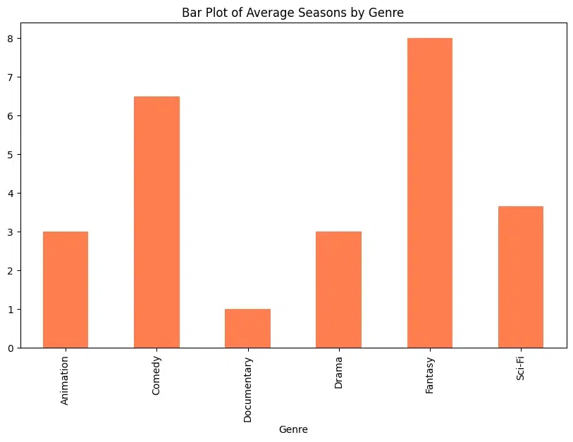
Pandas Plotting Functions: Bar Plot
A bar plot is a graphical representation of categorical data where the length of each bar represents the frequency or value of the category.
Here, a bar plot is used to compare the average value of a numerical variable (e.g., seasons) across different categories (e.g., genres) of TV serials.
The plot is crafted using DataFrame.plot.bar()
Python3
# Bar Plot: Genre vs Seasons
genre_seasons = tv_serials_df.groupby('Genre')['Seasons'].mean()
genre_seasons.plot.bar(figsize=(10, 6), color='coral', title='Bar Plot of Average Seasons by Genre')
Output:
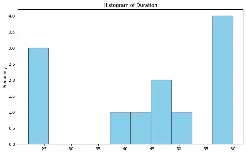
Pandas Plotting Functions: Histogram
A histogram is a graphical representation of the distribution of numerical data. It consists of a series of bars, where each bar represents a range of values, and the height of the bar represents the frequency of values in that range. Histograms are useful for understanding the distribution, shape, and spread of data. They can help identify patterns and outliers in the data.
In the DataFrame context, a histogram is used to visualize the distribution of the duration of TV serials using plot.hist()
Python3
# Histogram: Duration_Minutes
tv_serials_df['Duration_Minutes'].plot.hist(bins=10, figsize=(10, 6), color='skyblue', edgecolor='black', title='Histogram of Duration')
Output:
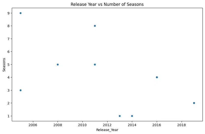
Pandas Plotting Functions: Scatter Plot
A scatter plot is a type of plot that displays values for two variables as points on a two-dimensional plane. Each point represents an observation in the data.
Below, scatter plot is used to visualize the relationship between two numerical variables, such as release year and the number of seasons for TV serials using plot.scatter().
Python3
# Scatter Plot: Release_Year vs Seasons
tv_serials_df.plot.scatter(x='Release_Year', y='Seasons', figsize=(10, 6), title='Release Year vs Number of Seasons')
Output:
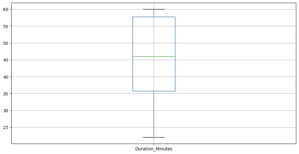
Pandas Plotting Functions : Box Plot
Box plots describe the distribution of numerical data and indicate outliers. A box plot, also known as a box-and-whisker plot, is a graphical representation of the distribution of numerical data through quartiles. It displays the median, quartiles, and potential outliers in the data.
Box plots are useful for comparing the distribution of numerical data across different categories or groups and indicate outliers using dataframe.boxplot().
Python3
# Box Plot Duration_Minutes
tv_serials_df.boxplot(column='Duration_Minutes', figsize=(12, 6), showfliers=False)
Output:
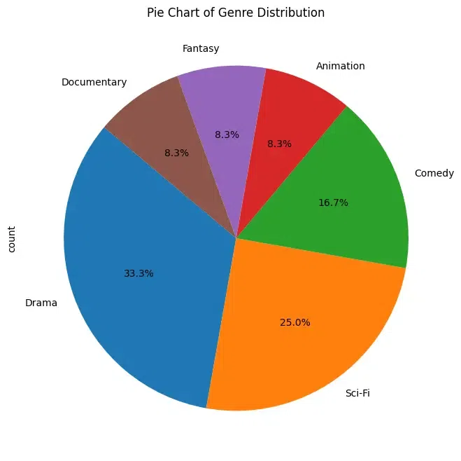
Pandas Plotting Functions : Pie Chart
Pie charts are a circular statistical graphic divided into slices to illustrate numerical proportions. Each slice represents a proportionate part of the whole. Pie charts are useful for displaying the relative sizes or proportions of different categories within a dataset.
Pie chart is used to visualize the distribution of genres within the dataset using DataFrame.plot.pie()
Python3
# Pie Chart: Genre distribution
genre_distribution = tv_serials_df['Genre'].value_counts()
genre_distribution.plot(kind='pie', figsize=(8, 8), autopct='%1.1f%%', startangle=140, title='Pie Chart of Genre Distribution')
Output:
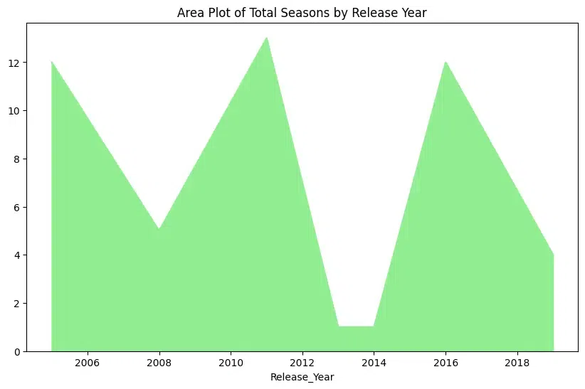
Pandas Plotting Functions : Area Plot
An area plot is a type of plot that displays data points connected by straight lines and the area between the lines and the x-axis is filled with color. It is similar to a line plot but emphasizes the cumulative change in values.
An area plot is used to visualize the cumulative change in total seasons over the years with DataFrame.plot.area()
Python3
# Area Plot: Release_Year vs Seasons
tv_serials_df.groupby('Release_Year')['Seasons'].sum().plot(kind='area', figsize=(10, 6), color='lightgreen', title='Area Plot of Total Seasons by Release Year')
Output:
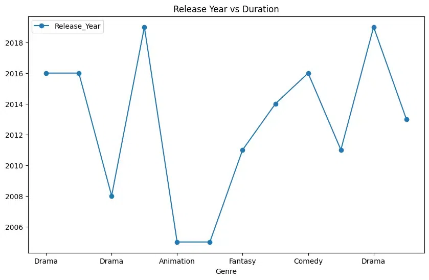
Pandas Plotting Functions : Line Plot
A line plot is a type of plot that displays data points connected by straight line segments. It is commonly used to visualize trends or changes over time. Line plots are useful for showing trends, patterns, or relationships between two variables over time or any other ordered variable.
In below plot, a line plot is seen representing genre vs release year using DataFrame.plot.line()
Python3
tv_serials_df.plot.line(x='Genre', y='Release_Year', figsize=(10, 6), title='Genre vs Release Year', marker='o', linestyle='-')
Output:
Best Practices for Efficient Plotting
Efficient plotting is crucial for creating visually appealing and informative plots, especially when dealing with large datasets or when generating plots in real-time applications.
- Choose the Right Library: Different plotting libraries have different strengths and weaknesses. Matplotlib is a powerful and flexible library that is suitable for most plotting tasks. Seaborn provides high-level abstractions for statistical visualization. Plotly offers interactive plots suitable for web applications. Choose the library that best fits your needs.
- Use Efficient Plotting Functions: Many plotting libraries offer high-level plotting functions optimized for common use cases. For example, Matplotlib’s
plt.plot() function is suitable for basic line plots, while plt.scatter() is better for scatter plots. - Batch Plotting: If you need to create multiple plots, batch your plotting commands together to reduce overhead. This can be particularly useful when generating plots in a loop or when plotting multiple subplots.
- Limit Plot Elements: Avoid overcrowding your plots with unnecessary elements such as grid lines, markers, or labels. Only include elements that are essential for conveying your message.
- Use Plotting Defaults Wisely: Customize the default plotting settings to match your preferences and the requirements of your audience. However, avoid excessive customization that could obscure the underlying data or make your plots difficult to interpret.
Conclusion
Pandas plotting routines give a straightforward and fast way to view data directly from DataFrame objects. By employing these tools, analysts and data scientists may construct meaningful visualizations to analyze and share significant results effectively. Experiment with multiple plot kinds and customization options to boost your data analysis operations. Happy planning!
Pandas Plotting Functions for Quick Data Visualization – FAQs
Is it possible to alter the way that charts produced by Pandas plotting functions look?
A: Yes, you may customize the look of plots using a variety of parameters that the Pandas plotting functions allow, such as colors, styles, labels, titles, and more. For a complete list of all the parameters that are accessible, see the Pandas manual.
Can I use Pandas charting functions with any restrictions?
A: Using Pandas’ plotting tools is convenient for quickly visualizing data, but it may not give as much customisation and flexibility as using Matplotlib directly. Use of Matplotlib directly could be required for charts that are very customized or sophisticated.
What is the process for saving plots created using Pandas plotting functions?
A: The plt.savefig() method from Matplotlib allows you to save graphs created by Pandas plotting routines to a file. After the plot has been generated, you can save it as a PNG file by using plt.savefig(‘filename.png’), or you may provide an alternative file format if necessary.
Can I use Pandas plotting functions to construct subplots?
A: By giving the subplot argument to the plotting method when calling it, you may indeed generate subplots using Pandas plotting methods. This enables the creation of numerous plots for side-by-side comparison or the presentation of various datasets inside a single figure.
When utilizing Pandas plotting functions, are there any performance issues to take into account?
A: Although Pandas plotting tools are convenient, they may not always be the best choice for intricate visualizations or enormous datasets. For more precise control over plot display and speed optimization, using Matplotlib directly could be advantageous in some situations.
Where can I read up on Pandas charting functions in greater detail?
A comprehensive description, examples, and use recommendations for every charting function are provided in the official Pandas documentation, which is a great place to learn more about Pandas plotting tools. Online guides and discussion boards may also be very helpful places to learn more about using Pandas for data visualization.
Share your thoughts in the comments
Please Login to comment...