Bokeh – Stacked Bar Chart from DataFrame
Last Updated :
30 Dec, 2022
Bokeh is a data visualization library that can be used to create beautiful graphics, from simple plots to complex dashboards with streaming datasets. Bokeh provides interactive plots in modern web browsers like Google Chrome etc, using HTML and JavaScript to present clean and highly interactive charts and plots. Bokeh allows us to create JavaScript-based visualizations without writing JavaScript code ourselves.
What is a Stacked Bar Chart?
A stacked chart is a type of bar chart that helps us in comparing and plot different columns of data at the same time. In simple terms, a stacked bar chart is a bar chart in which each bar is divided into sub-bars to represent multiple columns of data simultaneously. It is also important to note that stacked bar charts are not suitable for datasets that have both positive and negative values. In this article, we will plot a Stacked Bar Chart from DataFrame.
Vertical Stacked Bar Chart using Bokeh
In the bokeh library, there are two types of function which is used to build a stacked bar chart which is vbar_stack() and hbar_stack() which is used to create vertical and horizontally stacked bar chart. In this part, we will try to create a vertically stacked bar chart using the vbar_stack() function.
Step 1: Import the necessary libraries to plot Stacked Bar Chart from DataFrame.
Python3
from bokeh.plotting import figure, show, output_notebook
import pandas as pd
|
Step 2: Creating DataFrame to be used for visualization purposes.
Python3
Students = ['Ankur', 'Yash', 'Aditya', 'Harshit']
Subjects = ['Operating System', 'Data Structure',\
'Java Programming']
cols = ['#00ff00', '#009900', '#00cc99']
|
Step 3: Create and initialise data to the dictionary.
Python3
data = {'Students': Students,
'Operating System': [17, 20, 19, 18],
'Data Structure': [19, 18, 20, 17],
'Java Programming': [20, 19, 20, 18]}
|
Step 4: Create dataFrame and verify data.
Python3
df = pd.DataFrame(data)
df.head()
|
Output:

The first five rows of the dataset created
Step 5: Plot data In a vertically stacked manner.
Python3
fig = figure(x_range=df.Students,
height=500,
title="Marks counts of \
every students according to subjects")
fig.vbar_stack(Subjects,
x='Students',
source=df,
color=cols,
width=0.5)
|
Step 6: Display Stack Graph.
Output:

A stacked Bar Chart created using Bokeh
Adding Labels to Bokeh Stacked Bar Chart
We can use the attribute legend_label to show legends on our graph.
Python3
fig = figure(x_range=df.Students,
height=500,
title="Marks counts of \
every students according to subjects")
fig.vbar_stack(Subjects,
x='Students',
source=df,
color=cols,
width=0.5,
legend_label=Subjects)
show(fig)
|
Output:

A stacked Bar Chart created using Bokeh with legends
Horizontal Stacked Bar Chart using Bokeh
Now let’s create the exact visualization but this time the bars will be stacked horizontally and the function that will be used will be hbar_stack(). Also, there are options to, align the legends at different positions in the plot as you can see in the last lines of the below code block.
Python3
from bokeh.models import ColumnDataSource
fig = figure(y_range=df.Students,
height=500,
title="Marks counts of \
every students according to subjects")
fig.hbar_stack(Subjects,
y='Students',
source=ColumnDataSource(df),
color=cols,
height=0.5,
legend_label=Subjects)
fig.legend.orientation = "horizontal"
fig.legend.location = "bottom"
show(fig)
|
Output:

Horizontally stacked bar chart
Adding Tooltips to Bokeh Stacked Bar Chart
Tooltips are a convenient tool and one can get the numbers for a particular bar just by hovering on it else one will have to check the axes and then conclude some numbers which can lead to errors generally. So, to resolve this issue in bokeh charts one can add tooltips here as well by adding the same in the figure() function.
Python3
from bokeh.models import ColumnDataSource
fig = figure(y_range=df.Students,
height=500,
title="Marks counts of \
every students according to subjects",
tools="hover",
tooltips="$name @Students: @$name")
fig.hbar_stack(Subjects,
y='Students',
source=ColumnDataSource(df),
color=cols,
height=0.5,
legend_label=Subjects)
fig.legend.orientation = "horizontal"
fig.legend.location = "bottom"
show(fig)
|
Output:
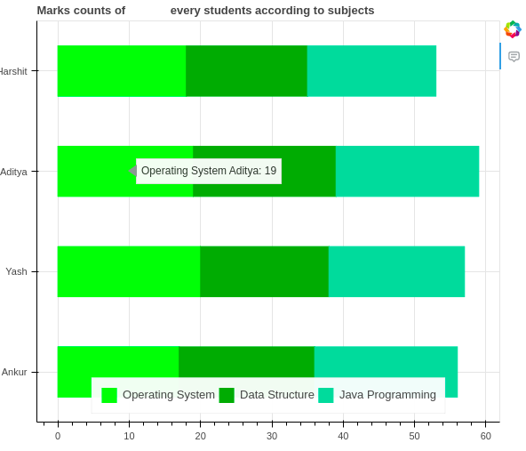
Bokeh Stacked bar chart with tooltips
Like Article
Suggest improvement
Share your thoughts in the comments
Please Login to comment...