Overlapping Histograms with Matplotlib in Python
Last Updated :
26 Nov, 2020
Histograms are a way of visualizing the data. Here, we will learn how to plot overlapping histograms in python using Matplotlib library. matplotlib.pyplot.hist() is used for making histograms.
Let’s take the iris dataset and plot various overlapping histograms with Matplotlib.
Step 1: Import the libraries
Python3
import matplotlib.pyplot as plt
import seaborn as sns
|
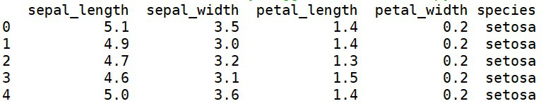
Step 2: Load the dataset
Python3
data = sns.load_dataset('iris')
print(data.head(5))
|
Step 3: Let us plot histograms for sepal_length and petal_length.
Python3
plt.hist(data['petal_length'],
label='petal_length')
plt.hist(data['sepal_length'],
label='sepal_length')
plt.legend(loc='upper right')
plt.title('Overlapping')
plt.show()
|
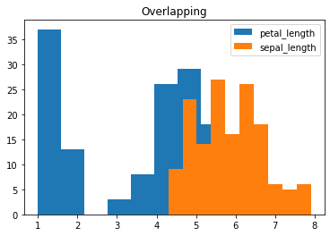
Here, we can see that some part of the histogram for ‘petal_length’ has been hidden behind the histogram for ‘sepal_length’. To properly visualize both the histograms, we need to set the transparency parameter, alpha to a suitable value. So let’s check various values for alpha and find out the suitable one.
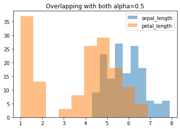
Step 4: Set alpha=0.5 for both sepal_length and petal_length
Python3
plt.hist(data['petal_length'],
alpha=0.5,
label='petal_length')
plt.hist(data['sepal_length'],
alpha=0.5,
label='sepal_length')
plt.legend(loc='upper right')
plt.title('Overlapping with both alpha=0.5')
plt.show()
|
Step 5: Set alpha=0.1 for sepal_length and 0.9 for petal_length
Python3
plt.hist(data['petal_length'],
alpha=0.9,
label='petal_length')
plt.hist(data['sepal_length'],
alpha=0.1,
label='sepal_length')
plt.legend(loc='upper right')
plt.title('Overlapping with alpha=0.1 and 0.9 for sepal and petal')
plt.show()
|
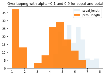
Through the above two steps, we can infer that for a better visualization for both the histograms, alpha=0.5 would be the most suitable option for the transparency parameter.
Now, to plot more than two overlapping histograms where we need custom colors, let’s follow step 6.
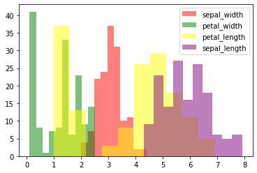
Step 6: Create more than 2 overlapping histograms with customized colors.
Python3
plt.hist(data['sepal_width'],
alpha=0.5,
label='sepal_width',
color='red')
plt.hist(data['petal_width'],
alpha=0.5,
label='petal_width',
color='green')
plt.hist(data['petal_length'],
alpha=0.5,
label='petal_length',
color='yellow')
plt.hist(data['sepal_length'],
alpha=0.5,
label='sepal_length',
color='purple')
plt.legend(loc='upper right')
plt.show()
|
Thus, in this article, we learned how to plot overlapping histograms using Matplotlib, how to set their transparency values, and customize their colors.
Share your thoughts in the comments
Please Login to comment...