Features of Responsive Web Design
Last Updated :
08 Jan, 2021
Introduction:
Website is something that is more important and essential for growth of company or business. It is the best way to reach more audience. Nowadays, each and every user and clients use mobiles phones more than anything and therefore wants a mobile version of website. But it’s difficult and sometime impossible to create website versions for each new resolutions and devices. Thats where responsive design comes in. Responsive web design is an approach that simply reflows, adjust, reposition, resize overall content and images according to width of browser or screen size. In simple words, responsive websites are designed to be accessed across all devices regardless of size of device screen. Some screen sizes that are kept in mind while creating responsive websites are desktop, laptop, mobile phones, and tablet.
Different Features of Responsive Design
There are basically 4 aspects of responsive design as given below:
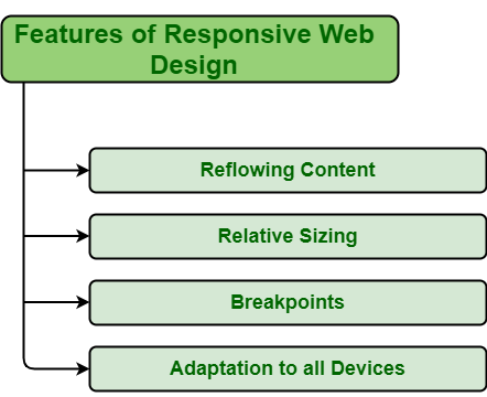
1. Reflowing Content
Reflowing content simply refers to content that adjusts its width to fit width of window. Every day, new devices are being developed with new screen sizes. It forces browser to again calculate dimensions and position of all elements and then again reload page. It is essential to provide optimized layouts for mobile devices and tablets.
2. Relative Sizing
Relative sizing simply means adjusting size of element according to width of browser or screen. When it comes to responsive design, one need to use relative length unit. Relative unit length does not have fixed size. With help of relative sizing, images or other elements adapt their size according to browser width. Different relative unit length that one can use include %, VW (Viewport Width), em, Vmin (Viewport Minimum), VH (Viewport Height), etc.
3. Breakpoints
Breakpoints, also known as media queries, are the simplest filters applied to CSS styles that can be used for different style rules for various devices such as laptops, mobiles, tablets, etc. One can also modify and make changes to layout and design on different device width ranges. It can also be used to detect other things about environment on which site is running and one can customize their website design for different devices.
4. Adaptation to all Devices
Flexibility is main component of responsive website. Their flexibility to adapt to different size screen provide better user experience and makes it more appealing. Responsive Websites works independently, adjust itself according to screen size, resize images, change font and navigations, reposition content, etc. This helps create a positive user experience and positive image of business on customer or user that in turn increase more audience.
Share your thoughts in the comments
Please Login to comment...