CSS Website Layout
Last Updated :
08 Apr, 2024
CSS Website Layout plays a crucial role in defining its visual structure, organization, and responsiveness when designing a website. In this article, we’ll learn various CSS techniques to create effective website layouts with CSS.
A website can be divided into various sections comprising of header, menus, content, and footer based on which there are many different layout designs available for developers. Different layouts can be created by using a div tag and using CSS property to style it.
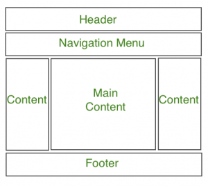
Structure of Website Layout
1. Header Section
The header section typically appears at the top of a website or just below the top navigation menu. It often includes the website name or logo. Here’s an example of how to style the header using CSS:
Example:
html
<!-- This code describes the header section
of website layout -->
<!DOCTYPE html>
<html>

<head>
    <title>
        Website Layouts
    </title>

    <style>
        .header {
            background-color: green;
            padding: 15px;
            text-align: center;
        }
    </style>
</head>

<body>
    <div class="header">
        <h2 style="color:white;">
            GeeksforGeeks
        </h2>
    </div>
    <br>

    <center style="font-size:200%;">
        Remaining Section
    </center>
</body>

</html>
Output:

2. Navigation Menu
A navigation bar/menu provides links for easy website navigation. Here’s an example of creating a simple navigation menu:
Example:
html
<!DOCTYPE html>
<html>

<head>
    <title>
        Website Layout
    </title>

    <style>
        /* CSS property for header section */
        .header {
            background-color: green;
            padding: 15px;
            text-align: center;
        }

        /* CSS property for navigation menu */
        .nav_menu {
            overflow: hidden;
            background-color: #333;
        }

        .nav_menu a {
            float: left;
            display: block;
            color: white;
            text-align: center;
            padding: 14px 16px;
            text-decoration: none;
        }

        .nav_menu a:hover {
            background-color: white;
            color: green;
        }
    </style>
</head>

<body>

    <!-- header of website layout -->
    <div class="header">
        <h2 style="color:white;font-size:200%;">
            GeeksforGeeks
        </h2>
    </div>

    <!-- navigation menu for website layout -->
    <div class="nav_menu">
        <a href="#">Algo</a>
        <a href="#">DS</a>
        <a href="#">Language</a>
    </div><br>

    <center style="font-size:200%;">
        Remaining Section
    </center>
</body>

</html>
Output:

3. Content Section
The content section is the main body of the website. The user can divide the content section in an n-column layout.
The most common layouts are:
- 1 Column Layout: It is mostly used for mobile layout.

- 2 Column Layout: This website layout is mostly used for tablets or laptops.

- 3 Column Layout: This website layout is mostly used for desktops.

The user can also create a responsive layout where the layout will get changed as per screen size. Consider the below example where if the idth of the screen is more than 600px then there will be a 3-column layout and if the width of the screen is between 400px to 600px then there will be a 2-column layout and if the screen size is less than 400px then the 1-column layout will display.
Example:
html
<!DOCTYPE html>
<html>

<head>
    <title>
        Website Layout
    </title>
    <style>
        * {
            box-sizing: border-box;
        }

        /* CSS property for header section */
        .header {
            background-color: green;
            padding: 15px;
            text-align: center;
        }

        /* CSS property for navigation menu */
        .nav_menu {
            overflow: hidden;
            background-color: #333;
        }

        .nav_menu a {
            float: left;
            display: block;
            color: white;
            text-align: center;
            padding: 14px 16px;
            text-decoration: none;
        }

        .nav_menu a:hover {
            background-color: white;
            color: green;
        }

        /* CSS property for content section */
        .columnA,
        .columnB,
        .columnC {
            float: left;
            width: 31%;
            padding: 15px;
            text-align: justify;
        }

        h2 {
            color: green;
            text-align: center;
        }

        /* Media query to set website layout
            according to screen size */
        @media screen and (max-width:600px) {

            .columnA,
            .columnB,
            .columnC {
                width: 50%;
            }
        }

        @media screen and (max-width:400px) {

            .columnA,
            .columnB,
            .columnC {
                width: 100%;
            }
        }
    </style>
</head>

<body>

    <!-- header of website layout -->
    <div class="header">
        <h2 style="color:white;font-size:200%">
            GeeksforGeeks
        </h2>
    </div>

    <!-- navigation menu of website layout -->
    <div class="nav_menu">
        <a href="#">Algo</a>
        <a href="#">DS</a>
        <a href="#">Language</a>
    </div>

    <!-- Content section of website layout -->
    <div class="row">

        <div class="columnA">
            <h2>Column A</h2>

            <p>
                  Prepare for the Recruitment drive of product
                based companies like Microsoft, Amazon, Adobe
                etc with a free online placement preparation
                course. The course focuses on various MCQ's
                & Coding question likely to be asked in the
                interviews & make your upcoming placement
                season efficient and successful.
            </p>

        </div>

        <div class="columnB">
            <h2>Column B</h2>

            <p>
                  Prepare for the Recruitment drive of product
                based companies like Microsoft, Amazon, Adobe
                etc with a free online placement preparation
                course. The course focuses on various MCQ's
                & Coding question likely to be asked in the
                interviews & make your upcoming placement
                season efficient and successful.
            </p>

        </div>

        <div class="columnC">
            <h2>Column C</h2>


            <p>
                  Prepare for the Recruitment drive of product
                based companies like Microsoft, Amazon, Adobe
                etc with a free online placement preparation
                course. The course focuses on various MCQ's
                & Coding question likely to be asked in the
                interviews & make your upcoming placement
                season efficient and successful.
            </p>

        </div>
    </div>
</body>

</html>
Output: The width of the screen size greater than 700px:

The width of screen size greater then 400px and less than 600px:

The width of screen size less than 400px:

4. Footer Section
A footer section is placed at the bottom of the webpage and it generally consists of information like contact info, copyrights, About us etc.
Example:
html
<!DOCTYPE html>
<html>

<head>
    <title>
        CSS Website Layout
    </title>

    <style>
        /* Style for footer section */
        .footer {
            background-color: green;
            padding: 15px;
            text-align: center;
        }
    </style>
</head>

<body>
    <center style="font-size:200%;">
        Upper section
    </center>

    <!-- footer Section -->
    <div class="footer">
        <a href="#">About</a><br>
        <a href="#">Career</a><br>
        <a href="#">Contact Us</a>
    </div>
</body>

</html>
Output:

Important Points to Remember
- Header section contains a website logo, a search bar and profile of user.
- Navigation menu contains link to various categories of articles available.
- Content section is divided into 3 parts(columns) with left and right sidebar containing links to other articles and advertisements.
- Main content section is the one containing this article.
- Footer at the bottom there is a footer section which contains address, links, contacts etc.
In conclusion, CSS, or Cascading Style Sheets, is a powerful tool that brings life to our web pages. This separation of layout (HTML) and formatting (CSS) enhances the sustainability, adaptability, and extendibility of web implementations. Whether you’re a beginner or an experienced professional, understanding CSS is crucial for creating attractive, user-friendly websites.
Like Article
Suggest improvement
Share your thoughts in the comments
Please Login to comment...