Tools for Responsive Web Design
Last Updated :
28 Dec, 2022
Responsive websites are essential nowadays for the growth of the business. These are websites created to ensure that website looks good on all devices such as desktop, laptop, smartphone, tablet, etc. It will usually contain the same content, images, and other elements on every device it is viewed on, only changes that occur in the size and way pages are organized according to screen size. These websites are specially designed to fit every screen type no matter what size is. This in turn improves user experience and increases the audience. The responsive website generally provides a consistent and good experience on every device.
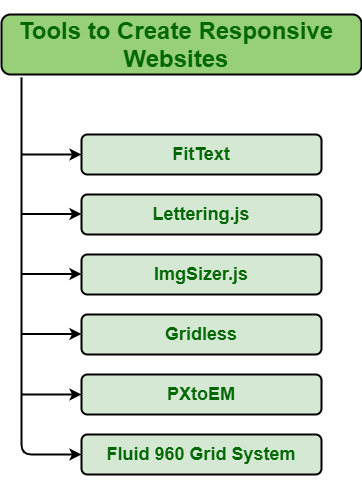
Tools to Create Responsive Web Design: Everyone knows that it is very essential to create a responsive website. It’s not easy to create a responsive website. At present, different tools are available that can be used to create responsive websites. Tools generally work as helpers that provide shortcuts for some tasks of responsive web design. Some important tools required to create web design are divided into three categories as given below:
1. Responsive Typography: Typography simply means the style or appearance of content or text. It creates visuals for the brand and attracts more customers that in turn establishes the value of the brand. It is very important to set overall business and ensure a great user experience. Therefore, it’s important to create a beautiful and attractive typography. Some tools required to create such typography are as follows:
FitText: It is a tool that is required to make a flexible size of the font. It allows the font size of the line of text to perfectly fit the width of the screen. It is basically a jQuery plugin that is used to fit the size of the font of the text. It is best that helps one to make headlines look better on other devices. Its features include:
- It makes font size flexible.
- It can be added to the js website folder.
- It provides scalable headlines.
- It makes text fit on one line.
- It resizes text to fit the parent element.
Lettering.js: It is a tool that allows one to manage each letter individually. Lettering.js is also a jQuery plugin that helps to control the appearance of web pages and characteristics of typography like spacing, the color of individual letters, etc. Its features include:
- It keeps markup manageable.
- It controls the kerning of individual letters.
2. Flexible Images: Flexible images simply refer to images that shape themselves according to size and display resolution. These images automatically adjust themselves to best fit screen size and provide a better user experience. Tools to create flexible images are as follows:
ImgSizer.js: It is a tool that generally used to create different size images from the original ones. It creates different size images depending upon the screen size that the user is using to view the website. Its features include:
- It ensures that images render clearly on Windows.
- It manages all work related to images on the website.
3. Responsive Web Page Layout: Responsive web design generally makes web pages look good on every device such as laptop, smartphone, tablet, etc. It generally includes a flexible layout that adapts itself according to the screen size and features of the web browser of the user. Tools to create a flexible layout are as follows:
Gridless: It is a tool that generally provides both options I.e., HTML5, and CSS3. It is the best tool that can be used to create a future-proof responsive website with ease and beautiful typography. Its features include:
- It is simple and straight forward.
- Improves spectral efficiency.
- It helps in organizing content.
PXtoEM.com: It is a website that is used to convert absolute to relative unit I.e., pixels to EM while developing web elements. It is the best website used to solve complex mathematical equations much easily. Its features include:
- It converts fixed-width design work to a fluid layout.
- It helps in converting the absolute unit of measurements into a relative unit.
- It allows us to easily change the base font size of the layer to something easier.
Fluid 960 Grid System: Webpage payout is very essential while designing a responsive website. This tool-free to use and is used to meet particular needs. This tool readjusts the web layout to fit the width of the page. It is considered the best tool to give a fast and easy way to develop a grid system with help of a CSS framework. Its features include:
- It streamlines the web development workflow.
- It is a lightweight and CSS grid framework.
Share your thoughts in the comments
Please Login to comment...