CSS Box model
Last Updated :
01 Mar, 2024
CSS Box Model is a Fundamental concept in CSS that governs how elements are structured and positioned on a webpage. By learning this model, you’ll create elements visually appealing that adjust seamlessly to various screen sizes. It is used to create the design and layout of web pages.
In this article, we’ll learn the key components of the box model and its practical implications.
What is the CSS Box Model?
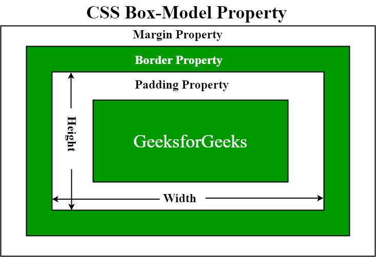
The box model in CSS is a container that contains various properties, including borders, margins, padding, and the content itself. These properties collectively determine the dimensions and spacing of an element.
Let’s break down the key components:
- Content: The actual data in text, images, or other media forms can be sized using the width and height property.
- Padding: Padding is used to create space around the element, inside any defined border.
- Border: The border is used to cover the content & any padding, & also allows setting the style, color, and width of the border.
- Margin: Margin is used to create space around the element ie., around the border area.
1. Content Area
- Contains the actual data, such as text, images, or other media.
- Sized using the width and height properties.
- Bounded by the content edge.
2. Padding Area
- Surrounds the content area.
- Space within the border box.
- Dimensions are determined by the width and height of the padding box.
3. Border Area
- Lies between the padding and margin.
- Width and height are defined by the border.
4. Margin Area
- Separates the element from neighboring elements.
- Dimensions specified by the margin-box width and height.
The following figure illustrates the Box model in CSS.
How Does the Box Model Work?
When setting the width and height properties for an element, we’re mainly adjusting the content area. However, to calculate the full size of the element, we need to consider padding, borders, and margins.
While setting the width and height properties of an element with CSS, we have only set the width and height of the content area. We need to add padding, borders, and margins in order to calculate the full size of an element. Consider the below example.
p {
    width: 80px;
    height: 70px;
    margin: 0;
    border: 2px solid black;
    padding: 5px;
}
Total Width Calculation
Total element width = width + left padding + right padding + left border + right border + left margin + right margin
- Total width of the element is 94px.
- Total width = 80px (width) + 10px (left padding + right padding) + 4px (left border + right border) + 0px (left margin + right margin) = 94px.
Total Height Calculation
Total element height = height + top padding + bottom padding + top border + bottom border + top margin + bottom margin
- Total height of the element is 84px.
- Total height = 70px (height) + 10px (top padding + bottom padding) + 4px (top border + bottom border) + 0px (top margin + bottom margin) = 84px.
Examples of Box models in CSS
Now, We have learned the working of the CSS Box Model in-depth and now we will see Box Model examples so that we can properly understand it.
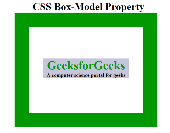
Example 1
This example illustrates the use of the CSS Box model for aligning & displaying it properly.
HTML
<!DOCTYPE html>
<html>
<head>
<title>CSS Box Model</title>
<style>
.main {
font-size: 36px;
font-weight: bold;
Text-align: center;
}
.gfg {
margin-left: 60px;
border: 50px solid #009900;
width: 300px;
height: 200px;
text-align: center;
padding: 50px;
}
.gfg1 {
font-size: 42px;
font-weight: bold;
color: #009900;
margin-top: 60px;
background-color: #c5c5db;
}
.gfg2 {
font-size: 18px;
font-weight: bold;
background-color: #c5c5db;
}
</style>
</head>
<body>
<div class="main">
CSS Box-Model Property
</div>
<div class="gfg">
<div class="gfg1">
GeeksforGeeks
</div>
<div class="gfg2">
A computer science portal for geeks
</div>
</div>
</body>
</html>
|
Output:
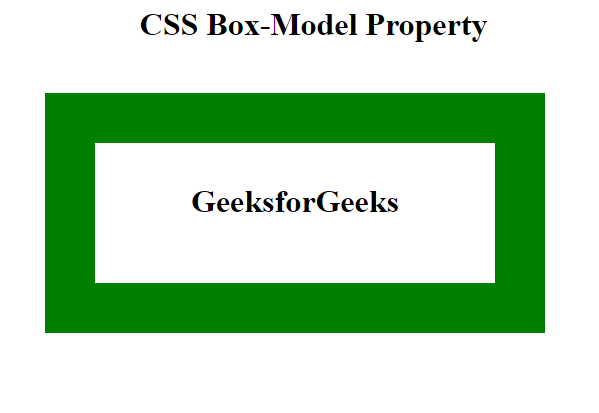
Example 2
This example illustrates the Box Model by implementing the various properties.
HTML
<!DOCTYPE html>
<html>
<head>
<style>
.main {
font-size: 32px;
font-weight: bold;
text-align: center;
}
#box {
padding-top: 40px;
width: 400px;
height: 100px;
border: 50px solid green;
margin: 50px;
text-align: center;
font-size: 32px;
font-weight: bold;
}
</style>
</head>
<body>
<div class="main">CSS Box-Model Property</div>
<div id="box">GeeksforGeeks</div>
</body>
</html>
|
Output:
Share your thoughts in the comments
Please Login to comment...