CSS Pseudo-classes
Last Updated :
04 Apr, 2024
CSS Pseudo-classes are powerful and allow developers to style elements based on their specific states. This guide will walk you through the most commonly used pseudo-classes and how to use them effectively.
Pseudo-classes in CSS are used to define the special state of an element. They can be combined with a CSS selector to add an effect to existing elements based on their states. For instance, you can change the style of an element when the user hovers over it, or when a link is visited. All of these can be achieved using Pseudo Classes in CSS.
Note that pseudo-class names are not case-sensitive.
Syntax:
selector: pseudo-class{
    property: value;
}
There are many Pseudo-classes in CSS but the ones that are most commonly used are as follows:
1. :hover Pseudo-class:
This pseudo-class is used to add a special effect to an element when our mouse pointer is over it. The below example demonstrates that when your mouse enters the box area, its background color changes from yellow to orange.
Example: This example shows the hover pseudo-class in CSS.
HTML
<!DOCTYPE html>
<html>
<head>
    <title>CSS transition-property property</title>
    <style>
        .box {
            background-color: yellow;
            width: 300px;
            height: 200px;
            margin: auto;
            font-size: 40px;
            text-align: center;
        }

        .box:hover {
            background-color: orange;
        }

        h1,
        h2 {
            color: green;
            text-align: center;
        }
    </style>
</head>

<body>
    <h1>Geeks For Geeks</h1>
    <h2>:hover Pseudo-class</h2>
    <div class="box">
        My color changes if you hover over me!
    </div>
</body>
</html>
Output:

2. :active Pseudo-class:
This pseudo-class is used to select an element that is activated when the user clicks on it. The following example demonstrates that when you click on the box, its background color changes for a moment.
Example: This example shows the active pseudo-class in CSS.
HTML
<!DOCTYPE html>
<html>

<head>
    <title>CSS transition-property property</title>
    <style>
    .box{
        background-color: yellow;
        width: 300px;
        height: 200px;
        margin: auto;
        font-size: 40px;
        text-align: center;
    }

    .box:active{
        background-color: orange;
    }

    h1, h2{
        color: green;
        text-align: center;
    }
    </style>
</head>

<body>
    <h1>Geeks For Geeks</h1>
    <h2>:active Pseudo-class</h2>
    <div class="box">
        My color changes for a moment if you click me!
    </div>
</body>

</html>
Output:

3. :focus Pseudo-class:
This pseudo-class is used to select an element that is currently focused by the user. It works on user input elements used in forms and is triggered as soon as the user clicks on it. In the following example, the background color of the input field which is currently focused changes.
Example: This example shows the focus pseudo-class in CSS.
HTML
<!DOCTYPE html>
<html>

<head>
    <title>CSS transition-property property</title>
    <style>
        form{
            width: 300px;
            height: 200px;
            margin: 0 auto;
            text-align: center;
            line-height: 2rem;
        }

        label{
            width: 30%;
        }

        input{
            background-color: default;
            float: right;
        }

        input:focus{
            background-color: grey;
        }

        h1, h2{
            color: green;
            text-align: center;
        }
    </style>
</head>

<body>
    <h1>Geeks For Geeks</h1>
    <h2>:focus Pseudo-class</h2>
    <form>
        <label for="username">Username:</label>
        <input type="text" name="username"
               placeholder="Enter your username" />
        <br>

        <label for="emailid">Email-Id:</label>
        <input type="email" name="emailid"
               placeholder="Enter your email-id" />

        <label for="Password">Password:</label>
        <input type="password" name="Password"
               placeholder="Enter your password" />
    </form>
</body>

</html>
Output:
 4. :visited Pseudo-class:
This pseudo-class is used to select the links which have been already visited by the user. In the following example, the color of the link changes once it is visited.
Example: This example shows the visited pseudo-class in CSS.
HTML
<!DOCTYPE html>
<html>

<head>
    <title>CSS transition-property property</title>
    <style>
        body{
            text-align: center;
        }

        h1, h2{
            color: green;
        }

        a:visited{
            color: red;
        }
    </style>
</head>

<body>
    <h1>Geeks For Geeks</h1>
    <h2>:visited Pseudo-class</h2>

    <p>
        <a href="https://www.geeksforgeeks.org/" target="_blank">
            My color changes once you visit this link
        </a>
    </p>
</body>

</html>
Output:

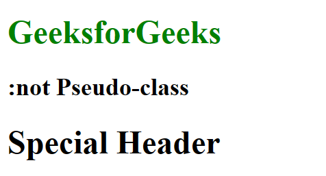
5. :not pseudo-class:
This pseudo-class is used to select elements that do not match a specific selector.
Example: In the following example, the :not pseudo-class is used to select all h1 elements that do not have the class “special”. The color of these h1 elements will be set to green.
HTML
<!DOCTYPE html>
<html>

<head>
    <title>:not Pseudo-class Example</title>
    <style>
        h1:not(.special) {
          color: green;
        }
    </style>
</head>

<body>
    <h1 class>GeeksforGeeks</h1>
    <h2>:not Pseudo-class</h2>
    <h1 class="special">Special Header</h1>
</body>

</html>
Output:
Share your thoughts in the comments
Please Login to comment...