CSS flex-basis Property
Last Updated :
24 Apr, 2024
The flex-basis property in CSS is used to specify the initial size of the flexible item. The flex property is not used if the element is not flexible item.
Syntax:
flex-basis: number | auto | initial | inherit;
Default Value:
Property Values:
Property Value
| Description
|
|---|
number
| It is a length unit that define the initial length of that item.
|
auto
| It is the default value, if the length is not specified the length will be according to it’s content.
|
initial
| It sets the property to it’s default value.
|
inherit
| It specifies that a property should inherit its value from its parent element.
|
Different Examples of CSS Flex Basis Property
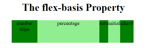
Example 1: In this example, we are using the CSS flex basis property.
html
<!DOCTYPE html>
<html>

<head>
    <style>
        .Geeks {
            width: 385px;
            height: 70px;
            display: flex;
        }

        .Geeks div {
            flex-grow: 0;
            flex-shrink: 0;
            flex-basis: 80px;

            /* For Safari 6.1 and above browsers */
            -webkit-flex-grow: 0;
            -webkit-flex-shrink: 0;
            -webkit-flex-basis: 80px;
        }

        .Geeks div:nth-of-type(2) {
            flex-basis: 50%;
        }
        .Geeks div:nth-of-type(3) {
            flex-basis: auto;
        }
        .Geeks div:nth-of-type(4) {
            flex-basis: initial;
        }
        .Geeks div:nth-of-type(5) {
            flex-basis: inherit;
        }
    </style>
</head>

<body>
    <center>

        <h1>
            The flex-basis Property
        </h1>

        <div class = "Geeks">

            <div style = "background-color:green;">
                number 80px
            </div>

            <div style = "background-color:lightgreen;">
                percentage
            </div>

            <div style = "background-color:green;">
                auto
            </div>

            <div style = "background-color:lightgreen;">
                initial
            </div>

            <div style = "background-color:green;">
                inherit
            </div>
        </div>

    </center>
</body>

</html>
Output:
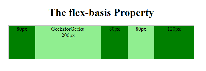
Example 2: In this example, we are using the CSS flex basis property
html
<!DOCTYPE html>
<html>

<head>
    <style>
        .Geeks {
            width: 560px;
            height: 100px;
            border: 1px solid black;
            display: flex;
        }

        .Geeks div {
            flex-grow: 0;
            flex-shrink: 0;
            flex-basis: 80px;
        }
        .Geeks div:nth-of-type(2) {
            flex-basis: 200px;
        }
        .Geeks div:nth-of-type(5) {
            flex-basis: 120px;
        }
        h3{
            color:Green;
        }
    </style>
</head>

<body>
    <center>

        <h1>
            The flex-basis Property
        </h1>

        <div class = "Geeks">
            <div style="background-color:green">
                80px
            </div>

            <div style="background-color:lightgreen">
                GeeksforGeeks <br>200px
            </div>

            <div style="background-color:green">
                80px
            </div>

            <div style="background-color:lightgreen">
                80px
            </div>

            <div style="background-color:green">
                120px
            </div>
        </div>
    </center>
</body>

</html>
Output:
Supported Browsers: The browser supported by flex-basis property are listed below:
- Google Chrome 29.0
- Edge 12
- Internet Explorer 11.0
- Mozilla Firefox 22.0
- Safari 9.0
- Opera 12.1
Share your thoughts in the comments
Please Login to comment...