CSS Grid Layout Module
Last Updated :
02 Apr, 2024
The CSS Grid Layout Module is a revolutionary tool in the realm of web development. It introduces a grid-based layout system, facilitated by rows and columns, that simplifies the design process of any webpage. This system eliminates the need for floats and positioning, making it a game-changer for developers.
Try It:
Auto
3 Columns Equally Spaced
2 Columns Min-Max
Auto-fill
Fractional Column Sizing
Fixed and Fractional
Currently Active Property:
grid-template-columns: auto;
CSS Grid Layout Module creates a grid-based layout system, with the help of rows and columns, and makes it easier to design any webpage without using floats and positioning.
Syntax:
.class {
    display:grid;
}
Note: An HTML element becomes a grid if that element sets display: grid; in style section or inline-grid. Below you will see both examples.
CSS Grid Layout Properties:
Property
| Description
|
|---|
column-gap
| It is used to specify the amount of gap between the columns in which a given text is divided using the column-count property.
|
|---|
|
gap
| It is used to set the spacing also caller gutter between the rows and columns.
|
|---|
|
grid
| It offers a grid-based layout system, with rows and columns, making it easier to design web pages without floats and positioning.
|
|---|
|
grid-area
| It is used to set a grid item size and location in a grid layout.
|
|---|
|
grid-auto-columns
| It is used to specify the size for the columns of implicitly generated grid containers.
|
|---|
grid-auto-flow
| It specifies exactly how auto-placed items get flow into the grid.
|
|---|
grid-auto-rows
| It is used to specify the size for the rows of implicitly generated grid containers.
|
|---|
grid-column
| It describes the number of properties that allow to design of grid structures and control the placement of grid items using CSS.
|
|---|
grid-column-end
| It explains the number of columns an item will span, or on which column-line the item will end.
|
|---|
grid-column-gap
| It is used to set the size of the gap between the columns in a grid layout.
|
|---|
|
grid-column-start
| It defines for which column line item will start.
|
|---|
grid-gap
| It is used to sets the size of the gap between the rows and columns in a grid layout.
|
|---|
|
grid-row
| It is used to specify the size and location in a grid layout.
|
|---|
|
grid-row-end
| It is used to define the grid item’s end position within a grid row by specifying the inline edge of its grid area.
|
|---|
|
grid-row-gap
| It is used to define the size of the gap between the grid elements.
|
|---|
|
grid-row-start
| It is used to define the grid items’ start position within the grid row by specifying the inline start edge of its grid area.
|
|---|
|
grid-template
| It is a shorthand property for defining grid columns, rows, and areas.
|
|---|
|
grid-template-areas
| It is used to specify the area within the grid layout.
|
|---|
|
grid-template-columns
| It is used to set the number of columns and size of the columns of the grid.
|
|---|
grid-template-rows
| It is used to set the number of rows and height of the rows in a grid.
|
|---|
CSS Grid Layout Module Examples
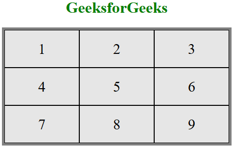
Example 1: Display Grid Property
This example illustrates the use of display: grid; property.
HTML
<!DOCTYPE html>
<html>

<head>
    <style>
        /* Designing all grid */
        .grid-container {
            display: grid;
            grid-template-columns: auto auto auto;
            background-color: gray;
            padding: 5px;
        }

        /* Designing all grid-items */
        .grid-item {
            background-color: rgba(255, 255, 255, 0.8);
            border: 1px solid black;
            padding: 20px;
            font-size: 30px;
            text-align: center;
        }

        /* Designing h1 element */
        h1 {
            color: green;
            text-align: center;
        }
    </style>
</head>

<body>
    <h1>GeeksforGeeks</h1>

    <!-- Creating grid -->
    <div class="grid-container">
        <div class="grid-item">1</div>
        <div class="grid-item">2</div>
        <div class="grid-item">3</div>
        <div class="grid-item">4</div>
        <div class="grid-item">5</div>
        <div class="grid-item">6</div>
        <div class="grid-item">7</div>
        <div class="grid-item">8</div>
        <div class="grid-item">9</div>
    </div>
</body>

</html>
Output:
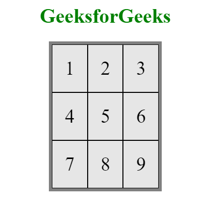
Example 2: Display inline-grid Property
This example illustrates the use of display:inline-grid; property.
HTML
<!DOCTYPE html>
<html>

<head>
    <style>
        /* Designing all grid */
        .grid-container {
            display: inline-grid;
            grid-template-columns: auto auto auto;
            background-color: gray;
            padding: 5px;
        }

        /* Designing all grid-items */
        .grid-item {
            background-color: rgba(255, 255, 255, 0.8);
            border: 1px solid black;
            padding: 20px;
            font-size: 30px;
        }

        /* Designing h1 element */
        h1 {
            color: green;
            text-align: center;
        }
    </style>
</head>

<body>
    <center>
        <h1>GeeksforGeeks</h1>

        <!-- Creating grids -->
        <div class="grid-container">
            <div class="grid-item">1</div>
            <div class="grid-item">2</div>
            <div class="grid-item">3</div>
            <div class="grid-item">4</div>
            <div class="grid-item">5</div>
            <div class="grid-item">6</div>
            <div class="grid-item">7</div>
            <div class="grid-item">8</div>
            <div class="grid-item">9</div>
        </div>
    </center>
</body>

</html>
Output:
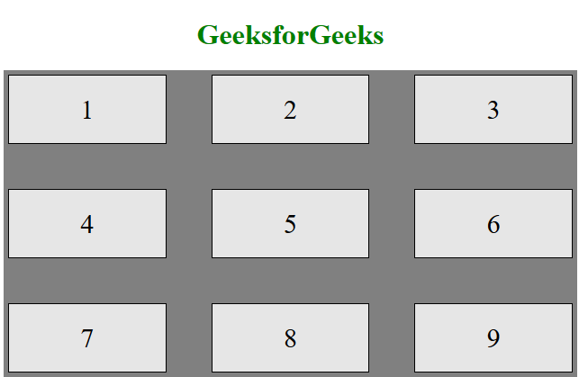
We can control the gaps in the grid system using these items
- grid-column-gap
- grid-row-gap
- grid-gap
Example 3: Custom Grid Gap
This example uses both grid-column-gap and grid-row-gap to define the custom gap in grids.
HTML
<!DOCTYPE html>
<html>

<head>
    <style>
        /* Designing all grid */
        .grid-container {
            display: grid;
            grid-template-columns: auto auto auto;
            background-color: gray;
            grid-column-gap: 50px;
            grid-row-gap: 50px;
            padding: 5px;
        }

        /* Designing all grid-items */
        .grid-item {
            background-color: rgba(255, 255, 255, 0.8);
            border: 1px solid black;
            padding: 20px;
            font-size: 30px;
            text-align: center;
        }

        /* Designing h1 element */
        h1 {
            color: green;
            text-align: center;
        }
    </style>
</head>

<body>
    <h1>GeeksforGeeks</h1>

    <!-- Creating grids -->
    <div class="grid-container">
        <div class="grid-item">1</div>
        <div class="grid-item">2</div>
        <div class="grid-item">3</div>
        <div class="grid-item">4</div>
        <div class="grid-item">5</div>
        <div class="grid-item">6</div>
        <div class="grid-item">7</div>
        <div class="grid-item">8</div>
        <div class="grid-item">9</div>
    </div>
</body>

</html>
Output:
Note: Similarly grid-gap also works.
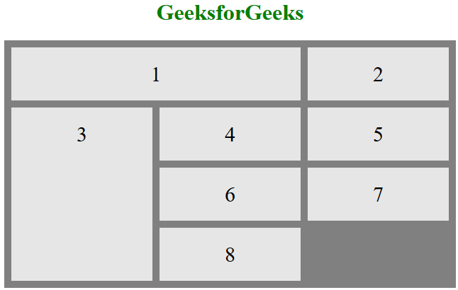
You can control individual grids using the following things on a grid system:
- grid-column-lines
- grid-row-lines
Example 4 : Custom Grid Lines
This code use both grid-column-lines and grid-row-lines together to display the customised grid.
HTML
<!DOCTYPE html>
<html>

<head>
    <style>
        /* Designing all grid */
        .grid-container {
            display: grid;
            grid-template-columns: auto auto auto;
            grid-gap: 10px;
            background-color: gray;
            padding: 10px;
        }

        /* Designing all grid-items */
        .grid-container>div {
            background-color: rgba(255, 255, 255, 0.8);
            text-align: center;
            padding: 20px 0;
            font-size: 30px;
        }

        /* Grid Column */
        .item1 {
            grid-column-start: 1;
            grid-column-end: 3;
        }

        /* Grid row */
        .item3 {
            grid-row-start: 2;
            grid-row-end: 5;
        }

        /* Designing h1 element */
        h1 {
            color: green;
            text-align: center;
        }
    </style>
</head>

<body>
    <h1>GeeksforGeeks</h1>

    <!-- Creating grids -->
    <div class="grid-container">
        <div class="item1">1</div>
        <div class="item2">2</div>
        <div class="item3">3</div>
        <div class="item4">4</div>
        <div class="item5">5</div>
        <div class="item6">6</div>
        <div class="item7">7</div>
        <div class="item8">8</div>
    </div>
</body>

</html>
Output:
Supported Browsers: The browser supported by CSS Grid Layout Module are listed below:
Share your thoughts in the comments
Please Login to comment...