CSS Animations
Last Updated :
10 Apr, 2024
CSS Animations are a powerful tool that allows you to control the motion and display of elements on your web pages. They consist of two parts: one that describes the animation of the elements, and another that contains keyframes indicating the animation properties of the element at specific time intervals.
Understanding CSS Animations
CSS Animations change the appearance and behavior of various elements in web pages. They are defined using the @keyframes rule, which specifies the animation properties of the element and the specific time intervals at which those properties should change.
Syntax:
/*property-name*/: /*value*/;
Animation Properties:
There are certain animation properties given below:
Property
| Description
|
|---|
animation-name
| It is used to specify the name of the @keyframes describing the animation.
|
|---|
animation-duration
| It is used to specify the time duration it takes animation to complete one cycle.
|
|---|
|
animation-timing-function
| It specifies how animations make transitions through keyframes. There are several presets available in CSS which are used as the value for the animation-timing-function like linear, ease,ease-in,ease-out, and ease-in-out.
|
|---|
animation-delay
| It specifies the delay of the start of an animation.
|
|---|
|
animation-iteration-count
| This specifies the number of times the animation will be repeated.
|
|---|
animation-direction
| It defines the direction of the animation. animation direction can be normal, reverse, alternate, and alternate-reverse.
|
|---|
|
animation-fill-mode
| It defines how styles are applied before and after animation. The animation fill mode can be none, forwards, backwards, or both.
|
|---|
animation-play-state
| This property specifies whether the animation is running or paused.
|
|---|
What is a Keyframe ?
@keyframes Rule or Keyframes are the foundations with the help of which CSS Animations work. They define the display of the animation at the respective stages of its whole duration.
CSS Animations Examples
In the first example code, the paragraph changes its color with time. At 0% completion, it is red, at 50% completion it is of orange color and at full completion i.e. at 100%, it is brown.
Example 1: This example describes the CSS Animation using the @keyframe rule.
Javascript
<!DOCTYPE html>
<html>
    <head>
        <style>
            #gfg {
                animation-name: color;
                animation-duration: 5s;
                padding-top: 30px;
                padding-bottom: 30px;
                font-family: Times New Roman;
            }
            @keyframes color {
                0% {
                    background-color: red;
                }
                50% {
                    background-color: orange;
                }
                100% {
                    background-color: brown;
                }
            }
        </style>
    </head>

    <body>
        <div id="gfg">
            <h2>CSS Keyframes Animation</h2>
        </div>
    </body>
</html>
Output:

css animation example
Example 2: This example describes the CSS Animation Properties using the animation-timing-function property.
HTML
<!DOCTYPE html>
<html>
    <head>
        <style>
            h2 {
                width: 350px;
                animation-name: text;
                animation-duration: 4s;
                animation-iteration-count: infinite;
                background-color: rgb(255,210,85);
            }

            #one {
                animation-timing-function: ease;
            }

            #two {
                animation-timing-function: linear;
            }

            #three {
                animation-timing-function: ease-in;
            }

            #four {
                animation-timing-function: ease-out;
            }

            #five {
                animation-timing-function: ease-in-out;
            }

            @keyframes text {
                from {
                    margin-left: 60%;
                }

                to {
                    margin-left: 0%;
                }
            }
        </style>
    </head>

    <body>
        <h2 id="one">This text is ease.</h2>
        <h2 id="two">This text is linear.</h2>
        <h2 id="three">This text is ease-in.</h2>
        <h2 id="four">This text is ease-out.</h2>
        <h2 id="five">
            This text is ease-in-out.
        </h2>
    </body>
</html>
Output:
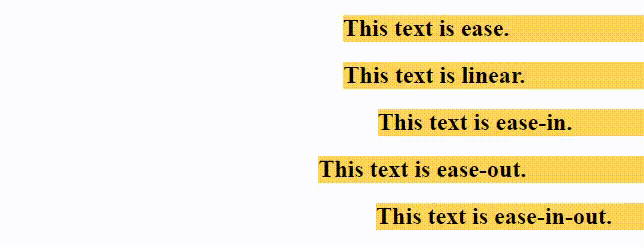
css animation timing funtion
Example 3: This example describes the CSS Animation Properties using the animation-delay property.
HTML
<!DOCTYPE html>
<html>
<head>
    <style>
        #one {
            animation-name: example;
            animation-duration: 10s;
        }

        #two {
            animation-name: example;
            animation-duration: 10s;
            animation-delay: 10s;
        }

        @keyframes example {
            from {
                background-color: orange;
            }

            to {
                background-color: white;
            }
        }
    </style>
</head>

<body>
    <h2 id="one">Text animation without delayed.</h2>
    <h2 id="two">Text animation with 10 second delay.</h2>
</body>
</html>
Output:

Example 4: This example describes the CSS Animation Properties using an animation-iteration-count property.
HTML
<!DOCTYPE html>
<html>
<head>
    <style>
        #one {
            animation-name: example;
            animation-duration: 2s;
            animation-iteration-count: 2;
        }

        #two {
            animation-name: example;
            animation-duration: 2s;
            animation-iteration-count: infinite;
        }

        @keyframes example {
            from {
                background-color: orange;
            }

            to {
                background-color: white;
            }
        }
    </style>
</head>

<body>
    <h2 id="one">This text changes its color two times.</h2>
    <h2 id="two">This text changes its color infinite times.</h2>
</body>
</html>
Output:

css animation iteration property
Example 5: This example describes the CSS Animation Properties using the animation-direction property.
HTML
<!DOCTYPE html>
<html>
<head>
    <style>
        h2 {
            width: 100%;
            animation-name: text;
            animation-duration: 2s;
            animation-iteration-count: infinite;
        }

        #one {
            animation-direction: normal;
        }

        #two {
            animation-direction: reverse;
        }

        #three {
            animation-direction: alternate;
        }

        #four {
            animation-direction: alternate-reverse;
        }

        @keyframes text {
            from {
                margin-left: 60%;
            }

            to {
                margin-left: 0%;
            }
        }
    </style>
</head>

<body>
    <h2 id="one">This text is normal.</h2>
    <h2 id="two">This text is reverse.</h2>
    <h2 id="three">This text is alternate.</h2>
    <h2 id="four">This text is alternate-reverse.</h2>
</body>
</html>
Output:

css animation direction property example
Example 6: This example describes the CSS Animation Properties using an animation-fill-mode property.
HTML
<!DOCTYPE html>
<html>
<head>
    <style>
        h2 {
            width: 400px;
            background-color: orange;
            animation-name: text;
            animation-duration: 3s;
        }

        #one {
            animation-fill-mode: none;
        }

        #two {
            animation-fill-mode: forwards;
        }

        #three {
            animation-fill-mode: backwards;
            animation-delay: 2s;
        }

        #four {
            animation-fill-mode: both;
            animation-delay: 2s;
        }

        @keyframes text {
            from {
                margin-left: 0%;
                background-color: #aaaaaa;
            }

            to {
                margin-left: 60%;
                background-color: #008000;
            }
        }
    </style>
</head>

<body>
    <h2 id="one">none</h2>
    <h2 id="two">forwards</h2>
    <h2 id="three">backwards</h2>
    <h2 id="four">both</h2>
</body>
</html>
Output:

css animation fill property
Supported Browsers: Following browsers support the CSS Animations
Like Article
Suggest improvement
Share your thoughts in the comments
Please Login to comment...