Short note on Responsive Web Design
Last Updated :
08 Jan, 2021
Responsive Web Design comprises two words i.e., responsive and web design. Responsive means to respond and web design means to design website. Therefore, responsive web design generally means website that respond to or resize or adjust itself depending upon screen size it is being seen through. It automatically adjusts to fit user’s screen whether it’s desktop, laptop, mobile, tablet, etc. It only uses one layout for web page and it can be done either using CSS and HTML or CSS3 and HTML5.
When to use it?
Responsive web design is a way by which website that contain flexible layout that automatically scale its content and elements according to screen size on which it is viewed. It simply resizes, shrink, enlarge, hide web pages so that it can look better on all type of devices and does not have to zoom and pan to see any content on website. But still some people get confused in deciding when to use responsive web design. Below given are some points to clear this confusion:
- Responsive web design is best for small to large scale business or company that want to grow their business. For growth and success, they need to update their existing website and get it converted into responsive website that not only help one to rank higher in search engine, but also offer better user experience to visitors.
- Responsive web design is best for new business that wants to build a new brand site and get ahead to other competitors. They need to create a responsive web design because of responsive design reach more audience, stay in touch with customers through mobile, increase conversions, etc.
- Responsive web design is best for service-based industries because it includes creative UX and UI design and is made up of images and text. Images and graphics are also clear and crisp when viewed on mobile device.
- Responsive web design is also best for companies that have less or tight budget and limited resources because responsive design is budget friendly. One has to invest their money and effort only in one rather because of its flexibility.
How to check whether the Website is Responsive?
One should know that not all Websites are responsive. Non-responsive websites display perfectly on desktop, laptop but not on mobile or tablets. Below are some steps given that one can follow to determine whether website is responsive or not.
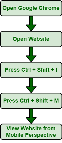
Step 1: Go to Google Chrome and Open it.
Step 2: Go to website that you want to check for responsive design.
Step 3: Press Ctrl + Shift + I. This will open Chrome DevTools. These are web developer and debugging tools built into browser and help one to edit page and identify problem easily.
Step 4: Press Ctrl + Shift + M. This will toggle device toolbar i.e.; toolbar will appear at top of page and enable one to see appearance of website on mobile device.
Step 5: View website from mobile, tablet perspective.
Conclusion: If the website view fits according to screen size, everything looks clear and crisp, images and text are clear, etc., then one can say that website is responsive. All images, fonts, and HTML elements will be scaled properly, and fit whatever screen size is.
Like Article
Suggest improvement
Share your thoughts in the comments
Please Login to comment...