How to create a multi level Dropdown NavBar in React-bootstrap using map?
Last Updated :
02 Nov, 2023
In this article, we are going to implement a drop-down-based navigation bar using React-Bootstrap. We will map the navigation links from an array to a navigation bar with suitable React-Bootstrap classes and components.
Prerequisite:
Steps to create React Application and install required modules:
Step 1: Create a React application using the following command:
npx create-react-app multidrop-nav
Step 2: After creating your project folder(i.e. multidrop-nav, move to it by using the following command:
cd multidrop-nav
Step 3: Now install react-bootstrap in your working directory i.e. multidrop-nav by executing the below command in the VScode terminal:
npm install react-bootstrap bootstrap
Step 4: Now we need to Add Bootstrap CSS to the index.js file:
import 'bootstrap/dist/css/bootstrap.min.css';
The updated dependencies in package.json file will look like:
"dependencies": {
    "@testing-library/jest-dom": "^5.17.0",
    "@testing-library/react": "^13.4.0",
    "@testing-library/user-event": "^13.5.0",
    "bootstrap": "^5.3.2",
    "react": "^18.2.0",
    "react-bootstrap": "^2.9.0",
    "react-dom": "^18.2.0",
    "react-scripts": "5.0.1",
    "web-vitals": "^2.1.4"
  },
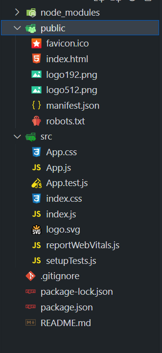
Project Structure
Approach
- In this approach, we have created an array of navbar items, and for each dropdown, we have created a submenu there containing all the items with their navigation links.
- Then we are mapping the whole navitem array in the project with suitable classes or components of React Bootstrap.
- For a particular item of an array, if it contains a submenu, we are returning a NavDropDown component; otherwise, we are returning a NavLink with the help of the menuShow() function in the file.
- Passing suitable Bootstrap classes to each element so that it will get styled.
Example 1: This example implements the above-mentioned approach in App.js file.
Javascript
import React from "react";
import {
Navbar,
Nav,
NavDropdown,
} from "react-bootstrap";
const navBarData = [
{
label: "Home",
url: "/",
},
{
label: "Tutorials",
submenu: [
{
label: "React",
url: "/react",
submenu: [
{
label: "Hooks",
url: "/react/hooks",
},
{
label: "Context",
url: "/react/context",
},
],
},
{
label: "JavaScript",
url: "/javascript",
},
],
},
{
label: "About",
url: "/about",
},
];
function App() {
const menuShow = (mItems) => {
return mItems.map(
(item, index) => {
if (item.submenu) {
return (
<NavDropdown
title={
item.label
}
key={index}
className="dropdown-menu-dark
dropend">
{menuShow(
item.submenu
)}
</NavDropdown>
);
} else {
return (
<Nav.Link
href={
item.url
}
key={index}>
{item.label}
</Nav.Link>
);
}
}
);
};
const navStyle = {
color: "black",
fontWeight: "bold",
};
return (
<Navbar
bg="light"
expand="lg"
variant="light">
<Navbar.Brand href="#home">
<h1
style={{
color: "green",
}}>
<b>GeeksforGeeks</b>
</h1>
</Navbar.Brand>
<Navbar.Toggle aria-controls="basic-navbar-nav" />
<Navbar.Collapse id="basic-navbar-nav">
<Nav
className="mr-auto"
style={navStyle}>
{menuShow(
navBarData
)}
</Nav>
</Navbar.Collapse>
</Navbar>
);
}
export default App;
|
Output: Now open your browser and go to http://localhost:3000/, you will see the following output:

Example 2: This example implements the above-mentioned approach in App.js file with additional styling which is imported in index.js file
Javascript
import React from "react";
import {
Navbar,
Nav,
NavDropdown,
} from "react-bootstrap";
import "./App.css";
const navBarData = [
{
label: "Home",
url: "/",
},
{
label: "Tutorials",
submenu: [
{
label: "React",
url: "/react",
submenu: [
{
label: "Hooks",
url: "/react/hooks",
},
{
label: "Context",
url: "/react/context",
submenu: [
{
label: "Advanced Context",
url: "/react/context/advanced",
},
{
label: "Redux",
url: "/react/context/redux",
},
],
},
{
label: "Router",
url: "/react/router",
submenu: [
{
label: "Nested Routes",
url: "/react/router/nested",
},],},],},
{
label: "JavaScript",
url: "/javascript",
},
],
},
{
label: "About",
url: "/about",
},
];
function App() {
const menuShow = (mItems) => {
return mItems.map(
(item, index) => {
if (item.submenu) {
return (
<NavDropdown
title={
item.label
}
key={index}
className="dropdown-menu-dark
dropend">
{menuShow(
item.submenu
)}
</NavDropdown>
);
} else {
return (
<Nav.Link
href={
item.url
}
key={index}>
{item.label}
</Nav.Link>
);}});};
const navStyle = {
color: "black",
fontWeight: "bold",
};
return (
<Navbar expand="lg">
<Navbar.Brand href="#home">
<h1
style={{
color: "white",
}}>
<b>GeeksforGeeks</b>
</h1>
</Navbar.Brand>
<Navbar.Toggle aria-controls="basic-navbar-nav"/>
<Navbar.Collapse id="basic-navbar-nav">
<Nav
className="mr-auto"
style={navStyle}>
{menuShow(
navBarData
)}
</Nav>
</Navbar.Collapse>
</Navbar>
);
}
export default App;
|
Javascript
import React from "react";
import ReactDOM from "react-dom/client";
import "./index.css";
import App from "./App";
import reportWebVitals from "./reportWebVitals";
import "bootstrap/dist/css/bootstrap.min.css";
const root = ReactDOM.createRoot(
document.getElementById("root")
);
root.render(
<React.StrictMode>
<App />
</React.StrictMode>
);
reportWebVitals();
|
CSS
.navbar {
background: linear-gradient(
135deg,
#52e878,
#00b59b
);
box-shadow: 0px 4px 8px
rgba(0, 0, 0, 0.1);
}
.brand-text {
color: #ffffff !important;
font-size: 36px;
font-weight: 800;
text-shadow: 2px 2px 4px
rgba(0, 0, 0, 0.2);
}
.dropdown-menu {
background: linear-gradient(
135deg,
#52e878,
#00b59b
);
border: none;
}
.dropdown-item {
color: #ffffff !important;
font-size: 18px;
font-weight: 600;
}
.navbar-nav .nav-link:hover,
.dropdown-item:hover {
background: linear-gradient(
135deg,
#00b59b,
#52e878
);
color: #ffffff !important;
transition: background-color 0.3s
ease-in-out;
}
.navbar-nav .nav-link.active {
background: linear-gradient(
135deg,
#ffc400,
#ffac00
);
color: #ffffff !important;
}
|
Output:

Share your thoughts in the comments
Please Login to comment...